Apizza Brooklyn
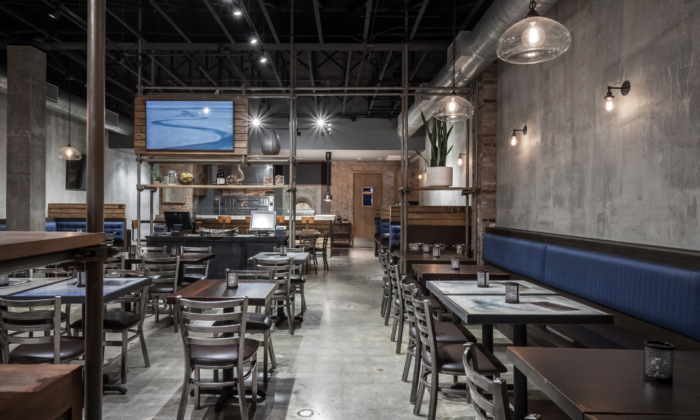
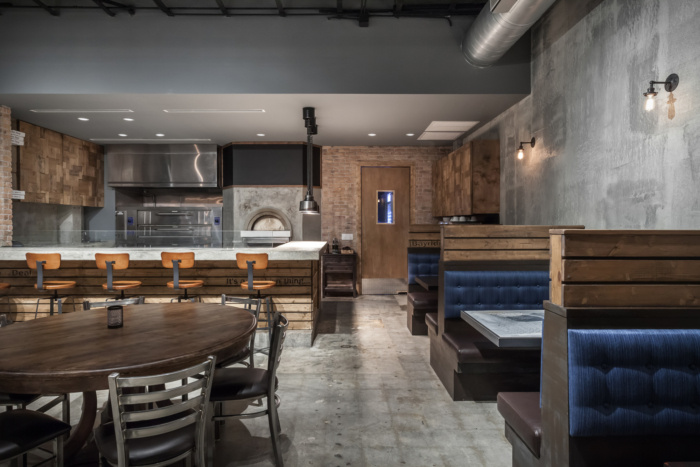
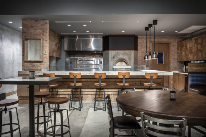
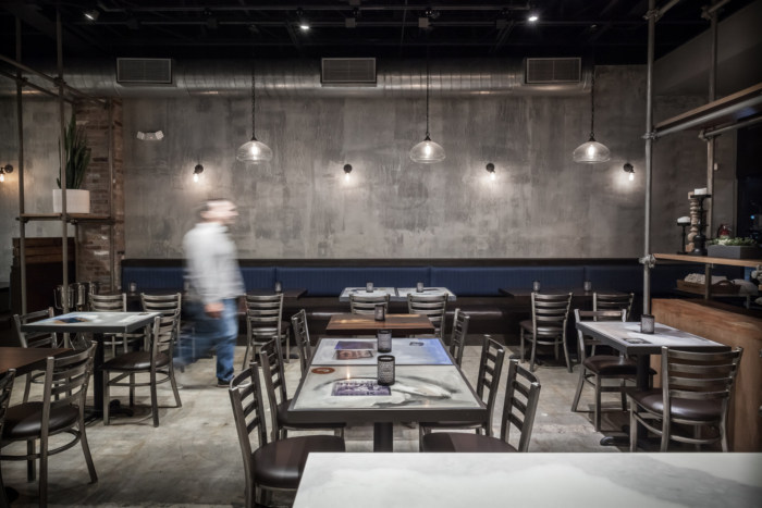
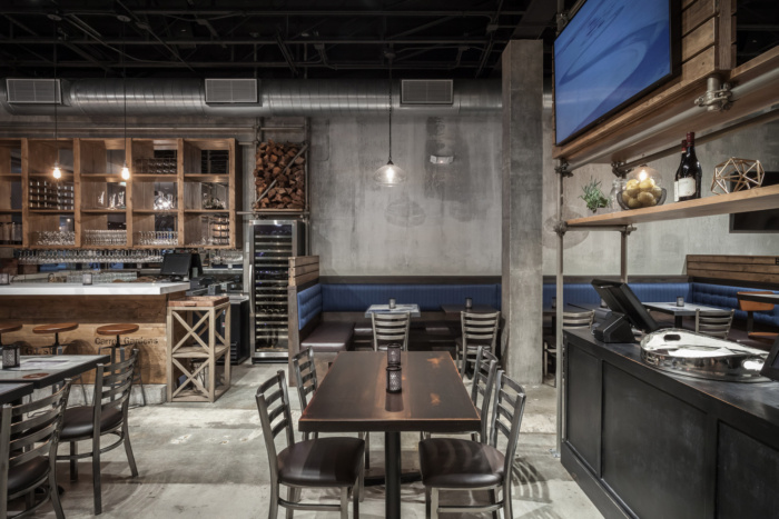
KoDA designed Apizza Brooklyn without a forced brand as a space that resonates an unforgettable identity, a personality that is both similar to the original space and suggestive of the cuisine’s heritage.
Along Miami’s bustling Bird Road, an unbroken space will be the second home for this local pizzeria. Like any great recipe, the design for this restaurant called for proper ingredients; equal parts innovation, creativity and familiarity. The goal was to script an unforgettable experience for the customer, while conjuring up their appetite for gourmet, brick oven pizzas made with garden-fresh ingredients.
This unique design approach began by investigating the feedback provided by the hundreds of reviews, sifting through those not specifically related to the experience. The customer’s feedback formulated several topics that became design challenges; noise control, seating variety, table arrangement, Etc. Analysis and research aided the solutions to the proposed challenges, however it was only through dynamic conversations with the client and their customers where the appropriate unique solutions realized.
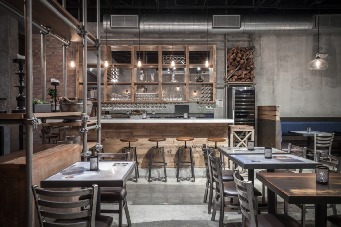
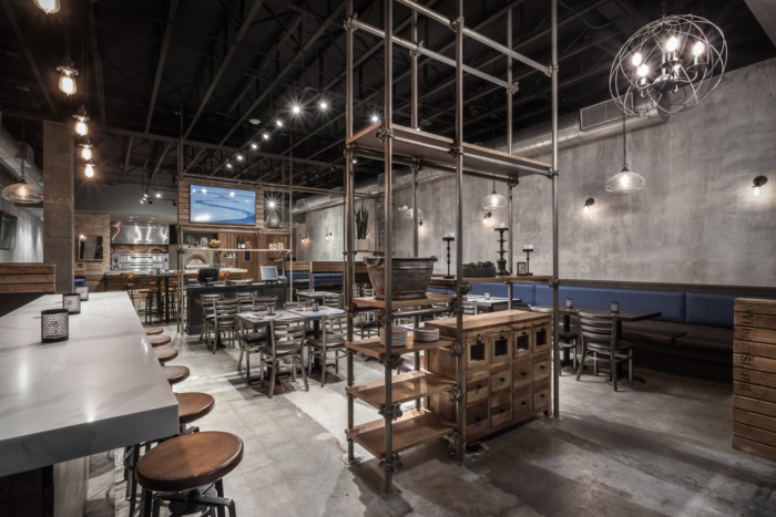
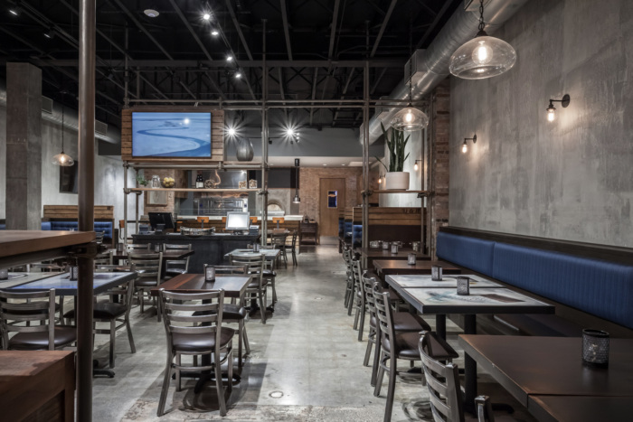
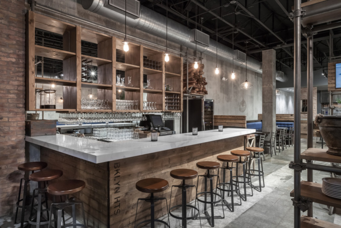
The deep and narrow space became segmented by functional screens made up of repurposed scaffolding, designed to display the fresh ingredients used in the kitchen. With a total of 280 miles of protective sidewalk scaffolding in front of close to 8,000 buildings in New York City, the otherwise industrial material has become synonymous with the identity and architectural experience of the city. Based on the client’s unlimited need for storage, the repurposed scaffold displays help give prominence to the duality of a brand made up of New York City and fresh ingredients.
The clients asked for a second restaurant location. It was important to have it’s own identity, being new and fresh, but also connecting back to the identity of their brand. A brand focused around fresh ingredients and their connection to NYC, they wanted the space to portray this. Therefore, we too an in-depth look into the company’s brand and figuring out how the firm could communicate that vision through spatial configurations, materials and menus design. We even read online reviews of the restaurant’s other location. This process allowed us to distill the brand down to its essence, and build and evolve it back into the space.
Design: KoDA
Photography: Emilio Collavino



Now editing content for LinkedIn.