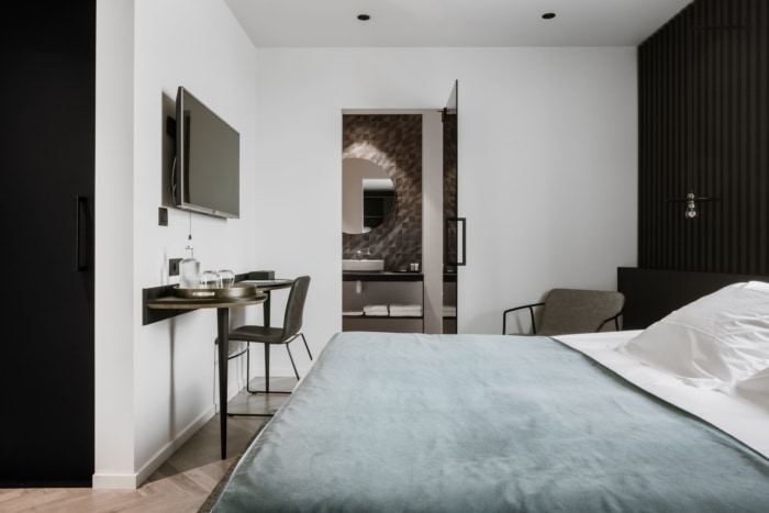
Hotel Beila
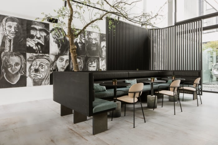
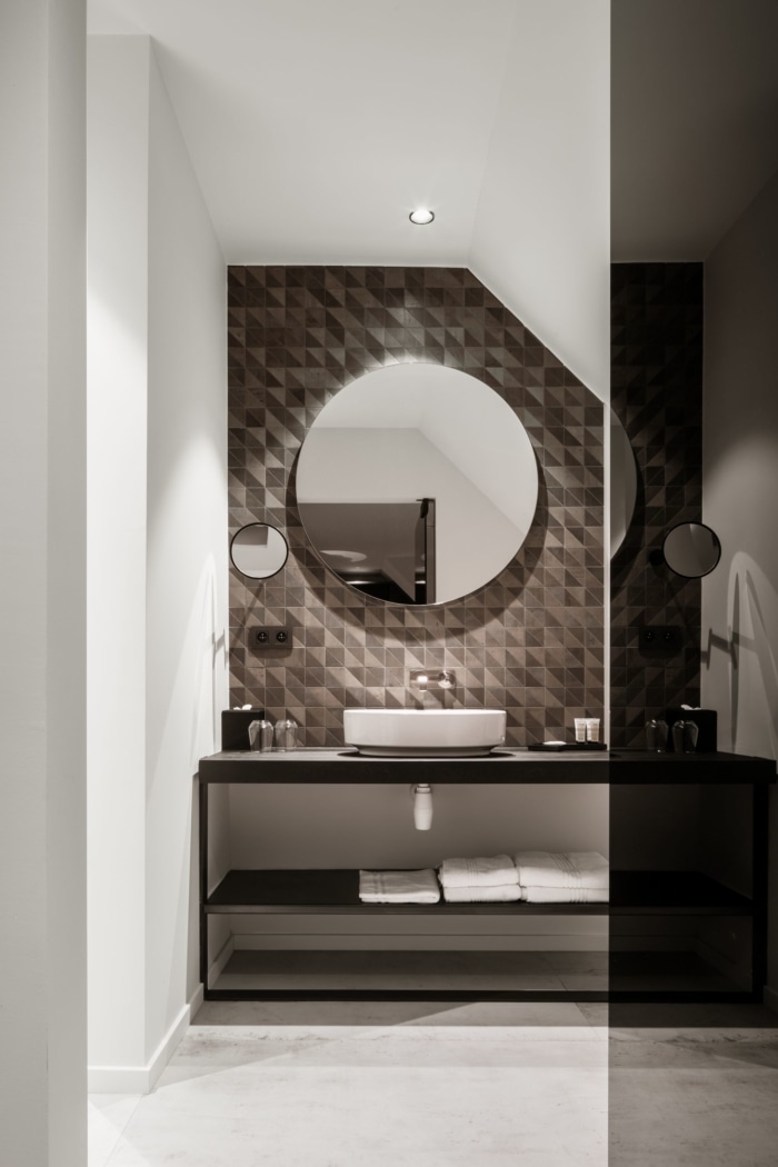
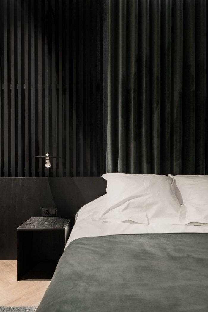
As the only boutique hotel in Bilzen, Creneau International sought to design the interiors of Hotel Beila with an eye for detail and comfort.
When we start the concept design of an interior design project, it’s often the interior designer that starts collecting moods, picking materials and drawing up the interior. It’s only later in the process that the graphic designer comes into the picture. Not with Hotel Beila. In this case, the concept design hinges on graphic lines. About the branding: first things first, the logo. We started with the 1819 coat of arms of Bilzen. We drew inspiration from the interplay of geometrical lines and the curves of the tree. The color palette was based on the coat of arms.
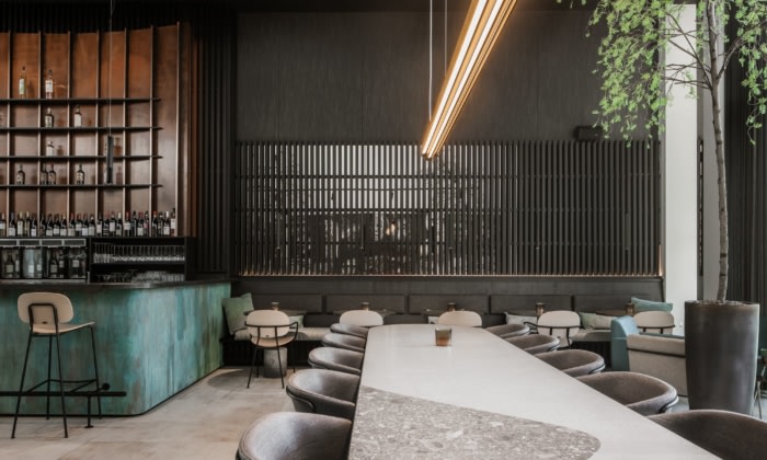
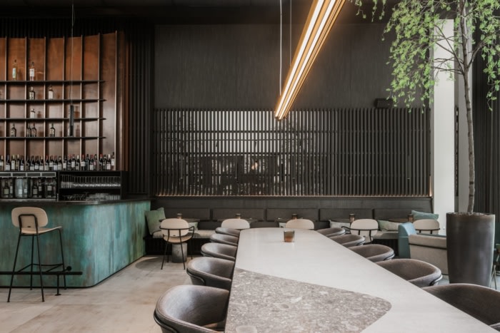
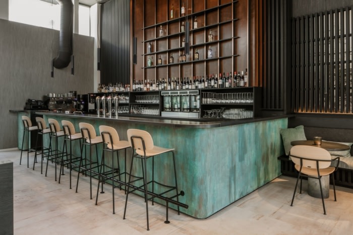
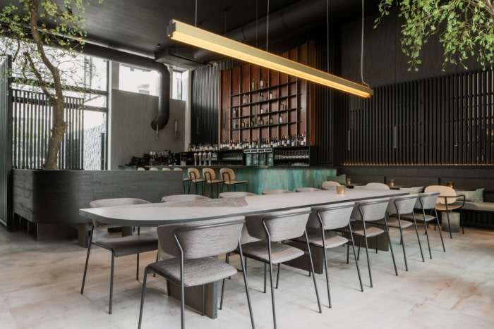
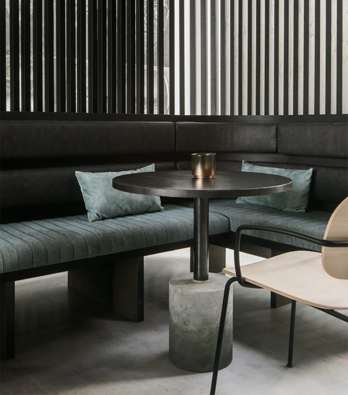
The materials: We didn’t go for the most luxurious materials, yet we picked materials that have a luxurious appearance. We opted for industrial materials, though we used them in a different way. For example, the cladding of the bar looks like oxidized copper.
Oxidized copper is not exactly considered a luxurious material but it does have luxurious look. Moreover, we introduced a material previously used only outside, in the interior of a boutique hotel. About the details: People with an eye for detail will feast their eyes on Beila. Those who pay attention, will recognize the lines of the logo in the fixtures of the wall lamps, in the curve of the tables and, if you look below, within the floor.
Design: Creneau International
Photography: Jeroen Verrecht

