110 North Wacker Drive Amenity Spaces
NELSON Worldwide was tasked with infusing five-star hospitality elements throughout the Class A tower’s amenity spaces, including 110 North Wacker Drive Amenity Spaces.
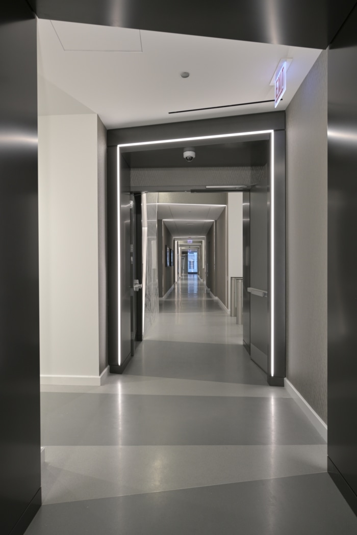
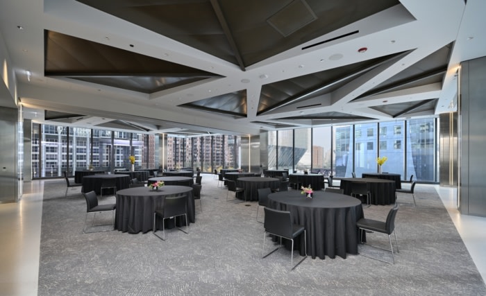
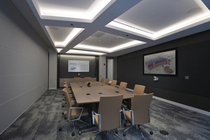
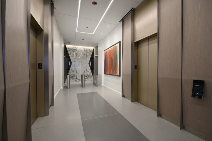
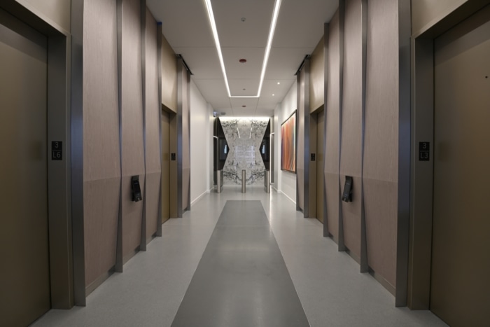
NELSON Worldwide is excited to announce the completion of the interior amenity spaces at 110 North Wacker Drive—Chicago’s next Class A office tower. Designed to realize maximum quality efficiency for tenants, the new 55-story building is a functional, yet luxurious addition to Chicago’s skyline and riverfront. NELSON Worldwide was tapped to design all 50,000 square feet of amenity spaces, including the design of the level three conference center, sundry, shoe shine, office of the building, fitness center, multi-tenant corridors, and tenant-floor elevator lobbies.
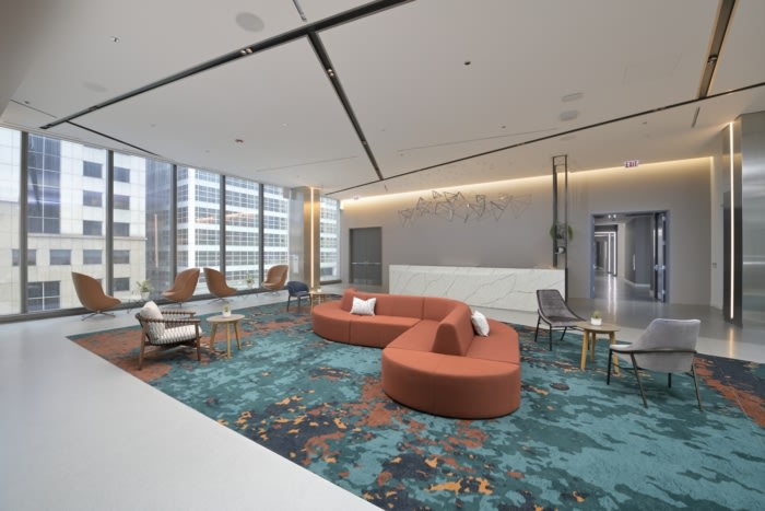
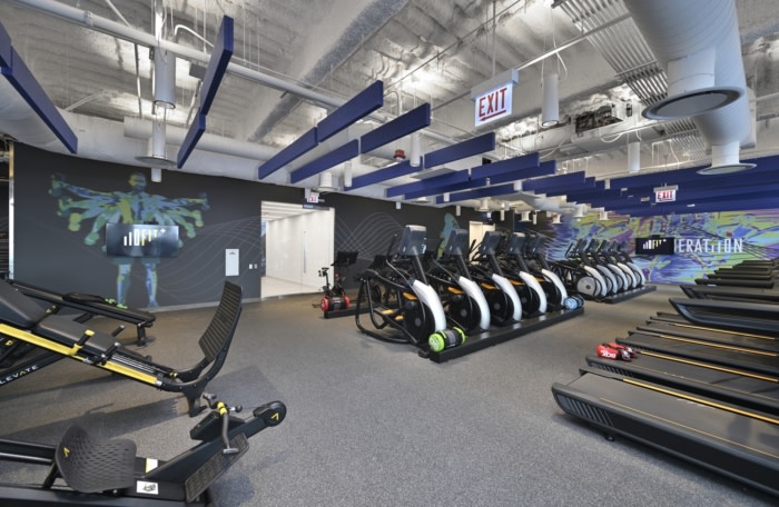
The tower features a conference center for tenant use; a two-story, state-of-the art fitness center; a tenant lounge; and multi-tenant floor elevator lobbies and circulation corridors. The NELSON team drew inspiration from the exterior architectural elements designed by the world-renowned architecture firm, Goettsch Partners, and re-interpreted them within the planes of the luxurious interior materials, paying homage to Chicago’s unique urban scene. Much like everyone who walks into the towering lobby, 110 North Wacker is a distinguished character in the Chicago story.
NELSON Worldwide has designed spaces that reinforce an immediate connection to one of the city’s greatest attractions—the Chicago River, which plays an integral role throughout all aspects of the building and has contributed to its leasing momentum. The NELSON team is also designing several offices throughout, as well as developing initial planning studies for the legal tenants considering occupancy. These planning studies demonstrate the great efficiencies that the design of the building floor plate can offer to the legal industry at 110 North Wacker Drive. To celebrate the building’s structure and its surroundings, the amenity spaces flow alongside the river, using pattern, texture, shape, and light influenced by Goettsch’s design. Creating positive and negative space, strong contrasts and movement were also influenced by music, with tight textures representing the high notes and broad scale representing the deep notes.
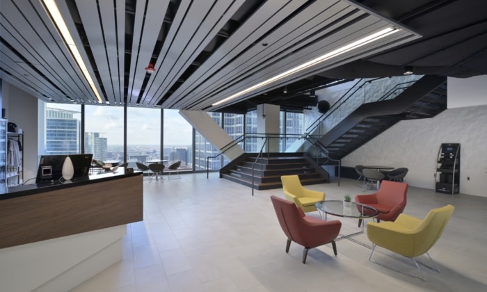
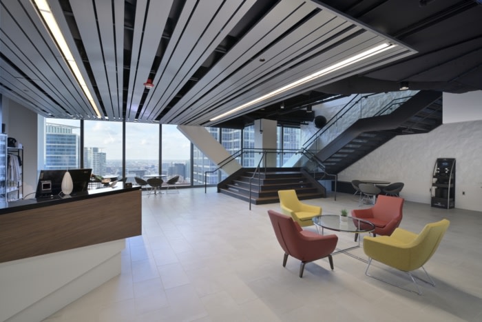
A few levels above on levels 23 and 24, the team designed all environmental graphic pieces within the fitness center. The center itself has a different feel, inspired by energy and movement, with bold graphics and colors. The third level gives of a more sophisticated and elegant aesthetic, made up of natural materials such as wood and stone. Because level three was also designed to function as an event space, there is a greater connection between the floor and ceiling elements and the exterior of the building to draw your eyes outside to the views of downtown Chicago, making for an unforgettable experience.
Design: NELSON Worldwide
Photography: courtesy of NELSON Worldwide





Now editing content for LinkedIn.