Sip Pho Restaurant
MAGIC architecture created Sip Pho Restaurant as an Austin building that is a reflection of a simple ask from the owners: Make ordinary things become extraordinary.
Guided by the owner’s interest in simple and clean spaces, the architecture of this building renovation was an exploration of how to make ordinary building parts look extraordinary. Located north of the University of Texas, the building’s quiet composition is a reaction to the busy and graphic mess of the surrounding streetscape.
At the start of the project, much of the existing 75 year old restaurant was beyond use. Sewer lines had vanished, asbestos was hidden between layers of layers of repairs. What had to remain was the use and some of the structure’s walls to receive a building permit. 15% of the existing exterior walls and footprint were re-used. Everything else is new.
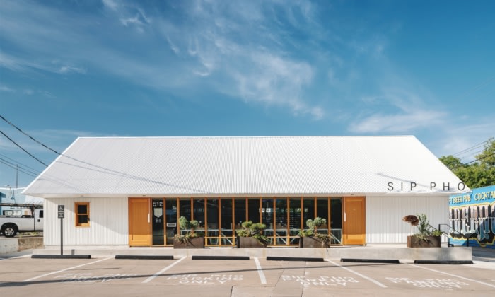
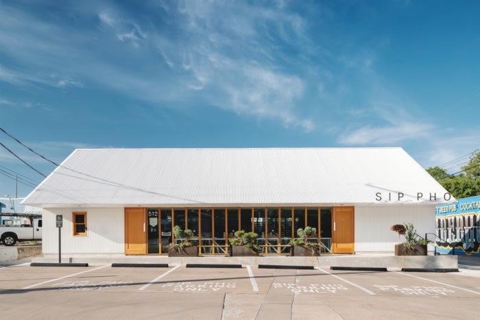
The building’s forms are based on the simple shapes of pioneer Texas structures, which were often basic gables roofs with overhangs for porches. The pioneer language here is translated into a composition of two forms: a gable + a box.
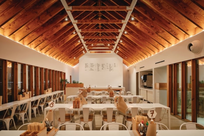
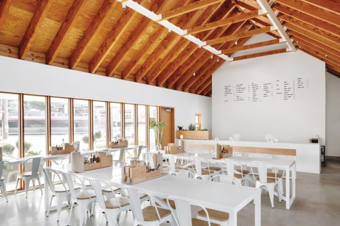
Each form has a different function as a direct representation of use, the gable (dining room) and the box (kitchen). The dining room is a column free 20 foot x 60 foot space with exposed Douglas Fir wood framed studs and rafters. The box (kitchen) is left understated to conceal the kitchen HVAC and related building systems.
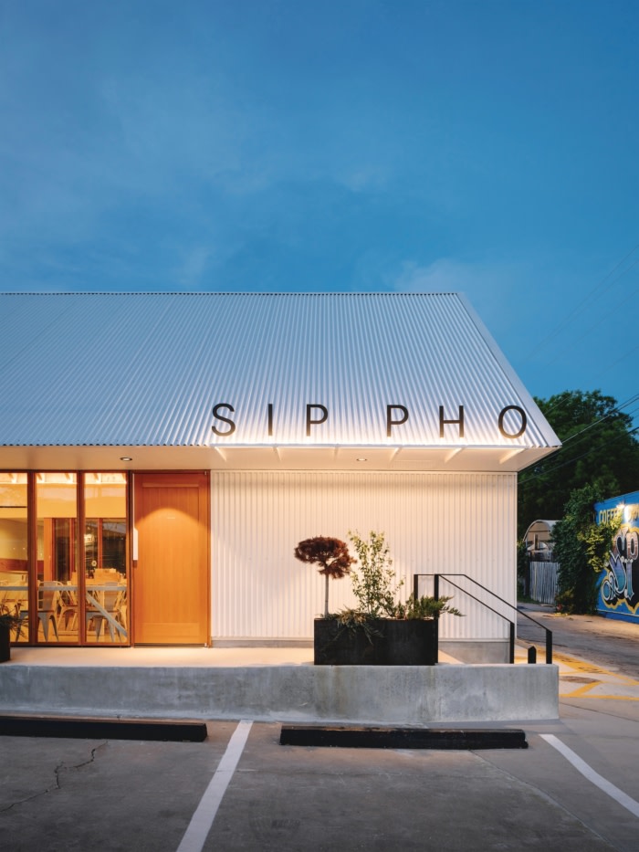
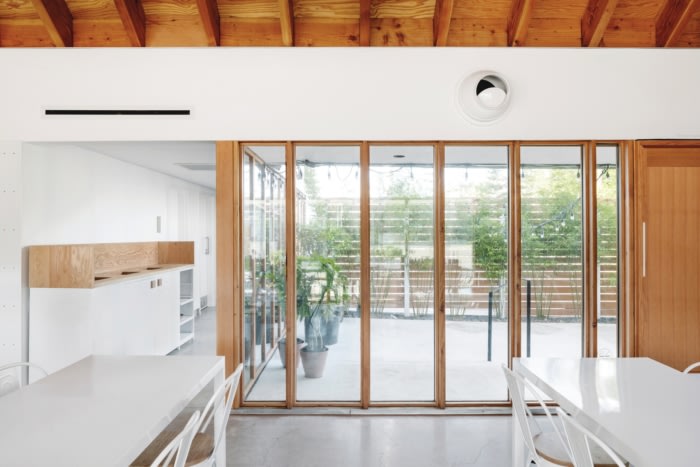
Simple available materials were used throughout. Pre-finished corrugated white siding is the primary exterior material, cladding walls and roof, broken with moments of site-built windows. Taking the language to the interior, a palette of white drywall, Douglas Fir framing and concrete floor carries throughout. To avoid structural beams and expensive window systems costs, the wall’s 2×6 wood studs are left exposed with insulated glass units glazed between them. Great attention and detail was given to conceal all ductwork and lighting from view, to quiet the overall visual experience.
Recognizing the knowledge of the pioneers, simple sustainability strategies were used to extend the building’s lifespan. To reduce heat and water intrusion, deep overhangs cover all windows, blocking out the sun, shedding water away and keeping patrons dry. Readily available skylights are spaced at 4 foot intervals facing North to provide ample daylight for lunch service and rhythmic shadows throughout the day. At night, the experience differs to reflect the menu. Warm adjustable downlights provide general lighting while a concealed tape light uplight each side of the ceiling.
The key challenge was working within strict local codes, the building footprint couldn’t be modified. Therefore, we built an entirely new restaurant (except for a few walls) on the previous outline.
The brief was to renovate a 70 year old BBQ restaurant into a casual+ Vietnamese Restaurant. We had to utilize commonly available materials and limit finishes. To do so, we chose to avoid common architect traps – expensive finishes, applied items and “nice haves”. Instead, we offered a solution that exposed the wall framing, the roof framing and had minimal headers and beams.
Design: MAGIC architecture
Photography: Chase Daniel



Now editing content for LinkedIn.