Great State Burger
Best Practice Architecture completed another location of Great State Burger, transforming an old building into the classic branding and clean space of the burger joint.
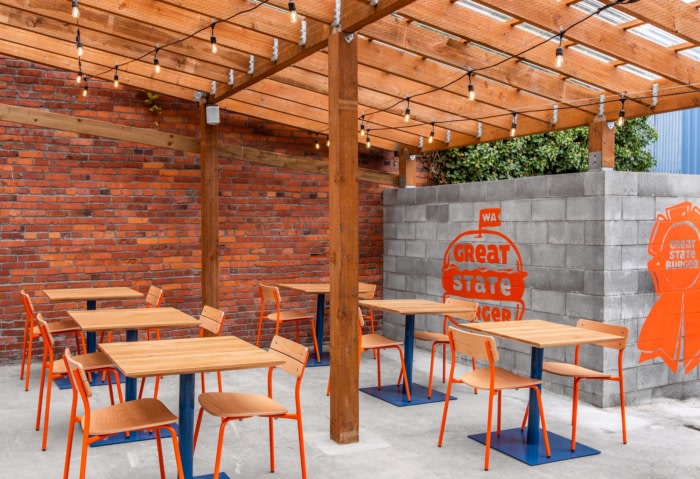
When asked to turn a ramshackle historic structure along one of Seattle’s landmarked commercial avenues into the newest location of Great State Burger, the team at Best Practice Architecture leapt at the task. Having designed three prior locations for the Northwest burger brand, the team is deeply familiar with its spirit, and aimed to retrofit the iconic Great State appeal in collaboration with new owner and restaurateur Renee Erickson of Sea Creatures into a beautiful place to enjoy a great burger.
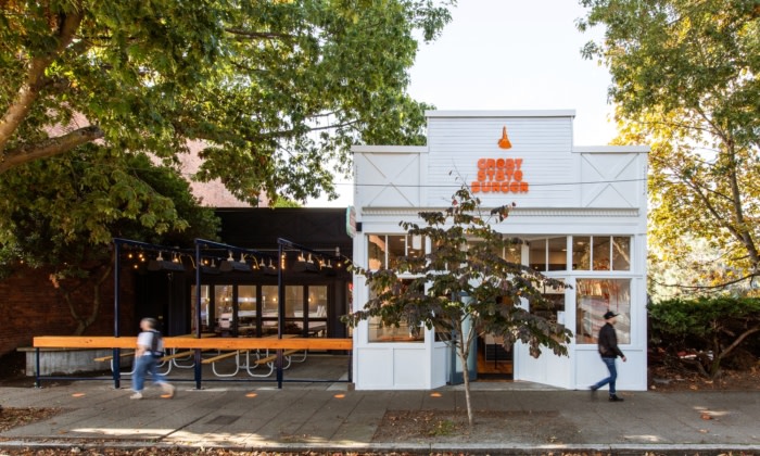
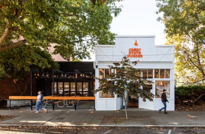
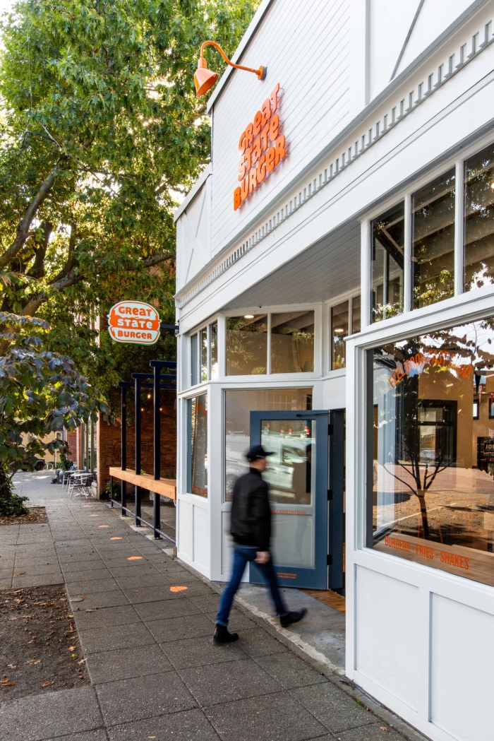
Built in 1895 to house the Dill Meat Market, the small wooden building Great State now calls home is one of the oldest structures remaining on Seattle’s Ballard Avenue, and is under protection by the neighborhood landmark committee. Its ornate wood storefront and intricate parapet detailing around the courtyard was embraced and preserved as the Best Practice design team worked with the historical board on improvements that jived with the landmark requirements. Paint colors, signage and lighting along Ballard Avenue were all carefully considered and chosen to highlight the front entry–which is the oldest portion of the 1895 structure–while also providing pops of color and interest that suit the restaurant’s look and feel. The rest of the building was repaired and painted a deep navy, creating a backdrop for the front to pop out.
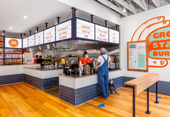
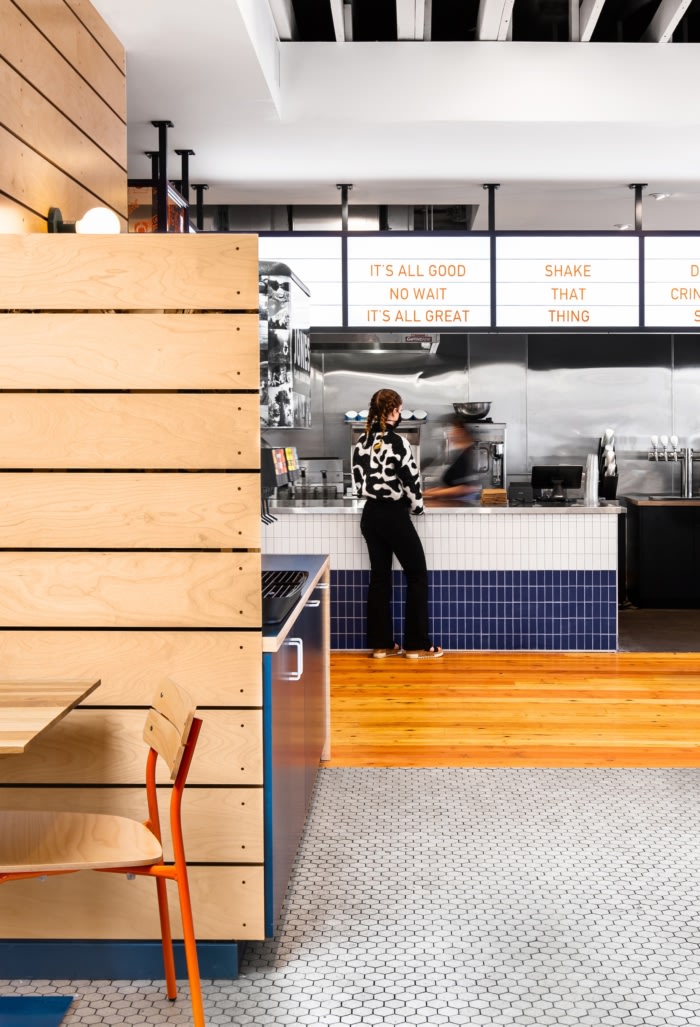
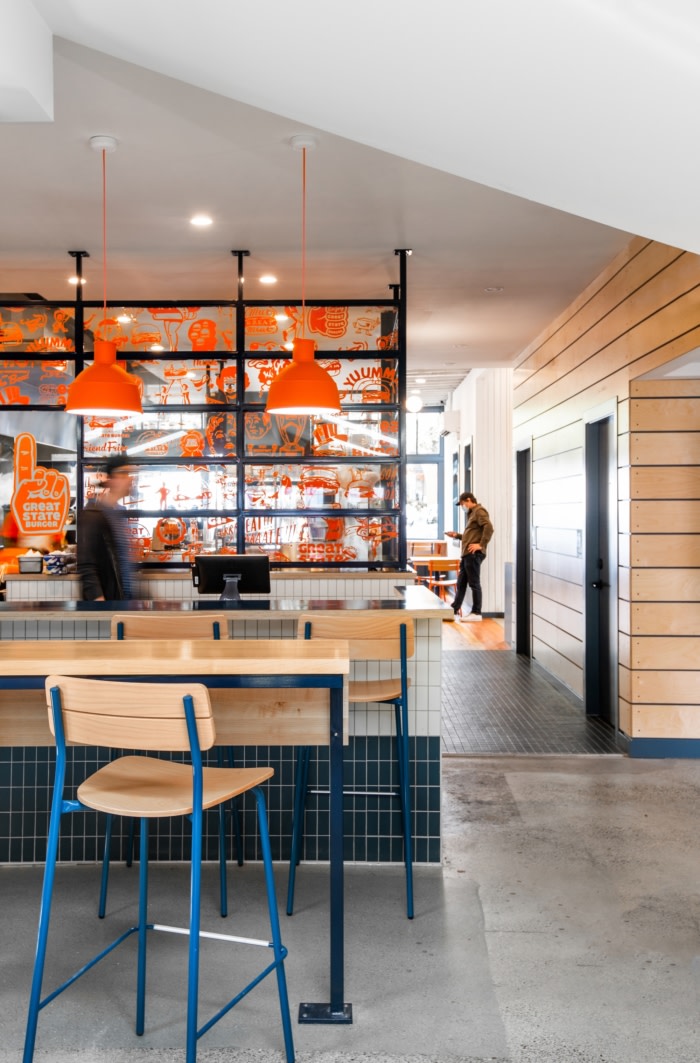
Inside, the team was able to expose some of the existing roof structure in the open ceiling, creating an expansive and airy room that houses the front counter and kitchen. Navy and white tilework wraps the room, while the original wood flooring was preserved and refinished below your feet. A glass wall encloses the kitchen from view, providing peeks of the work being done beyond, and a slightly retro, internally lit sign hangs above the ordering and pick-up counters.
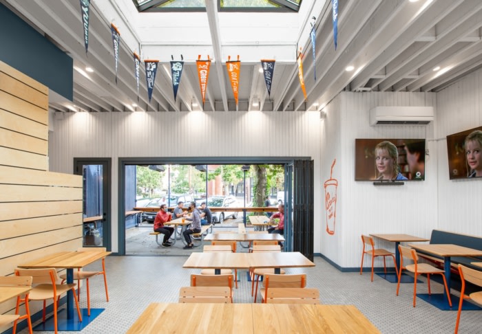
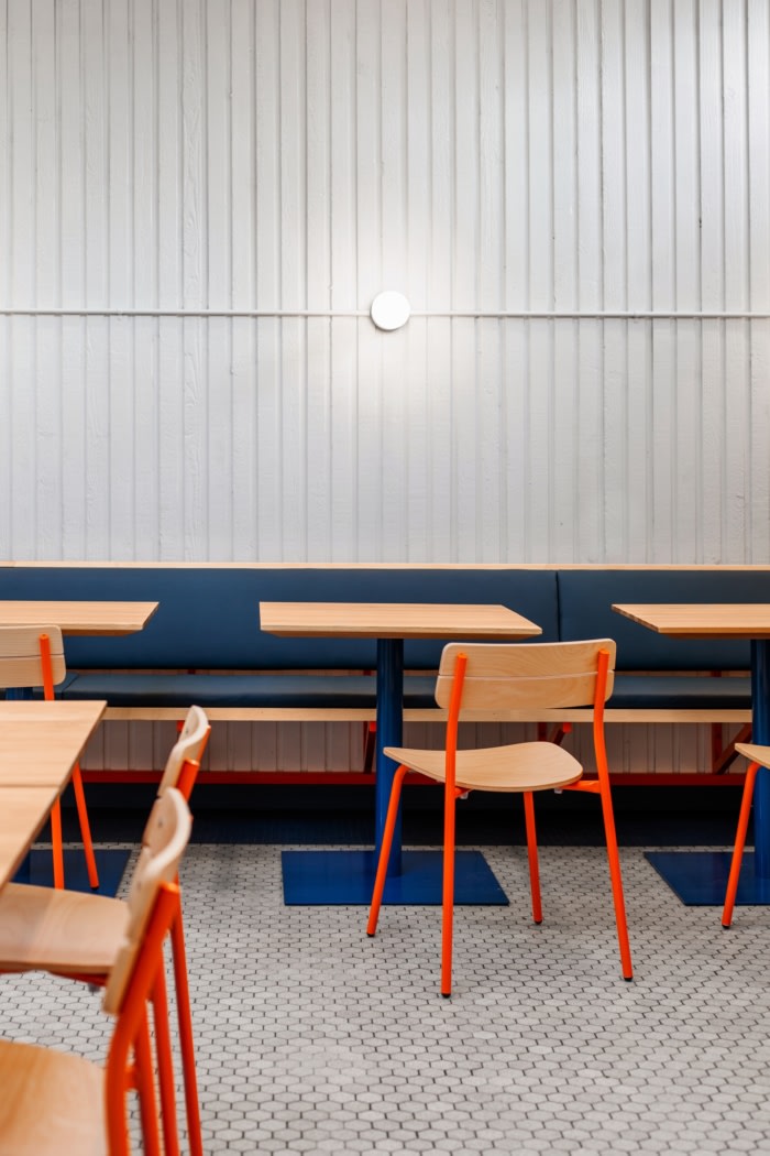
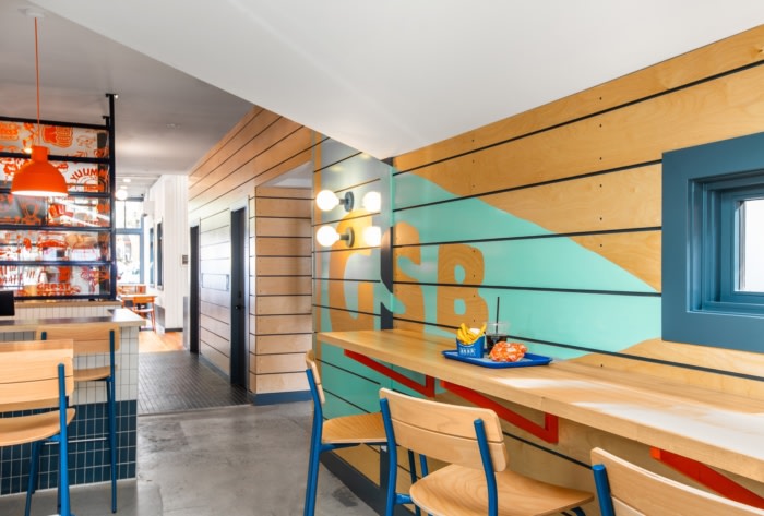
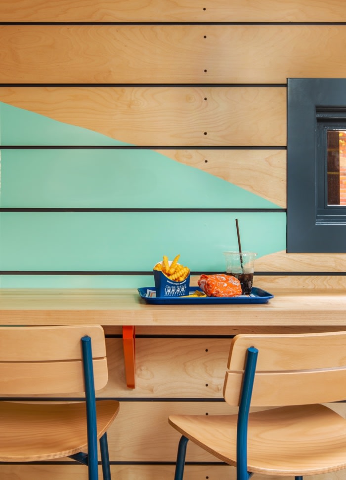
As you move into the spacious dining room, new accordion doors open onto a front courtyard, connecting the interior and exterior spaces. A giant skylight and west-facing clerestory windows flood the dining room with natural light. The design team uncovered vertical wood paneling under layers of sheetrock, and a traditional hexagon tile floor was refurbished to lend a retro look. New wall-mounted banquettes wrap the space while a few fun graphics enliven the walls. A new plywood-clad wall makes its way down the corridor, passing the new gender neutral restrooms and wrapping the bar and games area–this brand new wall is a connector, tying the front historic spaces to the newer rear areas.
With this project, the Best Practice team shows off a few of its key skills–collaborating closely with the historical board and the new owners, the team was able to find a compromise that looks and feels like a winner for all parties. Updating the Great State brand to excite diners, the team revived a historical structure in need of some well-designed attention, while the restaurant makes for a safe, comfortable and delicious addition to the neighborhood.
Design: Best Practice Architecture
Photography: Rafael Soldi



Now editing content for LinkedIn.