Today is Long Cafe
Absence From Island collaborated with Studio Etain Ho to design the Today is Long Cafe to be a blend of the owner’s Australian ties and Hong Kong roots.
The clients were a group of individuals who have studied and worked separately in Australia and have subsequently moved back to hometown Hong Kong where they eventually met due to a shared passion for coffee. One of them has become a well-accomplished barista and another has become a successful public-relation manager. The cafe is a place to house their fond memories of Australia and the good coffee that makes their life, which they would very much like to share with local residents and to make the cafe into a social hub.
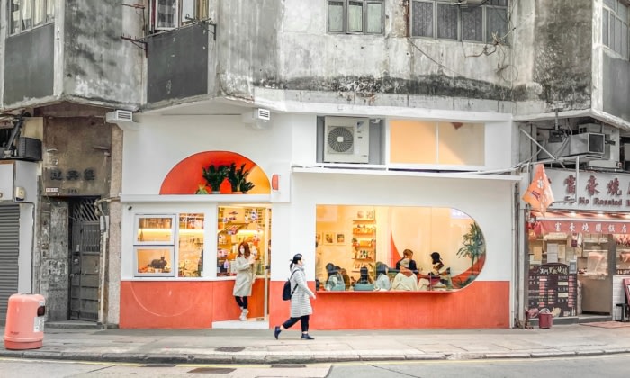
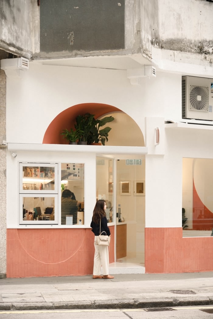
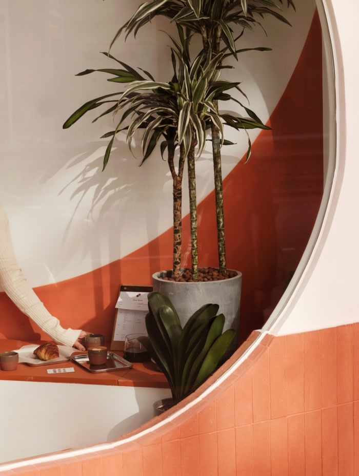
They named the Cafe as “Today Is Long” (TIL) and the design was inspired by the golden sunset of Australia. Warm red-orange became the theme colour which it also took reference from the sandstone monolith – Uluru in the Red Centre of Northern Australia. The texture of the baked earthy sandstone is also represented by the fired ceramic tiles anchored at the lower part of the facade.
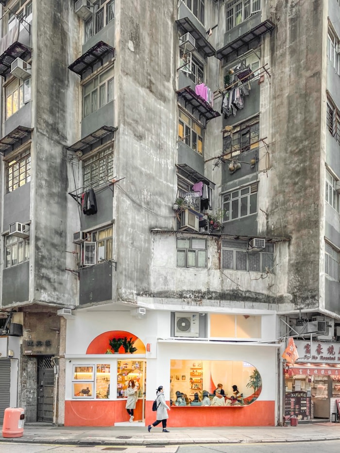
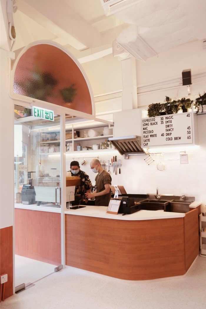
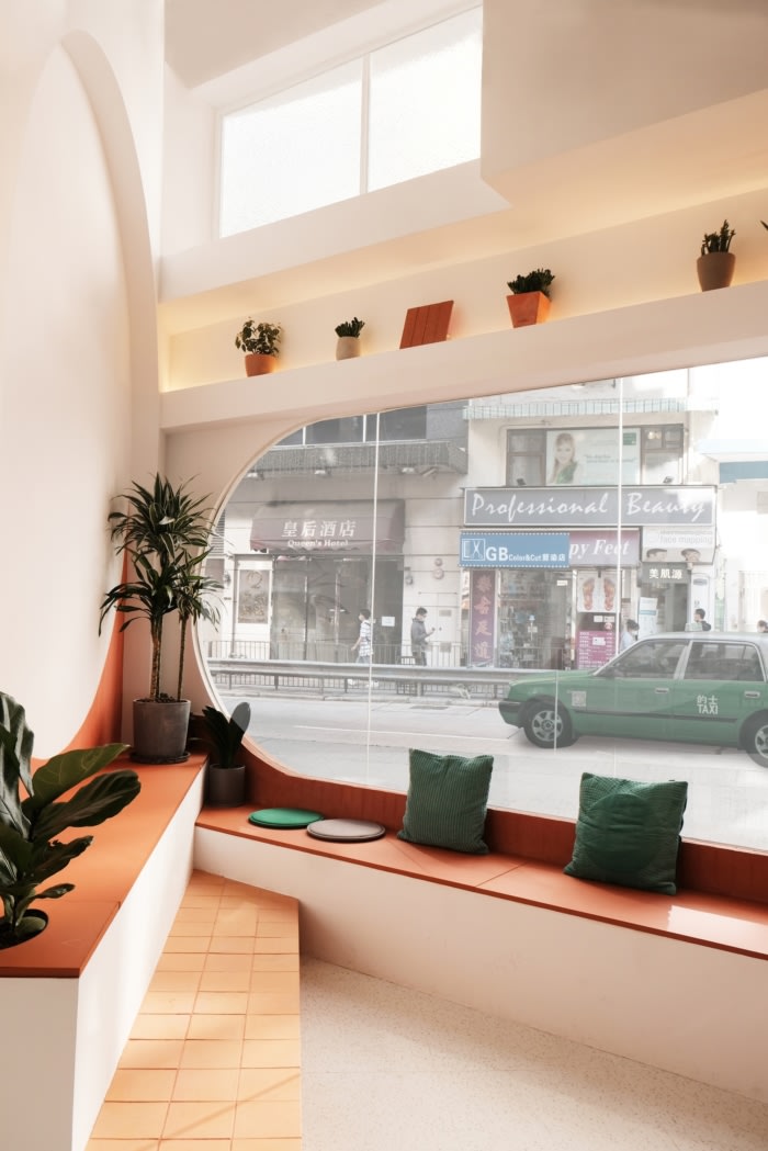
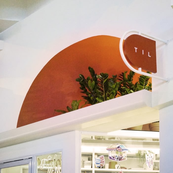
The hemisphere of setting sun has been applied in various ways on the facade. This helped form a facade with a strong geometrical language which distinguishes the cafe from its surroundings of old buildings. It allows the cafe to stand out and be noticed. One of the hemispheres became the welcome arch at the entrance which formed a short tunnel to transport customers from the hustle and bustle in Sai Ying Pun to the quiet and comfortable interior. Another formed a recessed wall pattern for the take-away counter. The third hemisphere was rotated sideway and formed the largest window to bring in as much natural light as possible. Apart from the facade, there was one full final circle in the interior which formed as the backdrop for the seating area.
Australia has always been blessed with abundant amounts of sunlight, thus a lot of white colour has been used together with the large windows to enhance the bright and airy atmosphere. And spaces have been reserved under the entrance arch, seating area and the overhead storage for plantings in order to create a green, lush and natural environment. Coffee grain used in the cafe will also be recycled as fertilisers for the plantings.
Sai Ying Pun, given its proximity to the University of Hong Kong, has been famous for its mix of locals and foreigners in recent years. And the idea of the cafe being a social hub is expressed by the seating arrangement – bench seating has been fitted in one triangular corner of the shop with the two rows facing each other. With the benches and the coffee counter arranged along the periphery of the cafe and with a focal point in the centre, the arrangement shall enhance interaction and create a sense of community. A thin bar table has also been designed on the facade for customers, especially dog-owners, to enjoy their coffee outdoors and to look into the cafe at the same time.
Design: Absence From Island, Studio Etain Ho
Contractor: CYDD Company Limited
Photography: fo visuals, Dypiem, Liz Eatery



Now editing content for LinkedIn.