PAN AM Restaurant
MODGI Group took on the design of the PAN AM Restaurant with the goal of giving a fresh take to an Asian restaurant with simple design features and careful furniture selection.
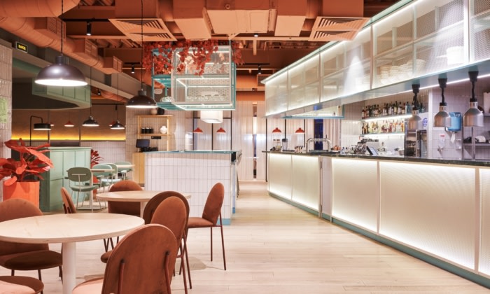
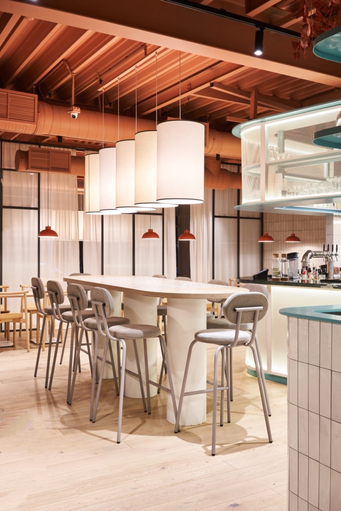
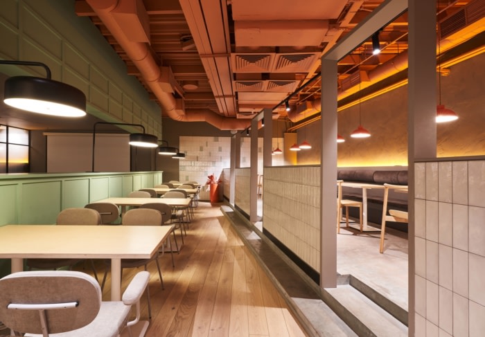
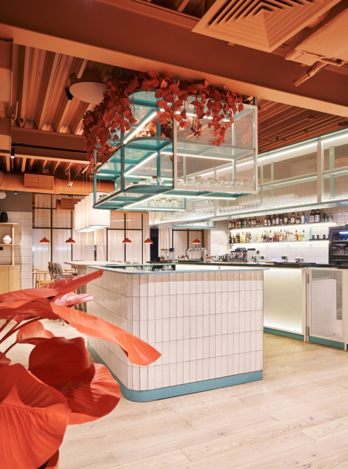
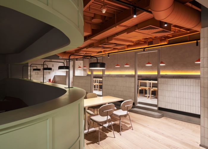
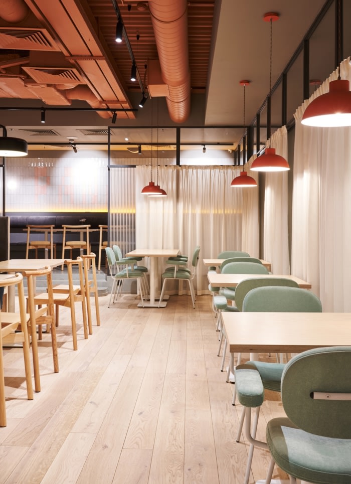
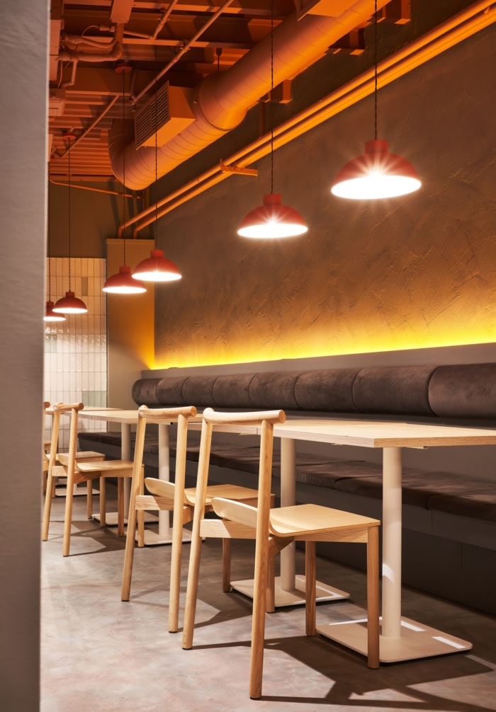
The main idea of the restaurant interior concept is to make an Asian restaurant without direct reference to Asian motifs. The menu contains dishes of various local cultures, the atmosphere of the institution is designed to become trends and images of modern Asia. PAN AM is a daytime restaurant, and the institution’s democracy is emphasized by a combination of classic and familiar techniques with bright eccentric details, a warm peach-colored ceiling on neutral walls or intentionally artificial plants of bright colors.
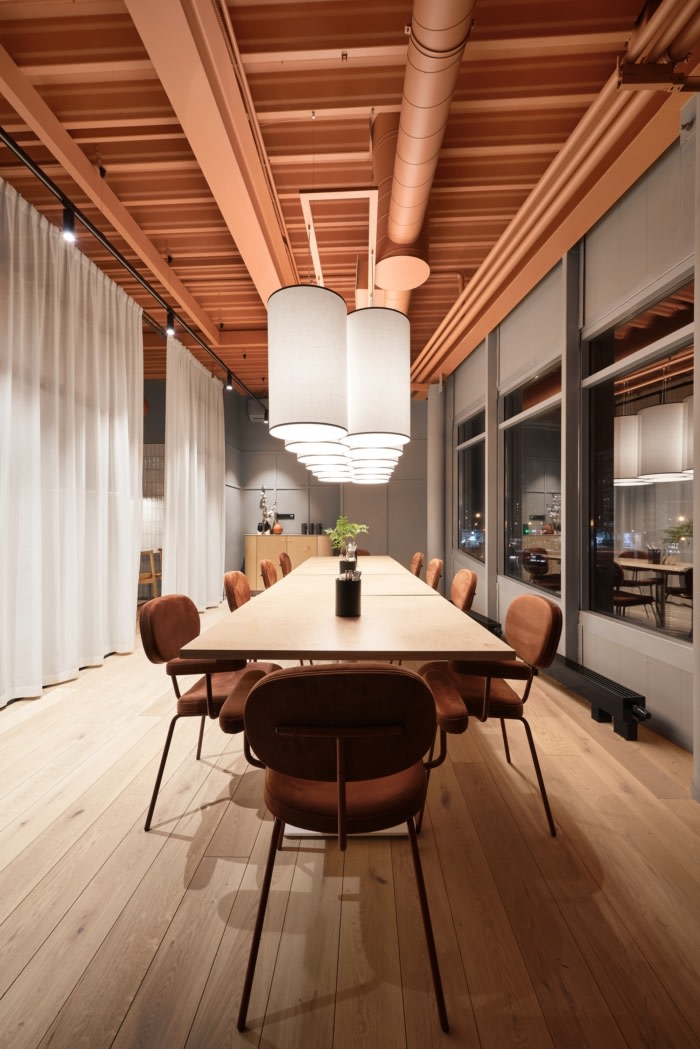
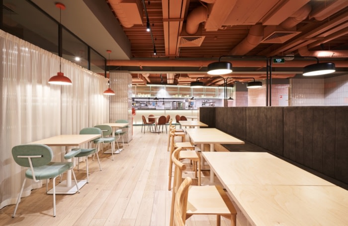
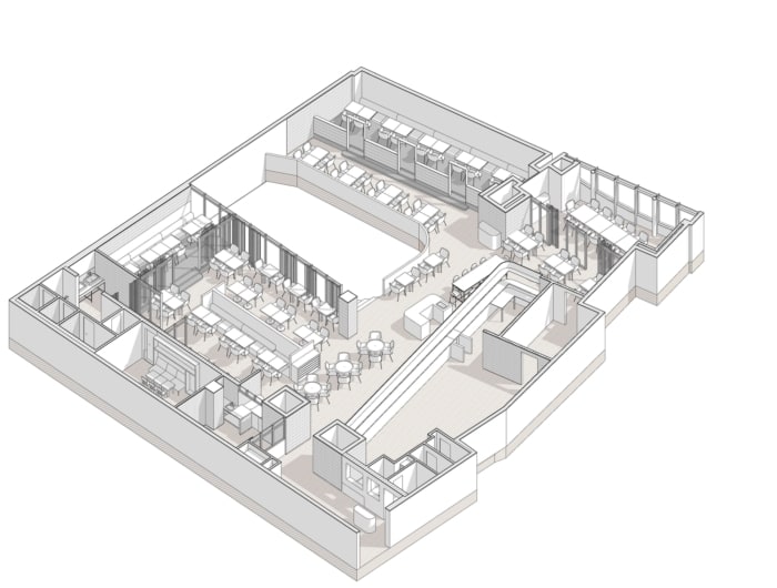
Zoning of the restaurant supports the idea of openness and simplicity: the space is divided into several zones for different tasks. There is a wide variety of standard landings, as well as a VIP room and a children’s room. A significant part of the area is occupied by an open kitchen.
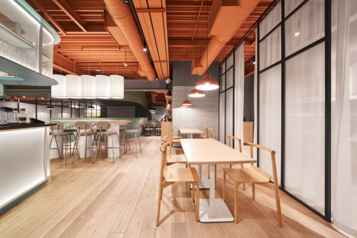
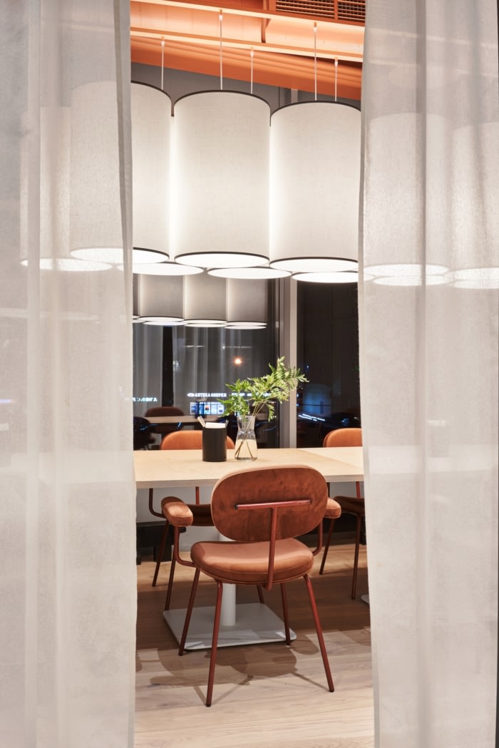
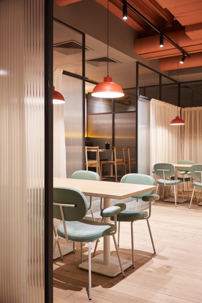
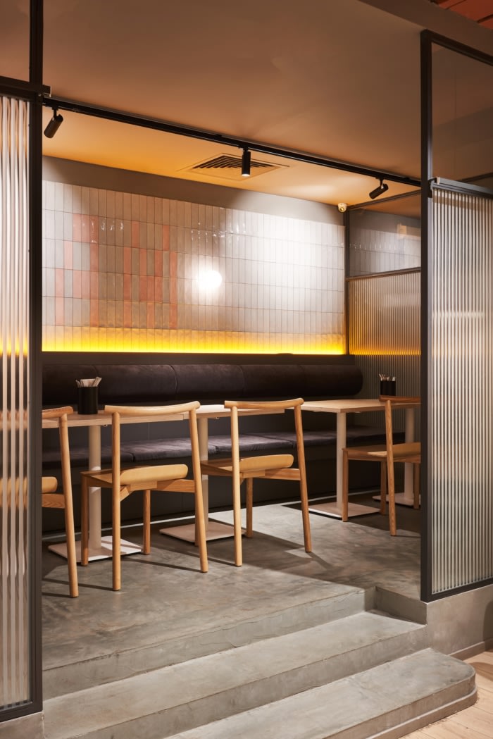
The main zoning method is metal frame partitions with transparent embossed glass inserts. This eye-catching and graphic technique is softened by smooth dairy cotton curtains.
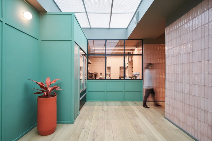
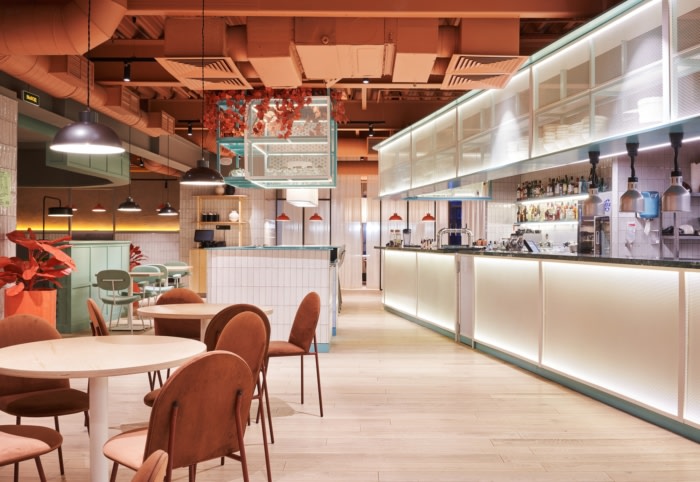
Simple materials were used in the interior decoration: painting, perforated metal and tile. An engineering board on the floor is the fundamental decision of the customer.
The decision to use plywood in countertops and furniture makes the image of the interior concise and complete.
The color palette was developed after the first discussions with the customer: we proposed a rather contrasting and non-trivial solution combining bright peach and orange shades with gray and pale green.
The customer immediately liked the decision to fill the artificial flowers with bright orange, but the ceiling was originally gray. According to the latest sketches, it turned out that the peach ceiling can combine the whole composition, but it was interesting to show the solution to the client at the last moment. The risk was worth it, this decision became the main conceptual method of the restaurant.
An open kitchen with an area of 73 square meters, which should be briefly inscribed in the interior, but without attracting much attention, is tactfully fenced with perforated metal sheet.
An interesting decision on the part of the client was to put a tea station in the center of the hall, which we happily supported by separately laying out the finds of water and wastewater on the floor.
Design: MODGI Group
Photography: Sergey Melnikov



Now editing content for LinkedIn.