Mother Pearl
A Work of Substance utilized the branding for Mother Pearl to give the vegan bubble tea cafe an eco-conscious, welcoming feel.
Created in Taiwan in the 1980s, bubble tea gained popularity in Asia and gradually became a global phenomenon. The Asian bubble tea market is overly saturated by sugary, unhealthy concoctions. With an opportunity to revolutionise the traditional bubble tea landscape in Asia, the challenge was to create an entirely new brand identity and interior design for a vegan bubble tea brand, a pioneering advocate for healthy teahouses in Hong Kong. Unlike other bubble tea shops in the city, Mother Pearl takes a root-to-stem approach to minimise food waste and offers nutritious drinks that are designed to fuel everybody. With a limited budget, we created a simple yet memorable identity and spatial design for the brand’s 350-square-foot flagship store that stayed in line with the simplicity of the consumer experience.
During our research, we recognised that bubble tea drinkers drew an immense amount of delight and happiness from bubble tea. Unlike coffee, there is an element of surprise and an expected reaction based on the interactions with the wide variety of drink choices. For many, drinking bubble tea is an indulging ritual, a momentary escape from the world. We also considered the location of the store, especially its surrounding urban and bustling environment, and posited the space as a portal that allows visitors to reflect and to take a pause in between the hustle and bustle. Driven by asian heritage ingredients, Mother Pearl’s brand identity had to embody the brand’s positioning as thoughtful, eco-conscious and innovative, while conveying the brand’s vision of providing a cleaner, more sustainable beverage option for today’s savviest of consumers.
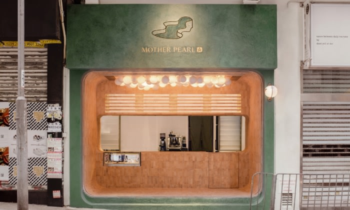
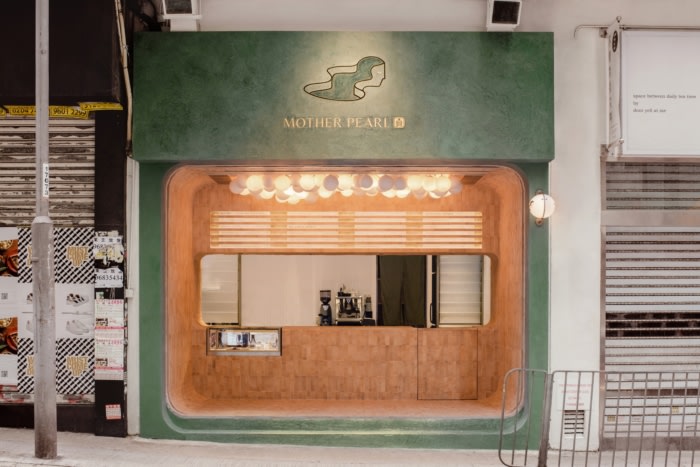
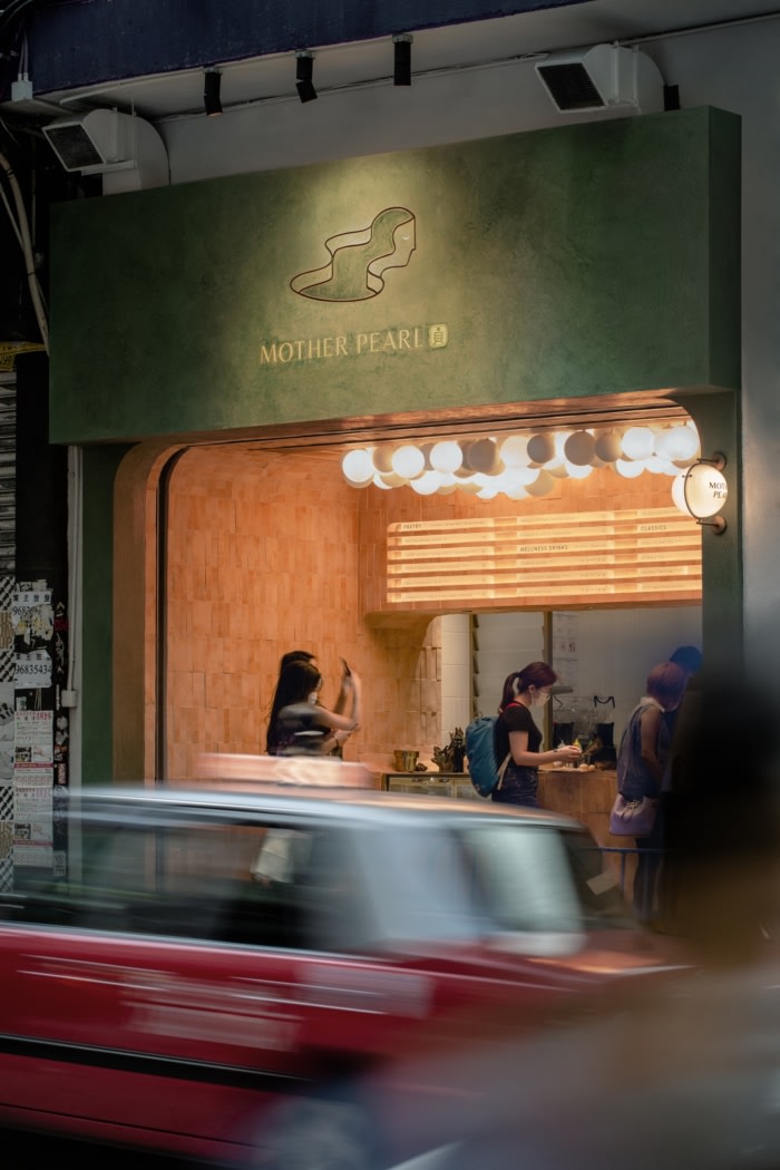
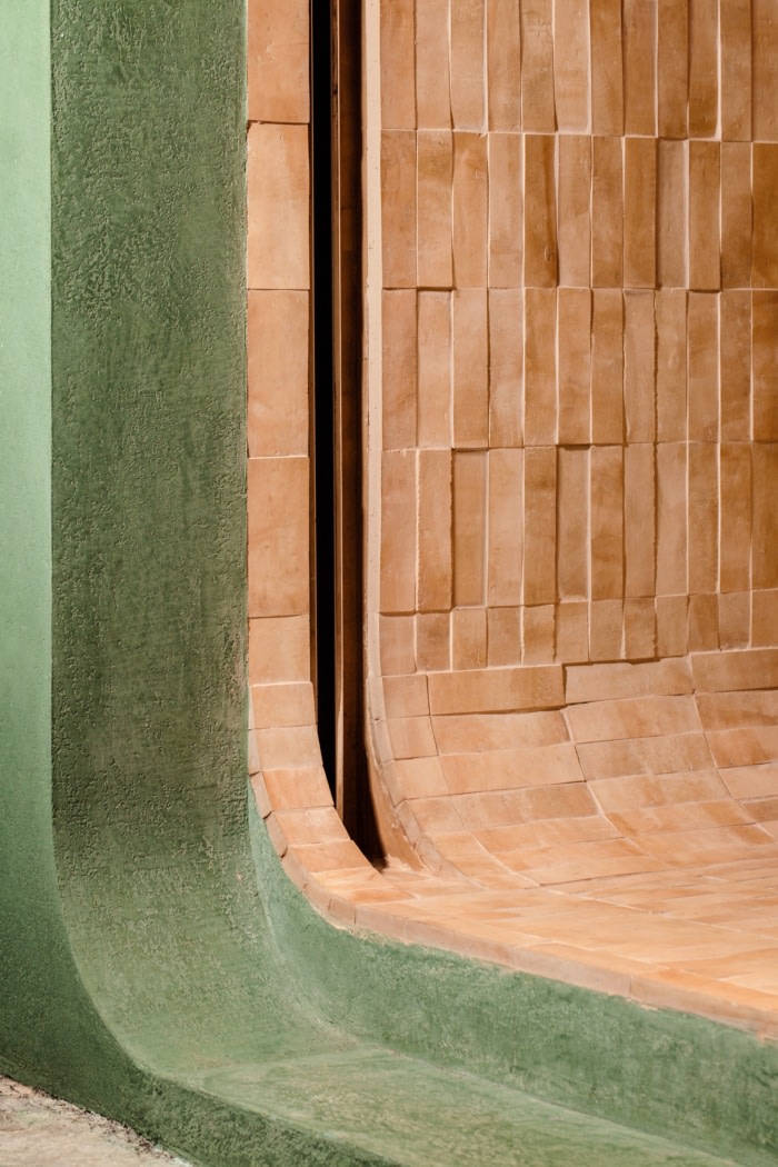
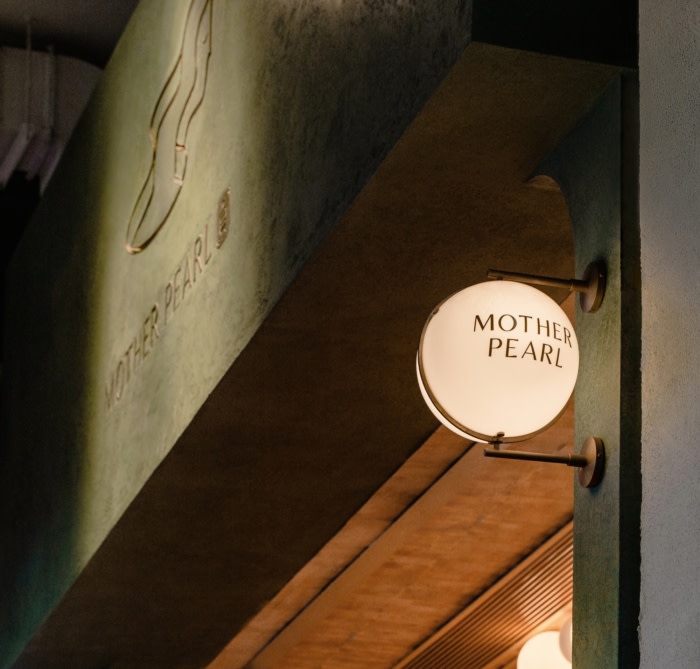
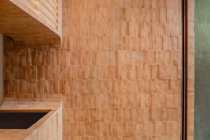
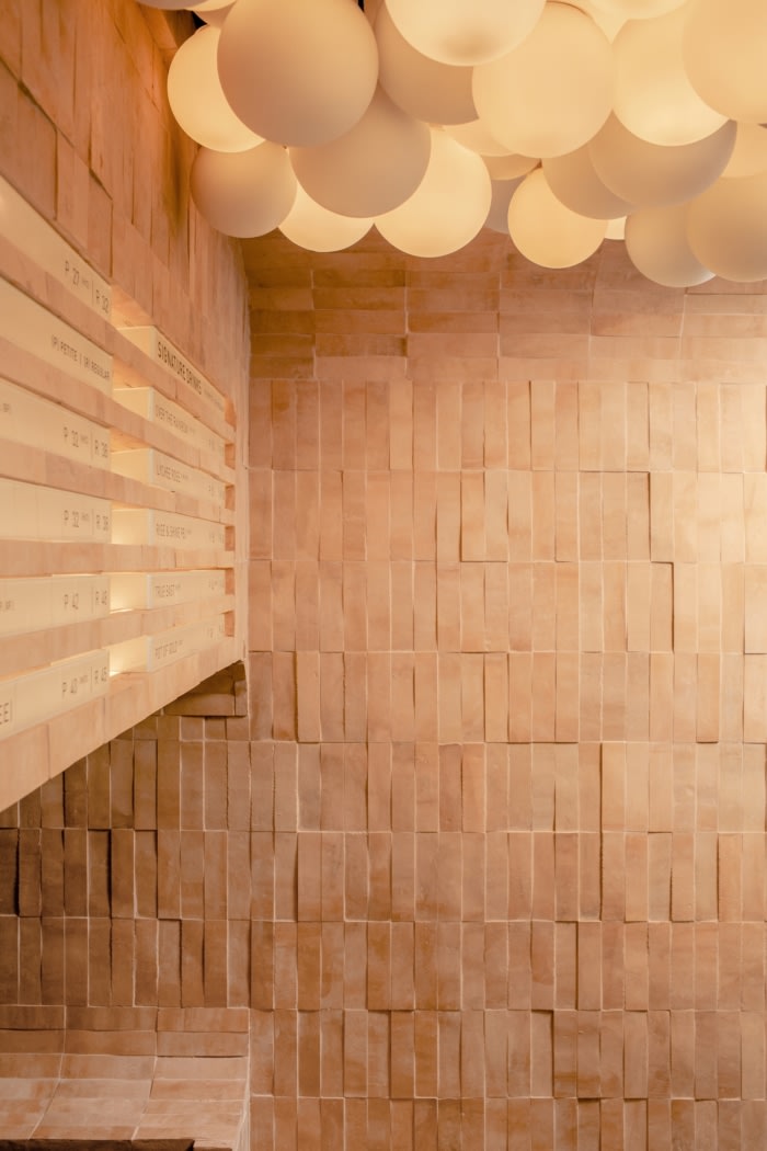
When sipping bubble tea, the spring-loaded pearls of tapioca instantly demands our attention. Confronted by the unapologetic chew of the pearls, we unconsciously transcend into a state of unexpected satisfaction. To highlight the beauty of the craft and processes that make this bubble tea drinking different, our approach was to create a simple and memorable brand identity system that resonates with our client’s ambition to scale globally. Serving as a vessel for the delightful sensations that emerge, the icon’s negative space evolves with seasonal and flavour changes. The humanist sans-serif in the logotype reflects Mother Pearl’s handcrafted teas, mimicking the imperfect nature of human process in the contrast of its strokes and counters. From the cloud of pearl-shaped lights floating above, to the dark olive green facade that opens a portal to a mystical universe, Mother Pearl expresses dimension through its organic materiality, drawing the consumer deeper into the sweetness of the present.
Design: A Work of Substance
Photography: Amanda Kho



Now editing content for LinkedIn.