Sangrita Cantina
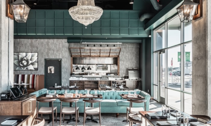
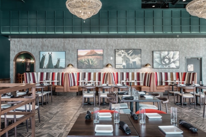
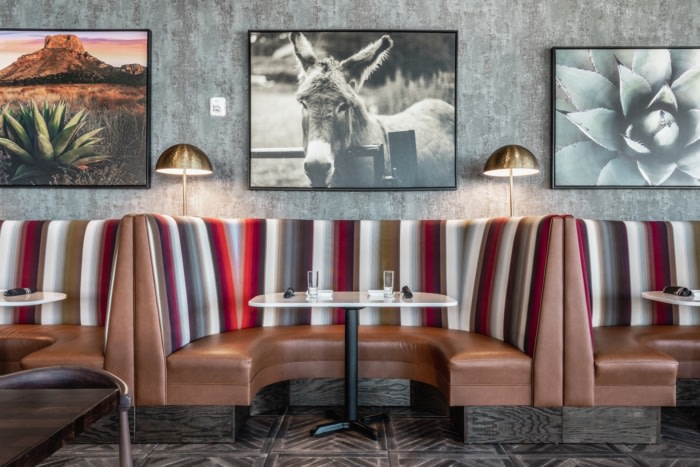
Parallel Design Group started with the material of the booths at Sangrita Cantina, then built around them incorporating bold colors and unique lighting to give the space a fun and welcoming feel.
At approximately 4,000 square feet (including a feature mezzanine for private parties), the intent Sangrita’s luxe space is to be 100% family-centric. With Mexican cuisine as their marked specialty, it was important to have a Spanish/Mod-Mex nod within the design but not be over-powering. Matching the Fishers District vibe and aura meant that this space would need to be set apart with an elegant flair.
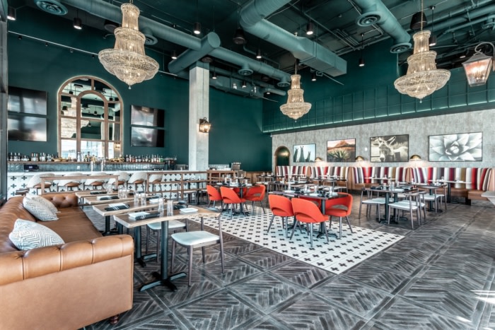
The schematic for the restaurant design all started was with the booth fabric. Senior Interior Designer Kaitlyn Barrett came across a Maharam fabric that she fell in love with. “Blended Stripe, by Paul Smith” was an amazing quality featuring a wide array of colors that reminded her of a Mexican blanket. She intentionally wove this bright striped fabric throughout the entire restaurant. Every color – from the couches, chairs, flooring and lighting somehow ties into this fabric.
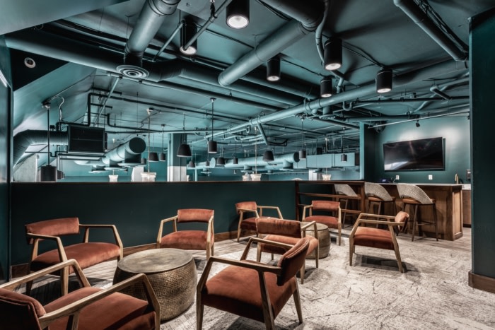
Unique to this project was the addition of the mezzanine, created as an additional private dining option with a capacity of 50. Within this space, we designed another bar; along with televisions for private events. This elevated space provides the guest a simply stunning view – many pops of color amongst the concrete beams and chandeliers dancing over their guests.
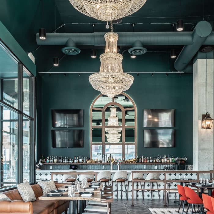
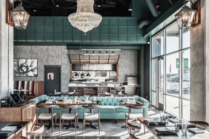
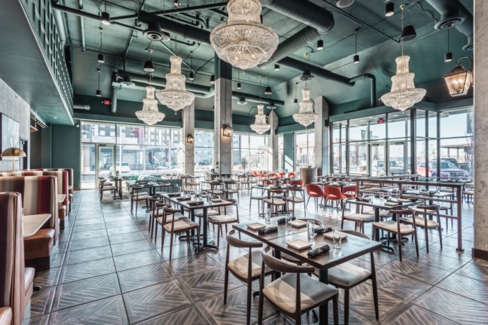
The chandeliers are impressive from every angle and provide elegance, and eclectic feel with a modern finish. The 200 pound fixtures help to bring the eye down within the high ceilings. While a lot is going on at floor level, the chandeliers were used to create a symmetrical balanced element to tie the entire restaurant together. Another unique design feature are the concrete columns, which were pre-existing in the space. Leaving the columns exposed helped bring the juxtaposition of old and new together.
The final challenge that remained constant throughout was making the area cozy and comfortable within the open footprint. With 22 ft. high ceilings, it was tricky to achieve a level of comfort and intimacy similar to their original location with 9 ft ceilings. We believe this mission was accomplished by providing one unison wall and ceiling color, couches in specific areas instead of stacking booths, and mixed materials. Various low seating options – some with cushions and pillows, underlined comfort and high design can co-exist (for the whole family).
Design: Parallel Design Group
Photography: The Addison Group/Kendall McQuay




Now editing content for LinkedIn.