New York Grill
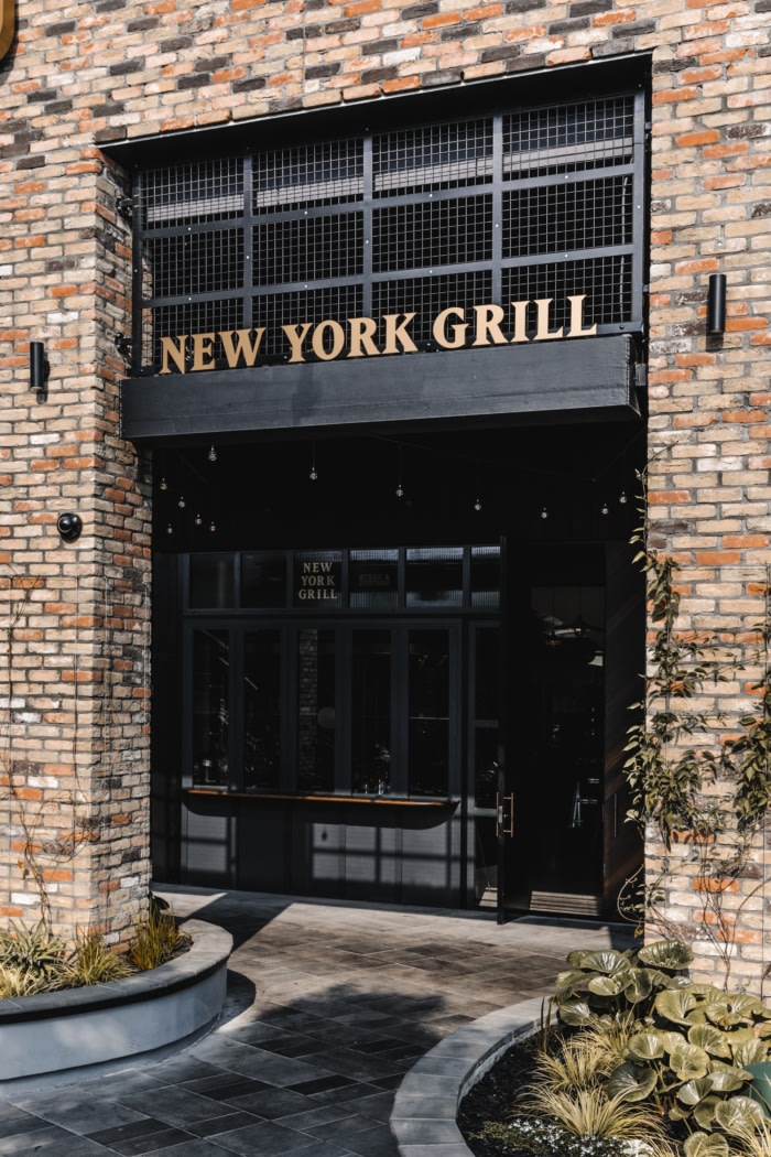
CTRL Space designed Auckland’s New York Grill to be a premium restaurant that echoed the vibe and styling of a typical New York Steakhouse.
They imagined a fine-dining silver service restaurant for high end customers. They visualised old black and white portraits of the streets of New York adorning the walls, dim lights, brick detailing and polished marble which they believed would attract a sophisticated clientele for a 5-star breakfast service, long indulgent lunch, romantic dinner or special occasion.
We aimed to strike the balance of sophistication that the client wanted and approachability to ensure the success of the restaurant. We felt that the restaurant should more comfortably align with the level of retail and surrounding dining options offered in the mall, and so, recommended softening the approach to make the restaurant feel slightly more casual and accessible for a more mainstream customer. Planning was critical to the scheme to ensure the balance was met. Influenced by the client’s ideas of a New York aesthetic and serving premium steak, we came up with a concept inspired by the original butcheries and abattoir shops of New York.
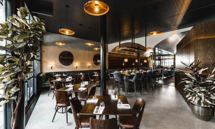
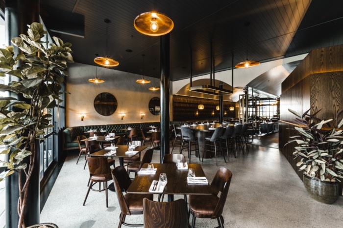
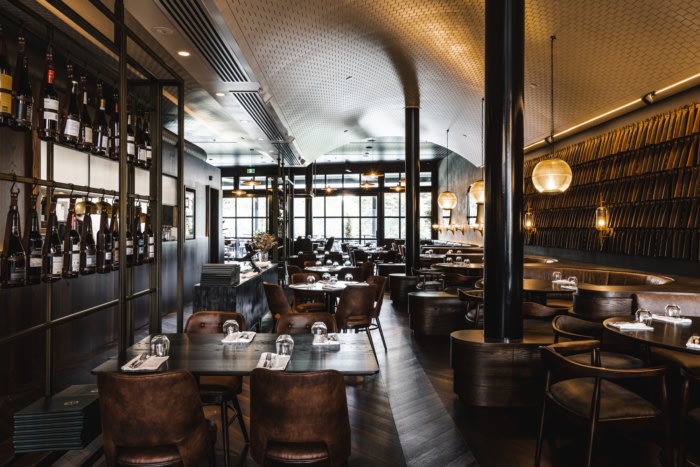
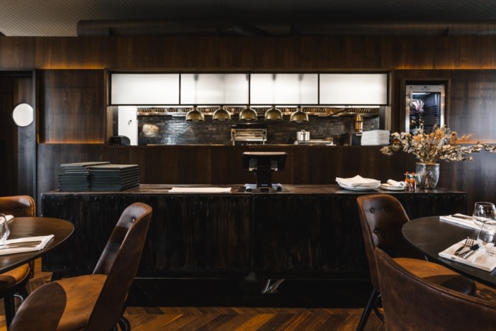
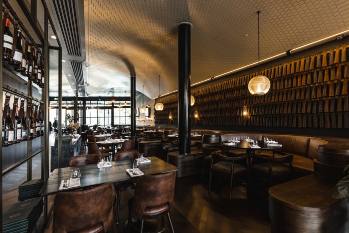
The same classic materials and details seen in a vintage New York butcher environment are seen throughout the design of this restaurant including raw stone, abundant leather, rich timbers and bronze hardware.
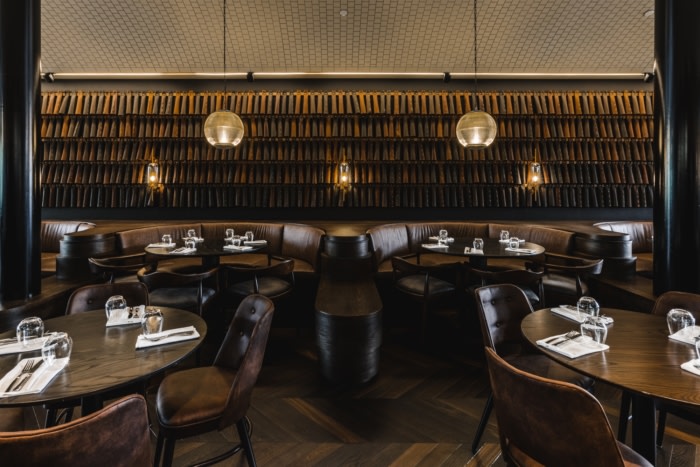
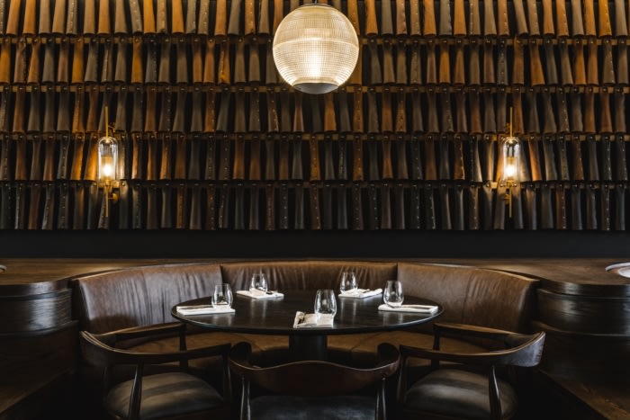
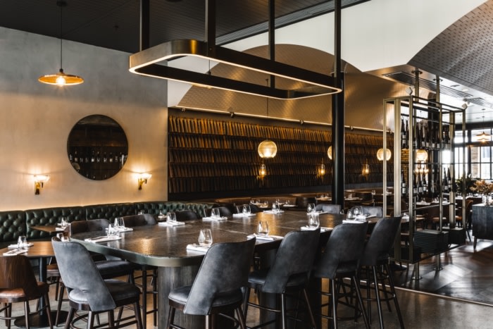
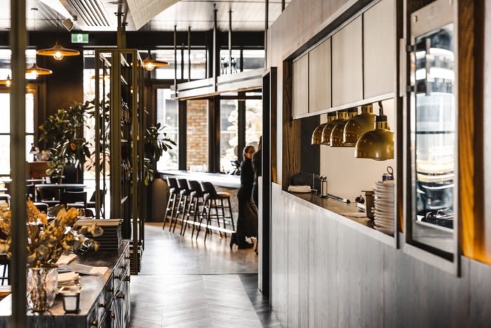
Design features include the suspended rail lighting feature above the bar which references a meatworks stock rail. The suspended wine display references a classic salami drying/display rack, and the leather textured panel lining the dining room wall references the cuffs of the riveted gloves worn by the butchers. The banquette seats are also raised on legs, as all of the furniture was in the butcheries for sanitary purposes and the lights are suggestive of an old lantern style lamp.
Through strategic floor planning, were able to create 3 distinct zones within the restaurant that each offer a different level of experience. The front section was planned as a relaxed and welcoming environment, perfect for casual drinks and nibbles. The rear section celebrated the views to the north and greenery of the landscape intended to draw customers deep into the restaurant. And finally, the central section was to be the show-case – more formal and intimate, here is where the true spirit of the concept was to exist; Tiled, vaulted ceilings, leather clad walls, deep, highly detailed leather booth seating and an array of intricate details, make this area a true dining destination within the restaurant and a reason to return.
Design: CTRL Space
Photography: Sarah Grace




Now editing content for LinkedIn.