Hapa Sushi Grill and Sake Bar
Roth Sheppard Architects infused the concept of dualities into the design aesthetic of Hapa Sushi by balancing old and new, local and foreign, and what is expected with flashes of unanticipated excitement.
Hapa is the concept of blending. A synergy of Asian, Pacific Islander, Hawaiian, and Mainlander cultures resulting in a harmony of distinctly different features. Hapa is more than just an idea, but rather an experience, where contrasting elements reinforce one another and create a playfulness that is imprinted on all patrons of Hapa Sushi.
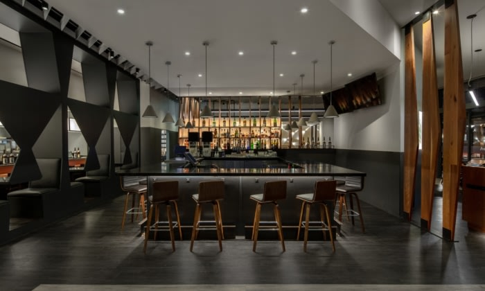
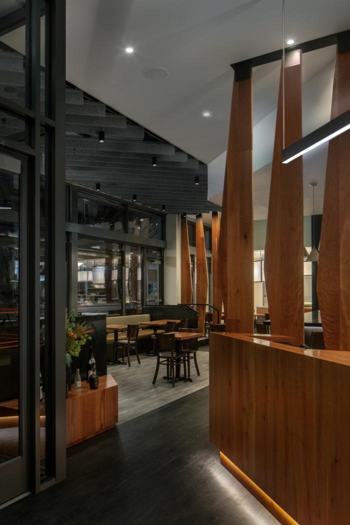
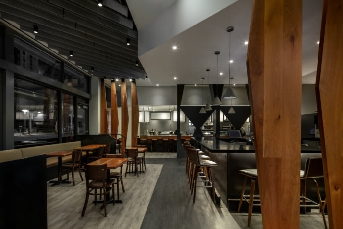
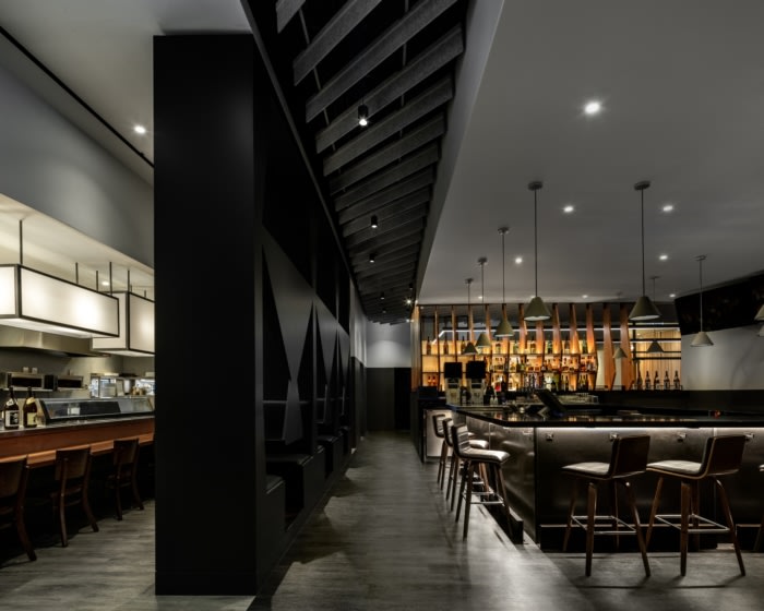
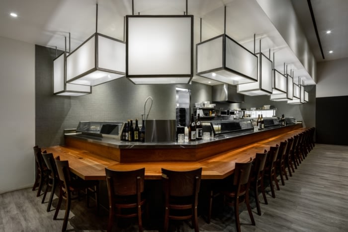
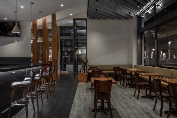
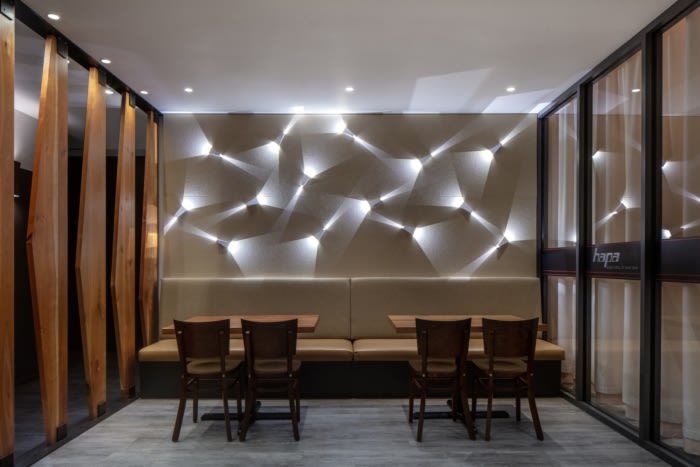
Just like the menu, there is nothing ordinary about the design; there is always something unique and intriguing to explore. By using the timeless material palate that balances warm wood tones with black stone, clean bright whites with pops of orange, Hapa is this balance between opposing forces.
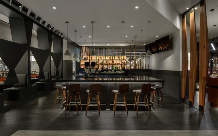
The two opposing forces may be distinct at times, but at other moments, they begin to blend. At Hapa, when two discrete elements are blended, they result in a third that is new and fresh. The blend begins simply, in the use of both orthogonal and angled grids, in plan and elevation. The angle adding interest, and the orthogonal grounding the space. Some elements, like the bar feature, or hostess stand, subtly blend both: the angles engage your eye, and the orthogonal make the space feel solid. A cornerstone of the design of Hapa Sushi is engaging patrons to probe the space for these dualities.
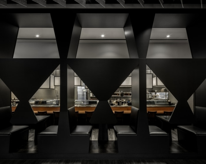
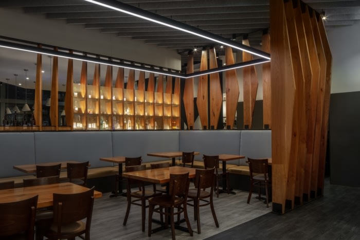
In realizing these dualities, patrons may see elements of the design differently. The screens become not only a barrier to divide spaces but become a feature and an art piece. These screens are not delicate and subtle, they are bold and graphic, evoking both the energy of Anime and the calm of island palm fronds. Patrons may unmistakably realize the unique group of two tops located between the lounge and the sushi bar. These (3) tables are each a small booth, with the angles of the seat backs continuing up overhead. The tabletop is supported on one side by the floor, and on the other from above. The seating area is both a table and a feature, a normal element that is given new meaning in its synergy.
When experiencing Hapa sushi, the identity and the aim are clear. Hapa offers patrons a new experience that is oddly familiar. There is a blend of what is expected and what is unanticipated that activates users to engage with the food. Crafting an identity between food and architecture is yet another duality that results in unforeseen results of expression, playfulness, and care.
Design: Roth Sheppard Architects
Contractor: Williams Construction
Photography: James Florio Photography



Now editing content for LinkedIn.