Living at NoHo Amenity Spaces
Private Label International incorporated playful elements into the design of Living at NoHo Amenity Spaces in North Holywood.
Living at NoHo is a three-building market rate development in the North Hollywood arts district. The scope of renovations included exteriors, public art, leasing office, lobbies and mail rooms, club rooms, co-working spaces, pools and residential units. The location of the project posed some challenges, as well as opportunities, in logistics, targeted demographics and design.
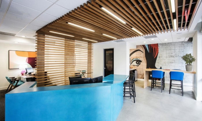
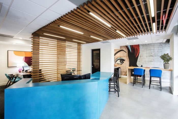
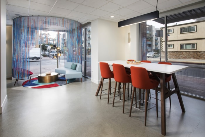
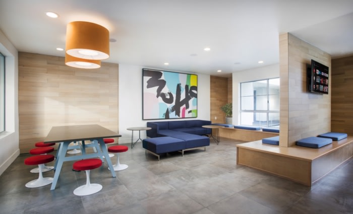
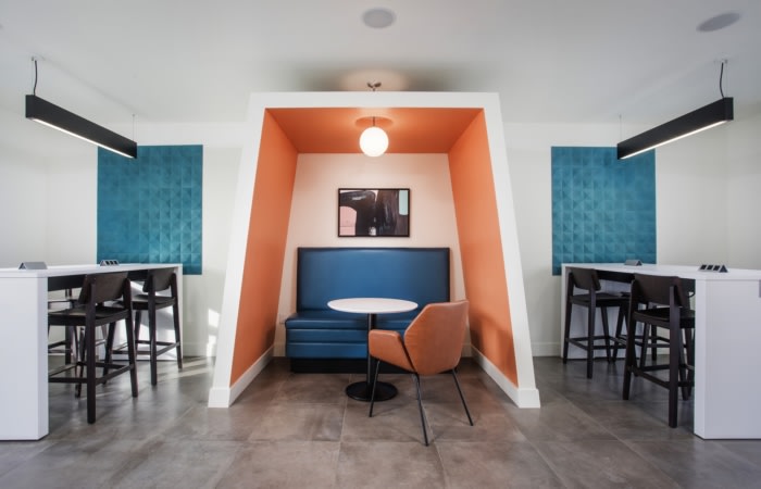
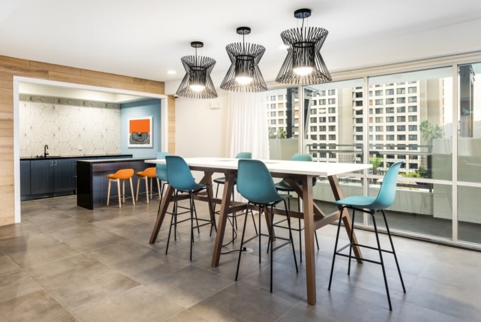
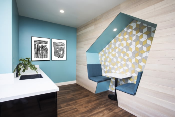
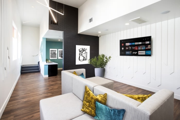
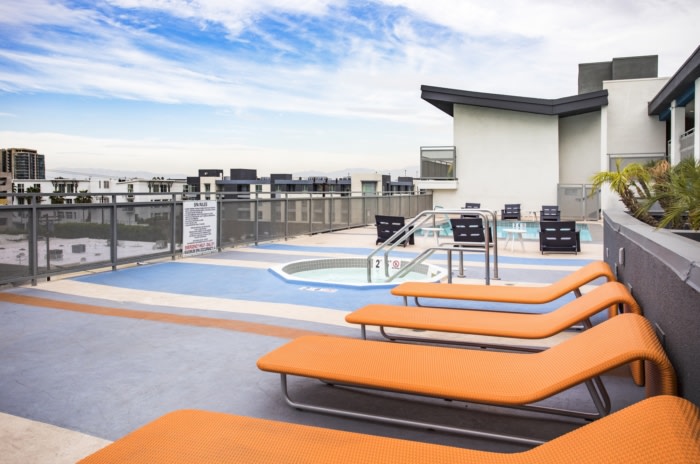
The surrounding community had a mix of existing rental properties that were all going through renovations and new developments, all of which were direct competitors. North Hollywood arts district is a very culturally rich area where the design narrative holds a lot of value to the targeted demographic, and it was imperative that the property felt local and had a defined character. The leasing office, being one of the first impressions to prospective tenants, was given specific attention in regards to brand identity as well as function and offering. Looking into the leasing office from the street, a feature lounge seating area can be seen with a custom chain drip art piece that surrounds it. The entrance to the space features a wood ceiling and screen wall detail and a custom concrete angled reception desk. Playful elements were added using graphic wall coverings and pops of color. Each building has multiple installations of unique fine art, as well as custom created digital art wall coverings throughout the amenities. The pool areas also have graphics integrated into the updated waterproof decking. Crisp, white walls were paired with large scale feature elements, where some areas felt like walking through an art gallery. Public art also was added to the exterior of one of the buildings on the street level by a Los Angeles based mural artist.
Being in an urban area, another challenge posed was of possible theft and additional wear and tear. Most of the spaces, especially the lobbies, had to rely on custom wall covering, tile patterns, built-in elements and large-scale art and unique paint accents to add the character and have much less emphasis on loose fixtures, furniture, equipment and accessories. The spaces needed to be designed and built to be heavily used.
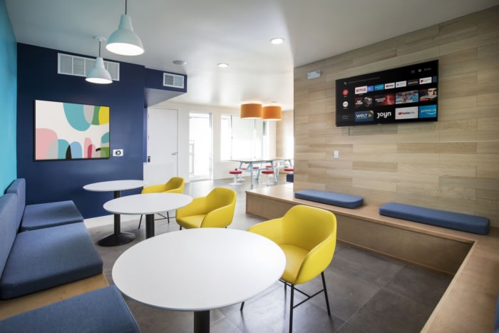
While programming the spaces, co-working was an important element to integrate, but in an unconventional way. The “business professional” in this area is less white collar and more performing artist. The spaces had to support table reads, aspiring writers, digital artists and a much broader range of what “co-working” could mean. The spaces needed to accommodate the different functions but also inspire creative people.
Because the property went through a full repositioning from curb to curb, emphasis was made to not just refresh the building for existing tenants, but to reposition it for an elevated submarket and improve upon offered amenities, security, and health and safety. This allowed for a raise in rents and overall property value increases. The overall response from the residents and the surrounding community regarding the repositioning, especially the art additions, was incredibly positive. This mindset helped enhance the feeling of community that the design aimed to support.
As far as environmental efforts, although not a driving force for this particular project, but always something Private Label aspires to do, as much of the existing features were kept as possible to limit demolition efforts. There were also several materials with high recycle content and all Title 24 compliant energy efficient lighting.
Design: Private Label International
Contractor: Milanco Building Group
Photography: Adrian Tiemens




Now editing content for LinkedIn.