House of Yuen by Sun Tung Lok
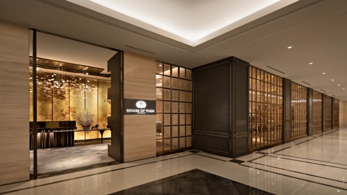
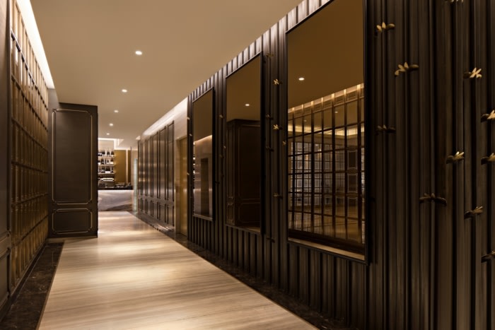
The design of Jakarta’s House of Yuen by Sun Tung Lok by Metaphor Interior was influenced by a mixture of 1920’s British and Chinese styles where elegance is delivered through the subtle mixture of details.
The height of style in China is widely considered to be during the 1920s, a period of British occupancy that gave birth to an amalgam of Oriental and Occidental cultures. During this era, Chinese architecture and fashion took the influence of modern, shapely silhouettes and simpler patterns.
Soaring Twenties
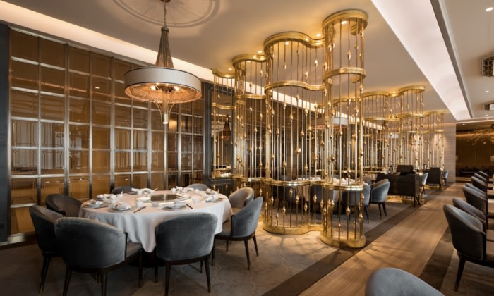
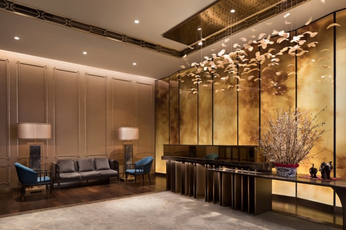
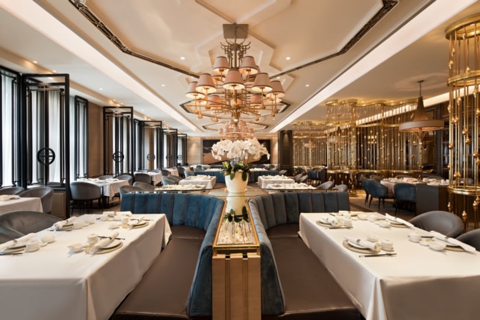
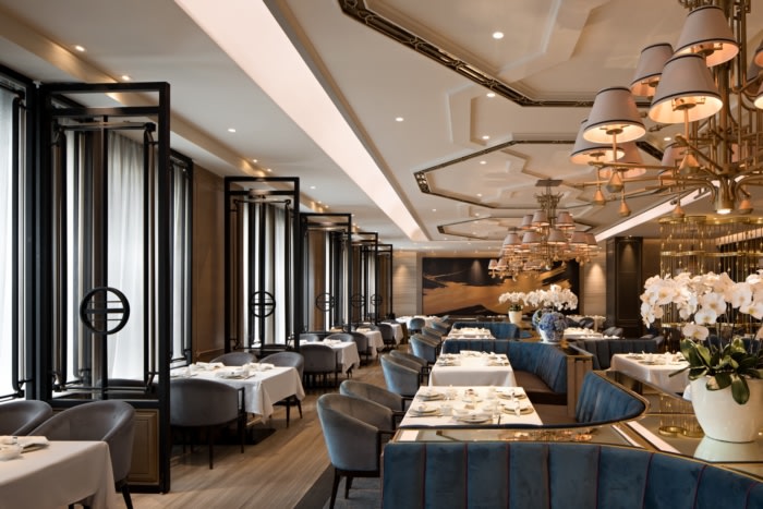
The European influence on 1920s China is conveyed through the geometric details in this design. While window grilles and panelling are used, they are transformed with the more oriental geometries of circles, octagons, and indented corners. The design of chairs, with their curvature and subtle angles, reflect a translation of European modernity with Chinese details. Departing from the usual colour schemes used in Chinese-inspired design, here the furnishing draws from a palette of soft turquoise with gold accents and subtle fuchsia linings.
Birds of a Feather
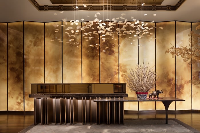
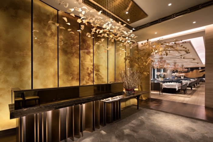
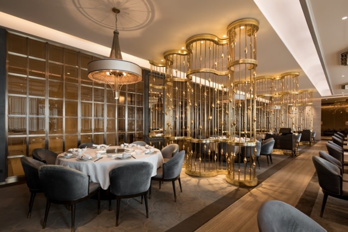
A motif repeated throughout the design of Sun Tung Lok is of birds, which symbolise grace and virtue. The design of prominent elements, such as the partitions and sinuous drapery beneath the lamps, are derived from the shape of birdcages. At the entrance foyer, visitors are greeted with an iconic centrepiece: an illuminated artwork of seashells that are carved to appear like feathers, arranged as if fluttering in flight.
Site Response
The restaurant is situated inside a hotel, with its dining area designed into an L-shaped layout. This configuration relegates the kitchen area conveniently beside the service lift at the corner. The placement of the kitchen also provides a separation between the main and private dining areas, each being provided with different entrances to maintain independence between the zones. The layout allows two sides of the restaurant to gain access towards natural light and views.
Circling the Square
Spatial flexibility is integrated into the design of this restaurant. During festive times such as Chinese New Year, the main dining area sees a transformation from square tables to the customary circular tables. To meet the required extra space and rearrangement, the design of partitions are rotatable and furniture is mobile. In particular, the table legs have been designed to support the addition of rounded table tops that accommodate the larger groups of diners.
Design: Metaphor Interior
Photography: Mario Wibowo



Now editing content for LinkedIn.