3li Community Cafe
Fon Studio maximized the functional space at 3li Community Cafe by utilizing creative seating and a minimal design with warms materials and a comfortable environment.
In big cities, people are always looking for a chill and fun place to have a rest. Those places usually hide at the corners of a noisy business district. The number of entertaining spots in Sanlitun District is growing fast to meet those demands. Bars and lounges are sitting there and waiting to satisfy one oldest desire of human beings in the most classical way——by offering them a glass of delicious liquor. The core appeal of those places would be a bright open bar that could allow people to drink and chatting among a unique designed surrounding with a comfortable atmosphere.
The project locates in the 3.3 Building. The building has been an outstanding landmark in Sanlitun District from the very beginning. Our project, San San De Jiu is sitting at the northeast corner of the building where is recognized as the most valuable spot in this area.
From the establishment of this project, our team has agreed on the same page. That was to minimize the “style” of the design while maximizing the value of the original space. Thus, we set the tone of our work with simplicity, no matter for the visualization or the space organization.
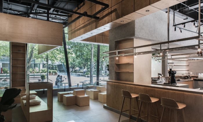
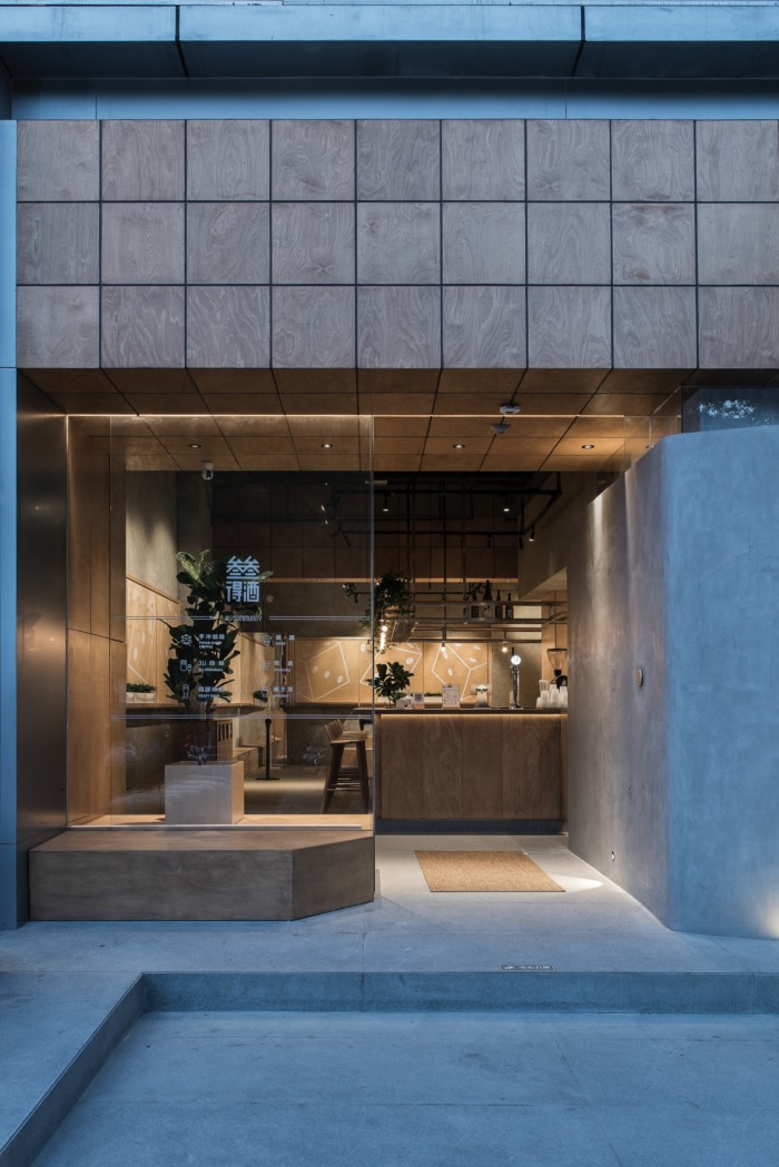
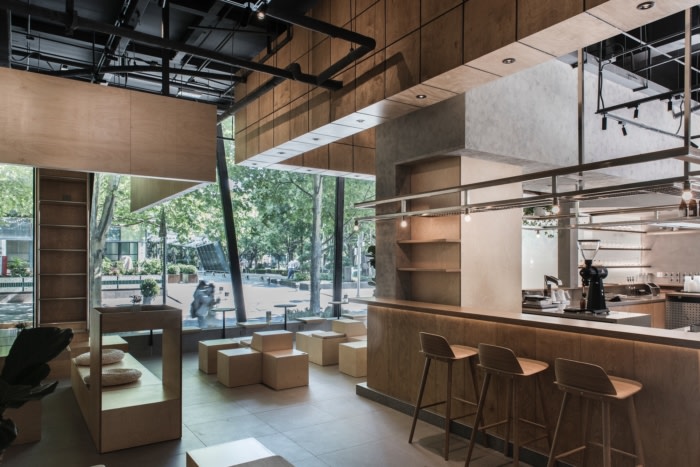
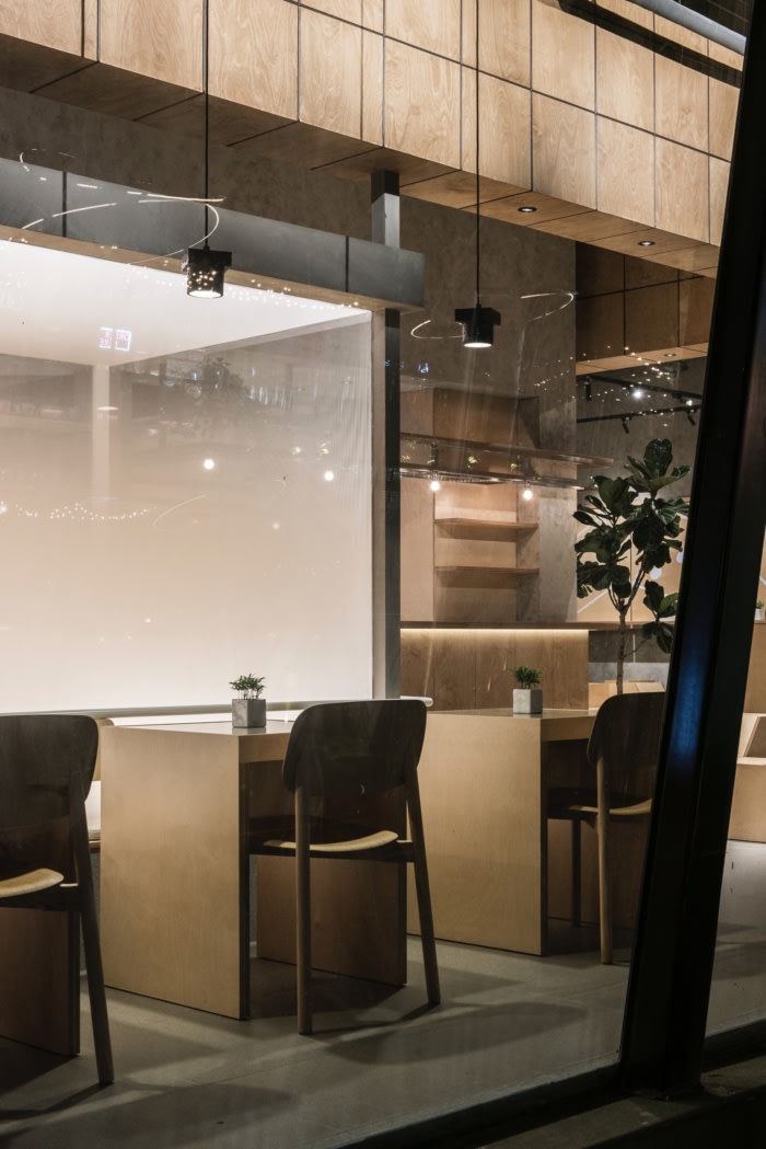
It is very noticeable that the biggest challenge for us was the original position of the fire exits. The escapes interlaced between the sides of the building. Our team utilized them as a highlight of the design. Under the principle of the fire regulations, we turned the passages into a transparent box of the landscape. The exciting selling point of the space is the outdoor area. As the extension of the inside, our team and the project manager both agreed to share that part with the people who just pass by and let it become a public resting area.
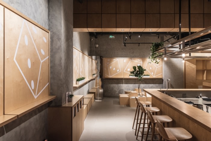
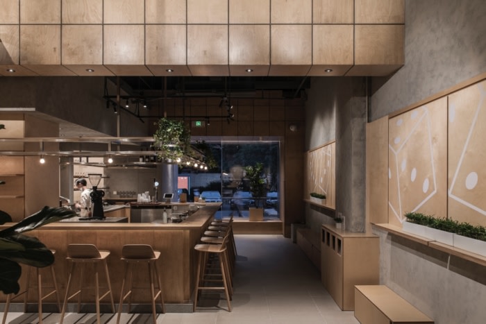
The brand image of San San De Jiu is targeted at leaving the message of emphasis on the simplicity and clearness of their drinks. Therefore, our strategy for the design was allocated with the same tone. Since the facade of the area is mostly transparent, we used the warm-colour wood as the main material to set a clear focus on the sights. The U-shaped ceiling extending from the inside to the outside is composed of grid modules, and the natural texture of the birch wood grain is just right to present the gentle streamlines. The entrance used a two-way inclined design to break the regular façade while introducing people to the indoor area.
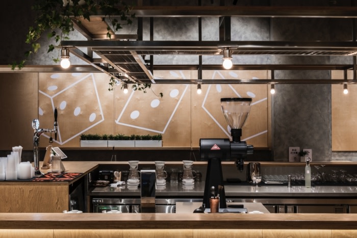
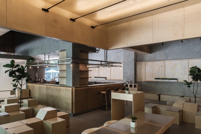
To reduce the complexity of the visual language, the square structure is coherently used indoor. For example, the display partition on the wall, the movable square box, and the wine rack above the bar are all combined in different proportions in the space. The core of the interior layout is naturally the bar operation area. Under the circular structure, the staff can take care of more customers. The seats surround it are designed in different forms to fit in with different scenarios. In an open space, people have more freedom to enjoy their social life.
Walking along with the city, the changing of the seasons, the passing of pedestrians, the tall buildings, and the variety of plants could bring us a thousand different kinds of feelings. The corner of a street may be the place to reveal some new unknowns, new gatherings and separations. Our project transformed the space with a several-month effort. We hope that could bring a relaxing refreshment and appropriate warmth to the people pass-by.
Design: Fon Studio
Design Team: Jin Boan, Li Hongzhen, Luo Shuanghua, Zhang Jingyi, Song Yuanyuan
Photography: courtesy of Fon Studio



Now editing content for LinkedIn.