Shoku-tei Sushi, Shenzhen
NATURE TIMES ART DESIGN completed the Shoku-tei Sushi with traditional elements honoring the cuisine with a minimal feel for welcoming guests.
Shoku-tei Sushi, a Michelin-level Japanese cuisine brand, chose Shenzhen as the site for its first restaurant in Mainland China, and entrusted local design practice NATURE TIMES ART DESIGN to conceive the space.
The brand commits to serving superior, delicate sushi to customers, and inherits the quintessence of the traditional craftsmanship of Edomae sushi. For the project, the design team tried to combine traditional Japanese cuisine with Oriental visual elements via modern design languages, intending to bring diners fabulous poetic experiences.
Layering
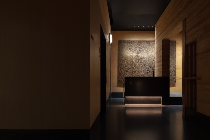
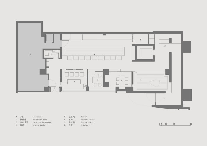
The restaurant sits on the ground floor of a commercial complex in Futian CBD, Shenzhen. It’s like a naturally growing “organism” hidden in a quiet corner. Natural elements such as stones, trees, earth and plants define its entrance, which subtly balances with the surrounding modern skyscrapers and the bustling downtown area.
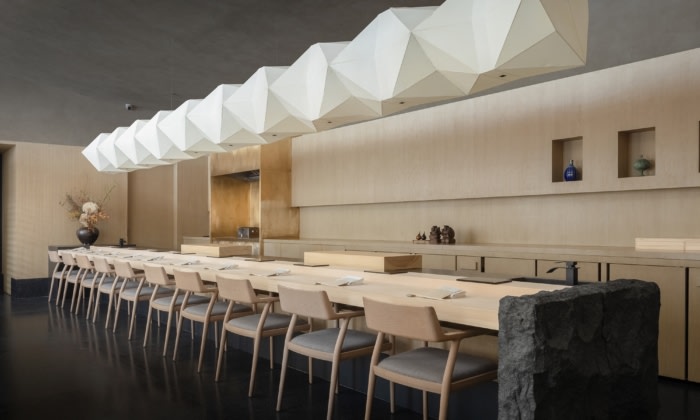
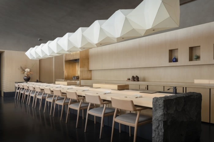
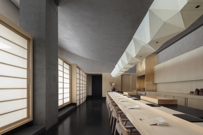
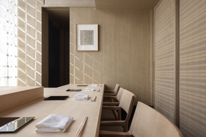
Natural materials are also extended to the 200-square-meter interior space and applied to rectangular structures of varying sizes and functions, to create a natural ambience and aesthetic. The spatial pattern, core walls, partitions, island counter and furniture feature simple square geometric shapes, giving the space a clear visual identity. The rectangular structures form various combinations, which enhance the layering and experience in the space.
Balance
NATURE TIMES ART DESIGN excels at shaping holistic spaces from the dimensions of time, space and nature. Based on the brand’s aesthetic values, the designers shook off the catchy forms and adornments commonly seen in today’s instagrammable spaces, but endowed this dining space with restraining design and a low profile, hoping to make it more sustainable and long-lasting in the ever-updating market.
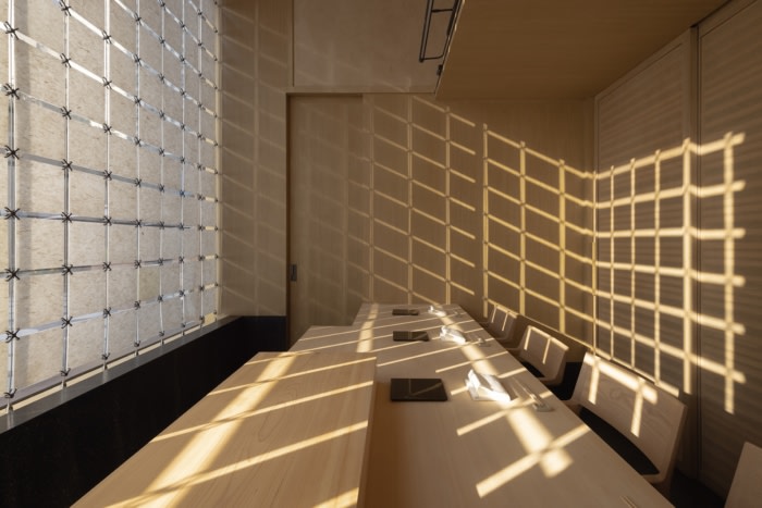
The space features a restraining color palette and textures. Rammed earth, a traditional Chinese building material, was used to clad the interior surfaces of the front area. It creates an indoor courtyard landscape along with the boat-like stone sculpture, and meanwhile helps optimize the ventilation of the space. The main dining area utilizes various inexpensive natural materials such as terrazzo, timber and paper, brings in fabric as partitions and window curtains, and creates large areas of blank surfaces. Based on minimalist design languages, it’s given a friendly scale and light environment as well as a resilient micro climate.
Ambience
Wei Jinjing, founder of NATURE TIMES ART DESIGN, was the chief designer of the project. He tried to express the wonderful taste of Edomae sushi through spatial languages, which are reflected in handmade materials, delicate lighting, orderly layout and warm hues, aiming to evoke diners’ emotions. The design not only created a space for enjoying delicate food, but also a calming, immersive atmosphere for temporarily escaping away from the hustle and bustle of daily life.
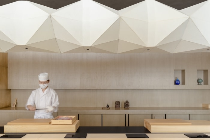
The details in the space subtly convey traditional culture and craftsmanship. For instance, the floor lamps at the front area are highlighted by a lampshade made of rice paper with varying grain, the utensils selected crystallize the refined skills of Japanese craftsmen, and the geometric three-dimensional lanterns in the dining area utilize hand-made silk membranes. All of those traditional elements contrast yet dialogue with the young city Shenzhen and its modern manufacturing industry.
Conclusion
Restaurant often bears the mission of offering a relaxing, sensitive, immersive and intimate environment to let people temporarily get away from the daily routine. This attribute determines that its spatial design shouldn’t be merely restricted to create distinctive experiential consumption scenes for brands, but also needs to convey positive aesthetics and humanistic care to the public and return to the essence of life, especially in the post-pandemic era.
Design: NATURE TIMES ART DESIGN
Photography: Shao Feng



Now editing content for LinkedIn.