OSSU Eatery
DA bureau mixed together warm colors and distinct materials to create a layered look for the OSSU Eatery creating a comfortable atmosphere.
Against the background of the interiors where the tendency to conform to one style or another is too obvious, we decided to open an Asian noodle shop without a single detail that would be actually Asian.
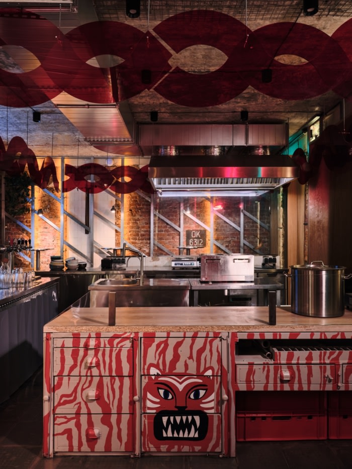
The central object of our interior is the open kitchen, around which the seats for guests are placed.
The premises have two entrances along the façade of the building –and we decided to use both, placing the kitchen in the middle between them.
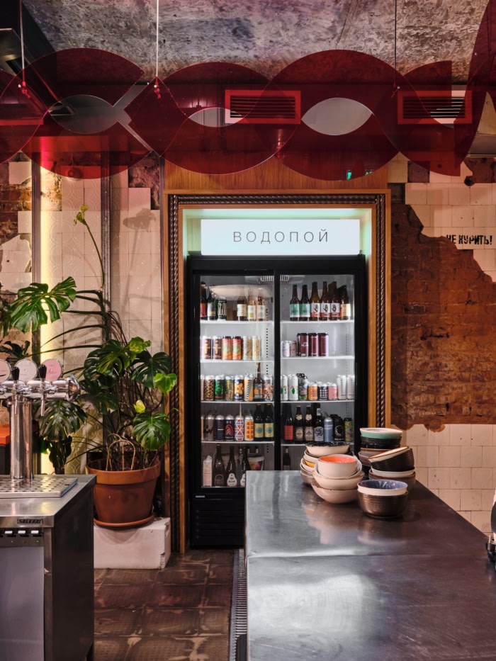
Thus, entering the premises, one gets right in the middle of the action – here, noodles are made on the open counter; a little farther, wok dishes are fried; in the center, drinks are poured. In this way, we pay tribute to Asian street eateries, where all the processes are always open and on display.
The concept turned out to be kind of inverse – the first room is the noisiest and the most dynamic one, and privacy increases as you go deeper into the next rooms, and then it peaks in a small VIP-room, which is located next to the bathroom.
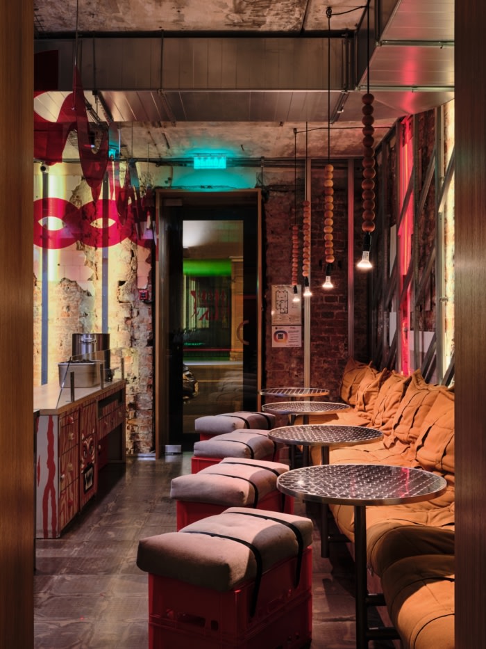
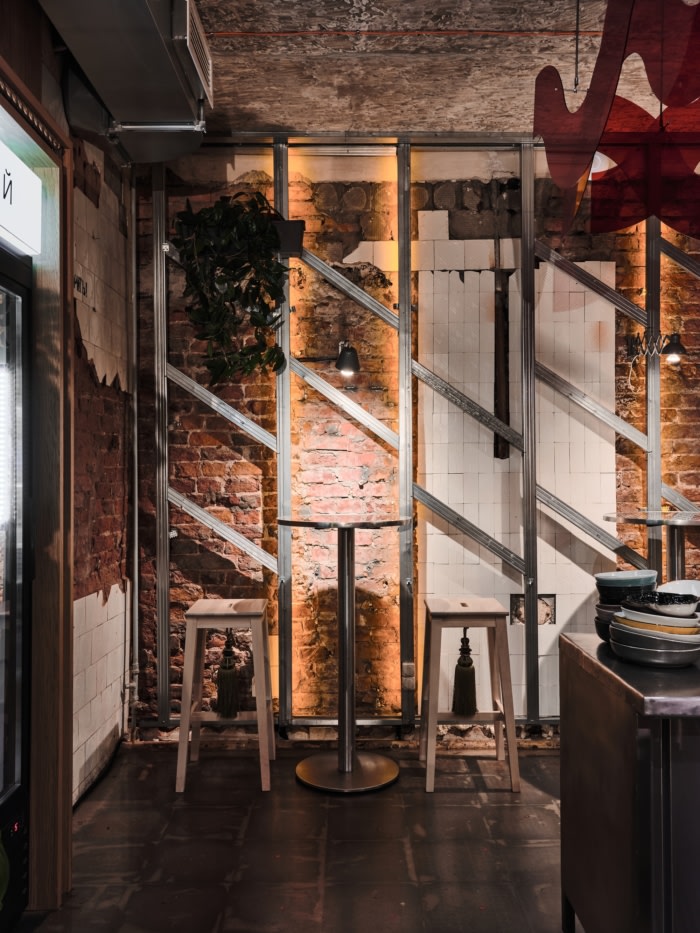
The design builds on secondary associations with authentic Asian catering establishments, where intrusive decoration and excessive pretentiousness are usually avoided. This is how the decision was made to leave the room virtually untouched after the disassembly phase. Under the layer of drywall, we have exposed the brick walls with the remnants of the old embossed tiles; and, after removing the floor covering, we have found a beautiful texture which we decided to preserve with a translucent epoxy resin. We poured epoxy resin over tiny heart-shaped red glitter as a reference to the small pieces of litter often found on the floor in Asian street cafés.
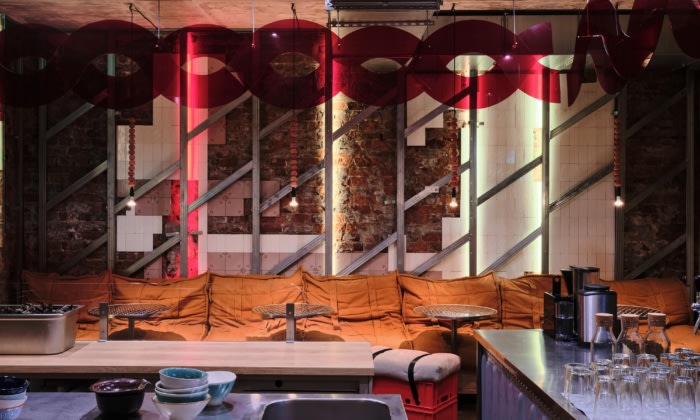
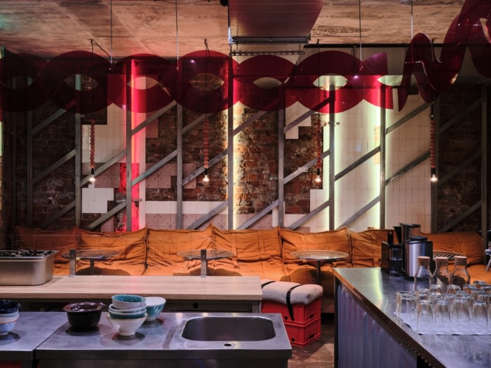
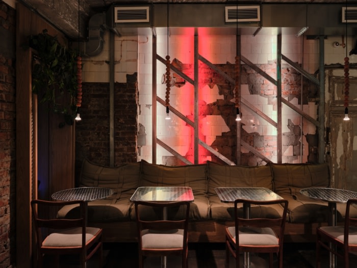
Metal rails from drywall were left around the perimeter of the premises. The aim to show the true history of the premises led to the idea of turning these simple construction elements into a three-dimensional pattern to complement the brick walls.
One of the few overtly designer elements were the wooden portals in the doorways. Such novel introductions further highlight the surroundings and preserved details.
We have allowed some elements that form an allusion to Asian markets to infiltrate the interior. The seating places are sofas made from ordinary folded cotton mattresses; vegetable storage boxes are used as chairs. The light fixtures were left in the “dismantling style”-without casings.
Despite the rather cold materials in the finish, the interior is filled with warm colors and light.
Design: DA bureau
Design Team: Anna Lvovskaia, Boris Lvovskiy, Fedor Goreglyad, Maria Romanova, Julia Gritsuk
Photography: Dmitrii Tsyrenshchikov




Now editing content for LinkedIn.