MORE FUN Bar
PIG DESIGN completed MORE FUN Bar to mimic the process of rotating and recovering a puzzle cube where its various sides are presented as you go on.
Based in Hangzhou, MORE FUN is a bar conceived by PIG DESIGN led by Li Wenqiang. Drawing inspiration from the “Rubik’s cube”, the design team reshaped the facade and spatial form and created a series of innovative scenes, to respond to the cultural context and the pattern of streets and alleys in Hangzhou and to create a destination secluded in the old neighborhood.
Mysterious facades
Located in Jiefang Road adjacent to West Lake, the project occupies parts of the first and second floors of an old residential building at the street corner. The memory of the neighborhood and the fabrics of streets and alleys in its surroundings provide infinite possibilities for breeding future new lifestyles. Inspired by the staggered blocks of the existing building, the designers decided to take “Rubik’s cube” as the design concept. Cubic blocks at staggering heights interpenetrate each other, and window openings are subtly carved out on the exteriors. The square and round shapes form an irregular, intriguing polyhedron.
The curtain wall system is formed by thin, prefabricated modular cement panels, rather than cast-in-situ concrete, which realized rapid and low-cost construction within a month. The lightweight modular components also effectively solved the load bearing problems of the old building, and obtained an exterior texture similar to fair-faced concrete. As time goes, the grain on the facades is enriched, and reveals a rough aesthetic complemented by light and shadows.
Infinite possibilities
The project is positioned as a fashionable leisure and socializing space serving creative cocktails. Just like the diverse combinations of a Rubik’s cube, cocktail making requires subtle coordination among ingredients and the strength and speed of shaking, to present rich sensory experiences through the change of layers and colors.
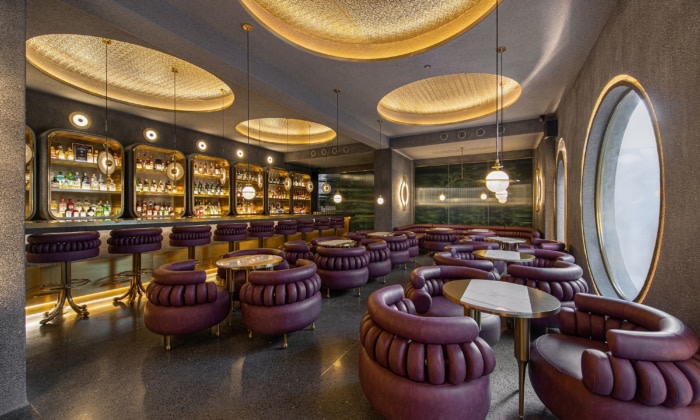
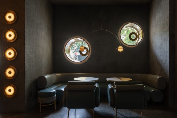
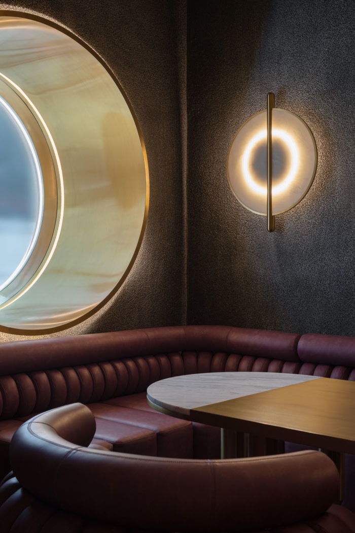
The interior space of the bar features staggered blocks, which echo the external facades’ structures and proportions. Window openings are carved out on the walls based on the arrangement of seating and the needs of introducing light and creating frame views. Set at different heights, those windows create fun visual interaction from different angles.
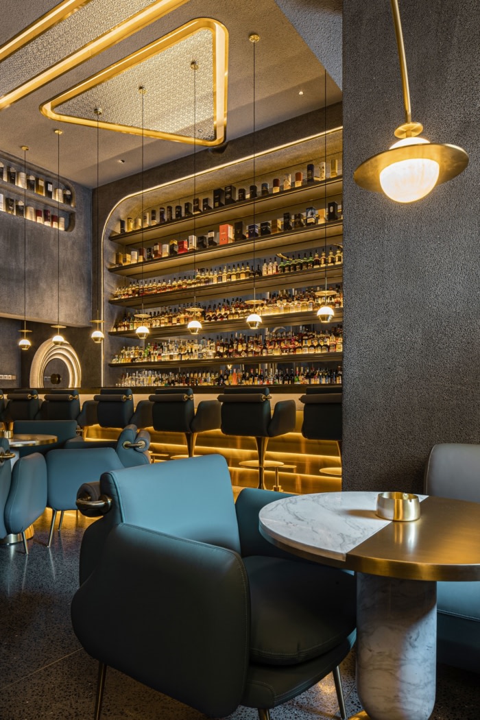
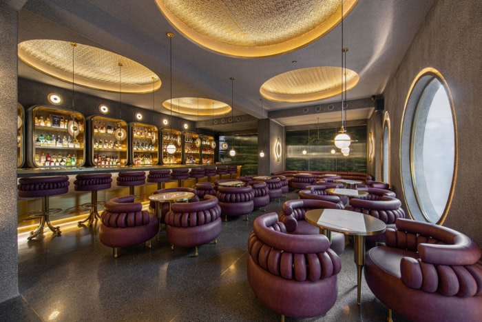
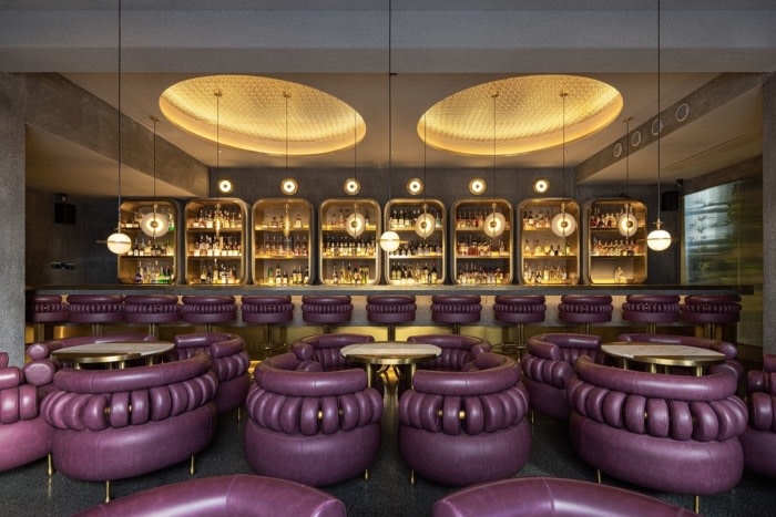
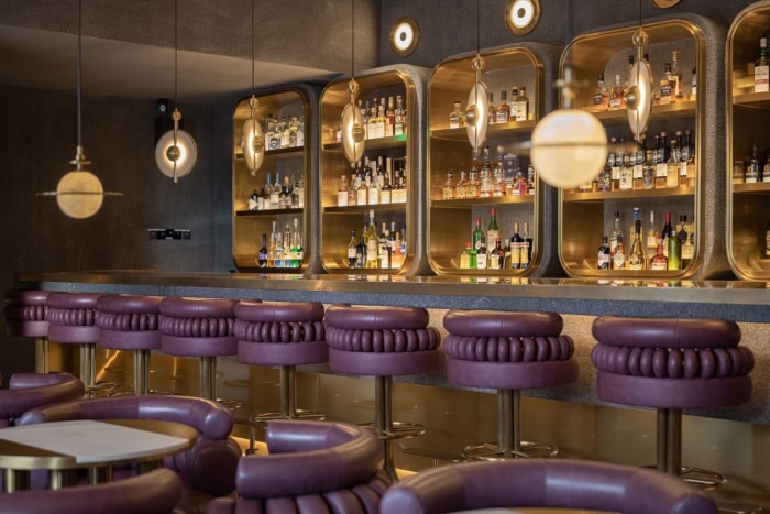
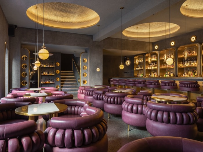
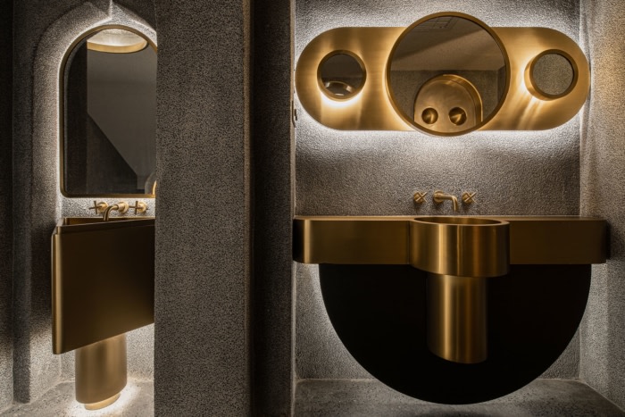
The two-floor interior space continues the modular concept of the architectural facades. Taking point, line and plane as basic elements, the designers created various functional geometric forms and decorative surfaces. The space is highlighted by the textural contrast of different materials like brass, washed stones and terrazzo.
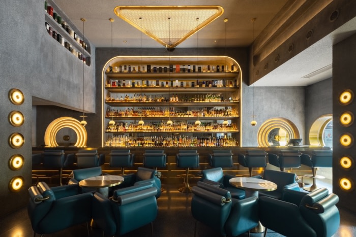
With an area of 80 sqm, the first floor presents a neutral tone coordinated by blue, green and gray, and provides an inclusive, leisurely atmosphere suitable for general customers. The linear bar counter, the dotted seats, the unique lighting fixtures at different heights as well as the light strips create diversified sensory experiences, and stimulate customers’ desire to explore the space.
Simplified solutions
It took a year to complete the project. At the preliminary stage of the project, the design team dug into the trends of bar sector from the perspective of the brand More Fun. The spatial layout reserves sufficient possibilities for commercial operation, and meanwhile helps release maximum potential to fulfill diversified consumption demands.
The logic of Rubik’s cube is a process of changing disorder into order, which is based on its underlying principles to show visible formal variations.
More Fun is a dynamic space that fuses diversified elements, clarity and vagueness, hardness and warmth. It records daily life, absorbs urban spirit reflected by socializing culture, and writes a chapter about the future unknown world with different people coming here.
Design: PIG DESIGN
Design Team: Li Wenqiang, Zhu Yiyun, Yang Zhiwei
Contractor: Hangzhou Mingcong Decoration Engineering
Photography: SFAP




Now editing content for LinkedIn.