Oh So Yum!
Phoenix Wharf have designed a new hospitality outlet for Harpreet Kaur, winner of this year’s BBC television series ‘The Apprentice’, with the new project funded by investment from the show’s host, business magnate Lord Sugar, now also a partner in the business. The new 144 sq m, 55-cover, sit-down ‘Oh So Yum!’ dessert parlour, located on Bradford’s White Abbey Road, will become the flagship for a brand that Harpreet and her business co-founder, elder sister Gurvinder, hope will become a national concern, set to ‘take over the dessert world’.
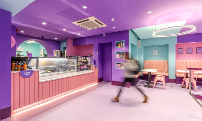
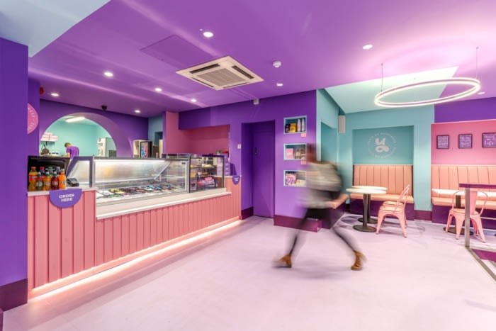
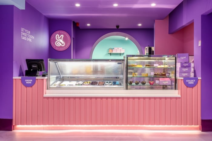
Two existing dessert parlous owned by the sisters in Leeds and Huddersfield, their home town, have now been re-branded as ‘Oh So Yum!’ outlets – having been formerly branded as Barni’s – with the Bradford site the brand’s new showpiece outlet, offering a full sit-down and sweet-treat takeaway offer, displaying the concept’s new branding (created by Halo using the name devised by Harpreet), as well as unveiling a candy-coloured fantasia for the interior, in an immersive, ‘wow factor’ space, inspired by Harpreet’s desire for a clean-lined, Willy Wonka-style interior experience.
Phoenix Wharf was initially introduced to the client by F&B specialists Seed Consulting, joining an existing creative team on this quick-turnaround project, including build partners Equinox. Phoenix Wharf then created the scheme’s interior design, developing the look and feel using Halo’s brand guidelines – and also did some graphics work on the scheme, including the menu design.
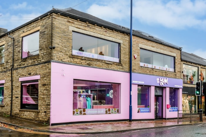
The site on Bradford’s White Abbey Road was formerly a retail premises. To create a totally immersive customer experience for the new store, permission was requested to paint the external fascia, which was duly granted, so that the brickwork shopfront surround is now painted candy pink, with branding in pink and white lettering (including the store name and ‘dessert parlour’, to clarify the new concept for new customers) on purple signage located over the entrance and two immediately-adjacent windows. Additional advertising banners feature on the building’s upper floor for maximum visibility. The main entrance, slightly to the right of the storefront, has one window to each side plus a longer window to the left, all featuring lightboxes for product photography and brand messaging displays.
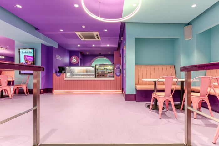
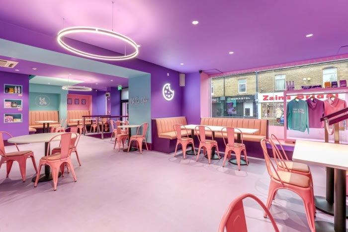
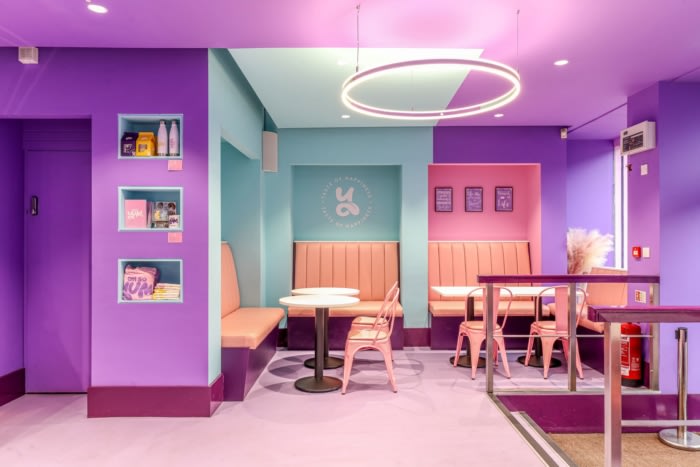
The 360° fantasia feel continues inside the store, with the candy colourway used for not only furniture and joinery, but for all surfaces. The space features flooring tiles from Marmoleum (the Forbo Eternal in lavender and coral, together with Polyflor Polysafe Ultima in iron ore), whilst the ceiling is painted in a deeper shade of purple. The all-pink furniture is a mix of bespoke-designed banquettes, upholstered in faux leather, and loose chairs – the New Edition Stylix Chair – in a pink matte metal with white tips to the legs. Tables were manufactured by Equinox, using tops by Egger. The third colour in the main palette – a warm peppermint green, is used sparingly for sections of the wall – with pink also used again here, creating constant visual interest and allowing for easy segregation into different seating areas and activity zones.
Design: Phoenix Wharf
Contractor: Equinox
Photography: Gary Britton

