Zhima Health Store Chengdu
WUUX Architecture Design Studio designed the interior and facade renovation of the first Zhima Health store in Chengdu, using traditional Chinese elements to reinforce the brand’s royal identity and localization.
In August last year, Zhima Health, a brand owned by the renowned TCM firm Tongrentang, put its first store in Southwest China in place, which lies in the intersection of Chunxi Road and Zongfu Road in Chengdu, the capital city of Sichuan Province. Its interior design and facade renovation projects were completed by WUUX Architecture Design Studio. Tracing back to the development of Chengdu and the brand Tongrentang originated from Beijing, it is noted that they resonate with each other to some extent even though they have seemingly irrelevant histories.
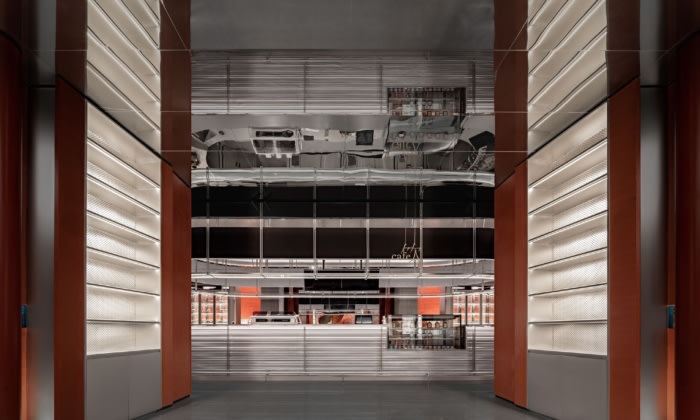
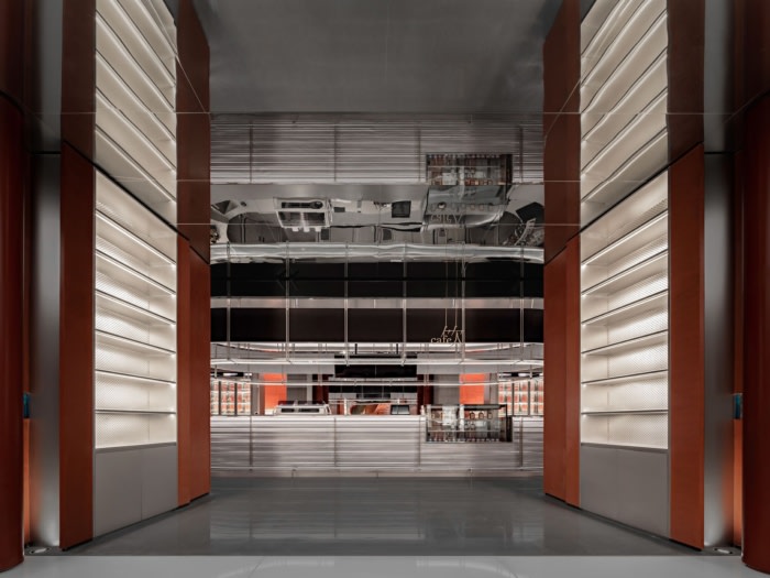
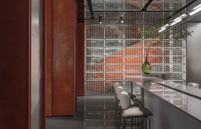
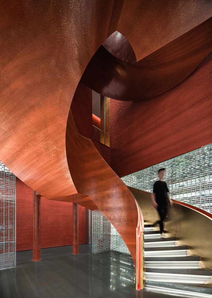
The logic of space design follows the order of etiquette in the East. A promenade is arranged in a symmetrical layout with a well-organized central axis, stepping toward the future east at the starting point of North Chunxi Road. 12 red lacquer colonnades and the jade green path modeled on the road particularly built for ancient emperors in China form a scenario which resembles a stage play.
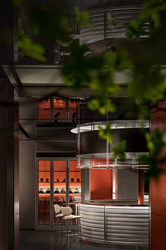
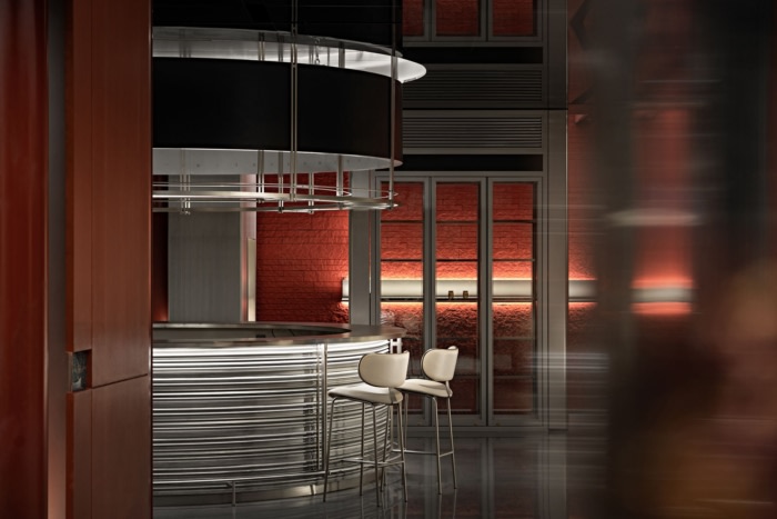
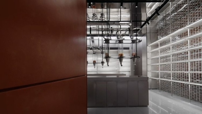
In the flagship store in Chengdu, WUUX Architecture Design Studio reinforced the royal identity of Zhima Health by applying traditional Chinese elements – red walls, glazed tiles, Dougong (a system of brackets inserted between the top of a column and a crossbeam), bricks, colonnades, and old medicine cabinets piled up and layered – which yielded unusual results within the space frame built by metal, glass and other modern materials. This was the first time that the designer had demonstrated the royal identity of Zhima Health to the public so unreservedly, which helped the brand achieve its localization in Chengdu. Meanwhile, the brand image was also rooted in the city by relying on the magnificent royal culture.
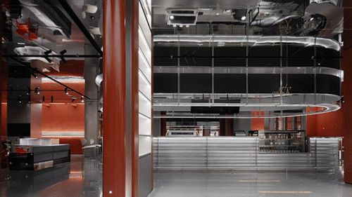
The space is divided into three functional areas, providing herbal coffee and drinks, healthy light meals and health care products. The display of the three areas is different due to their attributes and products provided.
Large amounts of stretch ceiling are applied to the space to create lighting overhead, allowing light and shade to float in the air. The light pouring down gives viewers an airy sense, which makes the space become a natural place that leads to an inner journey. Some parts of the ceiling create a mirror image of the space arrangement, stirring viewers’ mind by providing an immersive experience while they walk, giving birth to fantasies.
Different lighting modes with various colors adapt to the dynamic local lifestyle. Being a retail store selling health care products in the day and a bar with a tag of health preservation at night, the conversion of scenarios of different functions is efficient and convenient. The application of multimedia further enriches the presentation of the space and the brand, with LED screens and other new media installations infusing a romantic feeling and possibilities brought by high technology into the space.
Spanning a hundred years, from being a time-honored brand to setting up new retail scenarios, Tongrentang not only has been dedicated to cultivating both noble morality and benevolence and to doing good to society in TCM means, but also has pioneered new markets with trial and error, which is what makes the brand remain a high status.
Design: WUUX Architecture Design Studio
Design Team: Wang Yong, Teng Shujun, Yu Yue, Jiang Fugang, Liu Yutian, Jia Zhiyong, Zhu Chenxu, Tan Wei, Zhang Guiying, Song Wenshu, Liang Fan, Wen Huijie, Shen Xiaoxue
Photography: Zheng Yan



Now editing content for LinkedIn.