Good Hotel Guatemala City
Ninetynine incorporated muted finishes, warm materials, and graphic pops of color when designing social business, The Good Hotel, in Guatemala City.
Good Hotel is a social business that champions people by reinvesting profits to help them realise their potential. Whether it’s sending children to school who would otherwise not get an education, or giving adults the opportunity to retrain to work in hospitality. Their motto “Sleep good. Do good” translates to a variety of charitable projects in a simple way: the more people stay at Good Hotel, the more is devolved to support different causes. Just like the neighbouring location in Antigua, the upcoming Good Hotel in Guatemala City will support Niños de Guatemala, a foundation that was co-founded in 2007 by Marten Dresen, the founder of the Good Hotel. Niños de Guatemala provides underprivileged local children with an education. At this time, there are two primary schools and a secondary school, which accommodate over 600 children who would otherwise not have received schooling.
Ground Floor Lobby
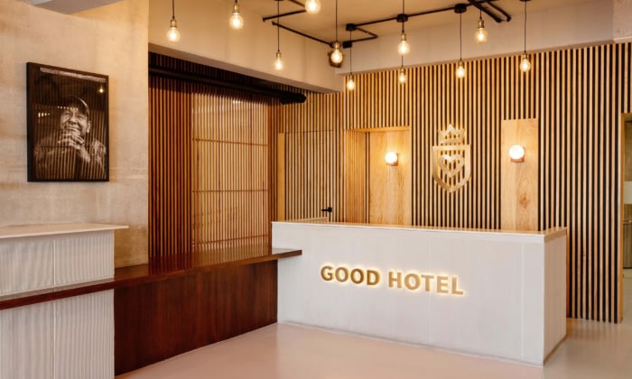
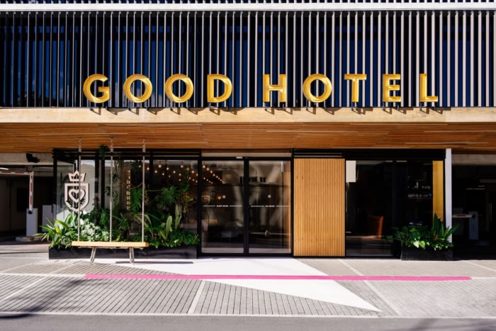
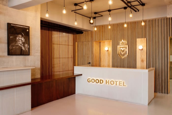
The Good Hotel is part of a mixed-use development that also houses residential and co-working functions, an artisan food market, and one of the city’s top nightclubs.
The lobby on the ground floor is the perfect transition zone for guests to leave the busy street life behind and start the Good Hotel experience. Good Hotel’s swing invites guests to (literally) swing by.Do good. Public Spaces
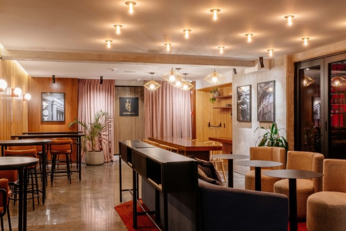
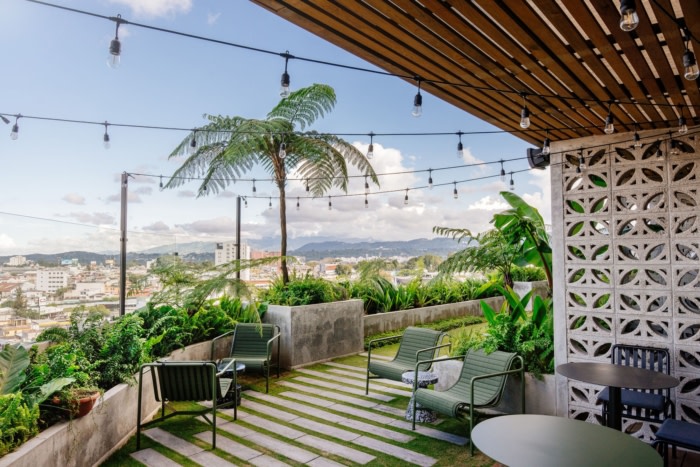
While the rooms are meant to be a private oasis and introspective, the purpose of the Good Hotel living room is the complete opposite. It is the social hub for everybody, a welcoming and warm meeting space that accommodates a multitude of different functions throughout the day. It is located on the 7th floor, on the north-east corner of the building, with indoor and outdoor spaces, and a direct connection to the roof garden.
An elevated wooden podium creates a transition from the bar area to the roof terrace, blurring the lines between inside and out. A functional zone towards the inner core of the building with amenities and storage is hidden behind a wooden slat wall. The resulting space is open and bright, with no unnecessary walls obstructing the amazing view or roof-garden access.
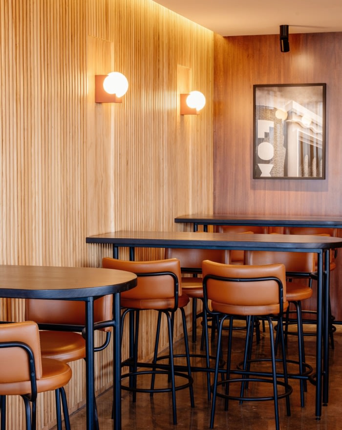
The layout is centred around the bar, which is the only fixed design element. The rest of the space is equipped with a variety of loose furniture pieces, in order to keep the setup flexible and adjustable depending on the occasion. A big communal table is nested in the corner while the wooden functional wall serves as the backdrop for more traditional bistro-style high seating. The rest of the furniture is more laid-back: soft lounge-style seating, arranged in different groups, creating private little corners while keeping the overall layout open and airy.
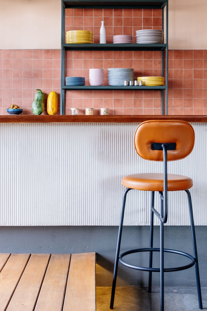
The signature palette of muted finishes and structural concrete is enhanced by complementary warm materials with an emphasis on texture. The wooden wall around the inner core is clad with wooden slats, creating depth and visual interest. This medium-coloured wood is complemented by the elevated podium and other details made from local hardwood in a deep dark shade to create a balanced mix of wooden features. The counter of the bar is clad with textured concrete, contrasting the darker polished concrete floor finish, while the back wall features terracotta-coloured tiling. The great variety of different textiles and colours incorporated in the furniture upholstery and rugs provides colourful accents throughout the space.
Sleep Good. Private Spaces
The local context of the neighbourhood of 4 Grados Norte heavily influenced the design of the rooms. We wanted to emphasise the connection between inside and outside spaces, keeping in line with the traditional way of living in tropical climates and honour the beautiful views on offer from the 7th and 9th floors of the Granat building.
Room Design
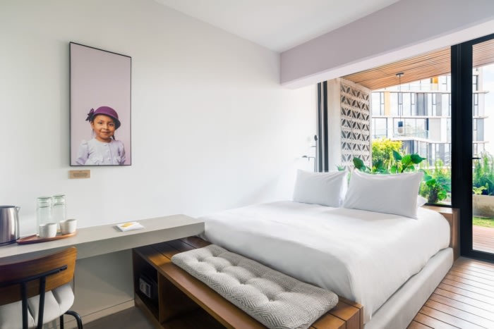
The main focus of the design was to keep the room as light and open as possible, with an unobstructed view and easy access to the terrace and roof garden.
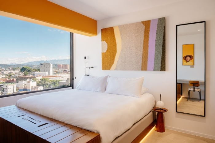
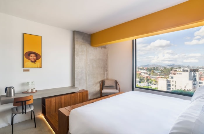
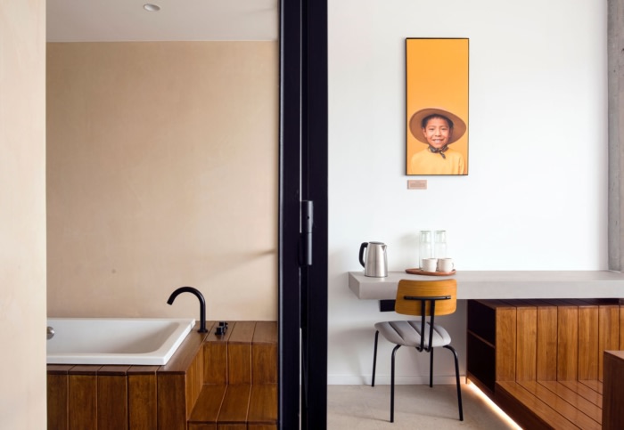
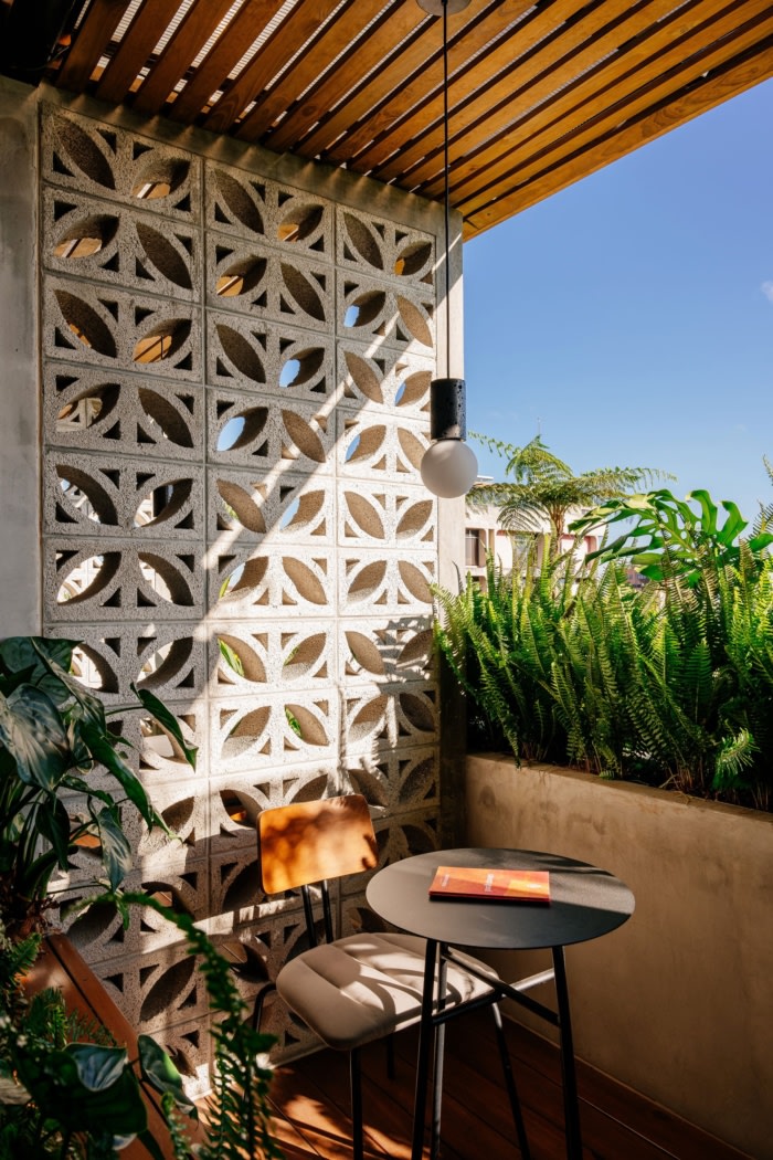
Most rooms have an attached private outdoor terrace. We introduced an elevated wooden podium to visually and physically extend the “living space” of the room to the outside. This gave us the opportunity to create a visual division inside the small room, and realise a built-in storage and bed. The podium extends to the outside and has integrated planters filled with lush plants, forming a private oasis that is connected to the roof garden.
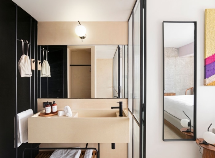
Considering the compact size of the standard rooms, we chose to avoid the traditional hotel room archetype with a closed bathroom block and corridor in the entrance area. The spatial concept of the room is a so-called room-in-room concept, creating an inner facade made of ribbed glass in the front part of the room that separates the private core, while letting natural light from the outside pass through. This core includes the entrance and wardrobe, the vanity and an open shower with access to natural light, and a separate toilet.
Spaces
Upon entering the room you find yourself in the private core of the space. The functional front part is executed in black colour-blocking with carpeted flooring wrapped up along the wall. The dark colours act as a threshold between the public hallway and your private space and emphasise the warmth and brightness of the rest of the design.
Look and feel
The shape language of the furniture and design elements is clean and minimalistic. The material palette is muted and natural, incorporating the existing structural concrete and complementing it with warm natural stone tiles, local hardwood, quartz, and steel accents throughout the space. The lush plants of the terrace and roof garden greatly contribute to the overall atmosphere as well.
Another main pillar of the overall design concept was the integration of graphic pops of colour, in contrast to the generally muted palette and in reference to the colourful spirit of the surrounding neighbourhood.
Design: Ninetynine
Photography: Agustin Fallas





Now editing content for LinkedIn.