Hawaiian Bros Restaurant
The design of Hawaiian Bros. Restaurant by Clockwork Architecture + Design incorporates the ‘aloha spirit’ and aims to authentically represent the Hawaiian culture.
The design of Hawaiian Bros. is a celebration of the ‘aloha spirit’, a word often used by native Hawaiians to describe the ‘authentic presence of breath and beauty’. To the designers, this became the foundation of the design.
The first of its kind, Hawaiian Bros. offers traditional Hawaiian plate lunches in a modern, fast casual structure. When designers first sat down with the ‘HBros.’ team, it quickly became apparent they wanted the restaurant’s design to share the same amount of detail, authenticity and craft that is put into their traditional plate lunches. The greatest challenge; how is the story and heritage of the Hawaiian culture injected into the space in a meaningful way?
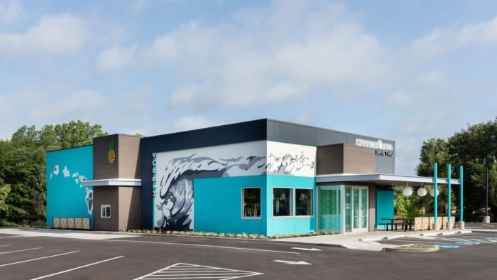
The solution was to create an authentic experience for the diners at every turn. The experience starts at the exterior, where guests are greeted by a 15-foot-tall wave mural that was designed and hand-painted by local art students from The Kansas City Art Institute. Also cladding the exterior is another hand-painted mural of the seven Hawaiian Islands. The pineapple, which can be seen above the drive-thru is the brand’s logo, and was created from CNC cut and powder-coated steel. Also scattered around the exterior are custom etched screens. The pattern seen in the screens was extracted from a traditional Polynesian tattoo. The screens were made from high-density poly ethylene which was selected for the material’s weather-resistant capabilities.
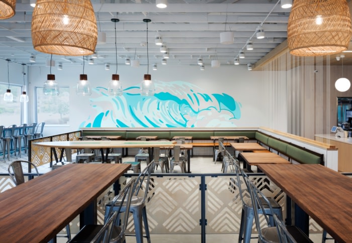
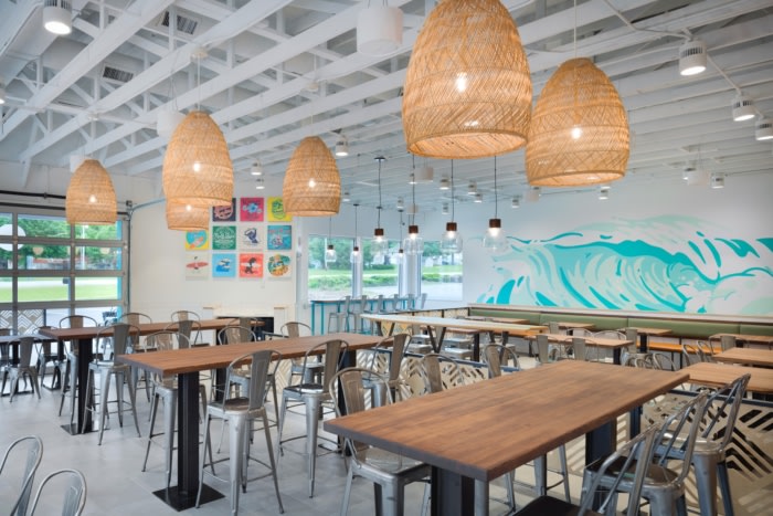
As diners enter the space, they are greeted with another hand-painted wave mural. The mural was strategically placed in the queue-line to assist with wayfinding. The mural is the first thing your eye is drawn to when you enter, so guests are naturally drawn to it. Designers knew it was important to create a space that was not only fun and playful, but also functional.
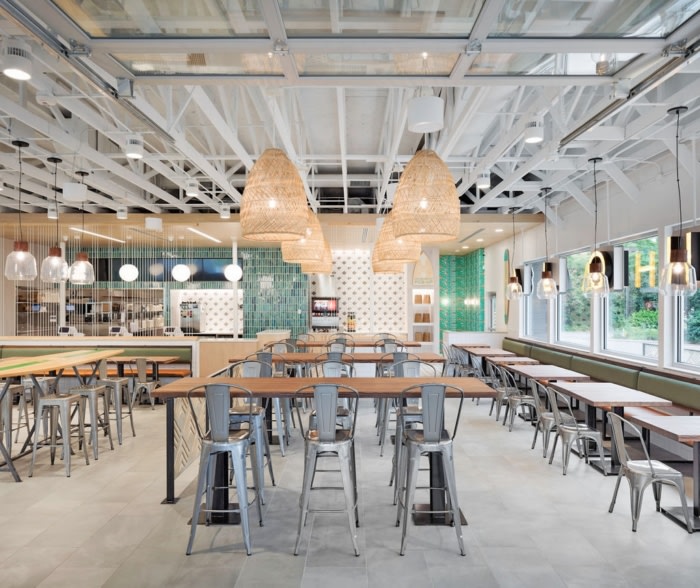
Another goal for designers was to ensure each detail felt authentic and integral to the brand and the Hawaiian culture. A high-top table, which has become the center-piece of the space was created with the silhouette of a surfboard. To further customize the table, the HBros. name and logo were printed on the top.
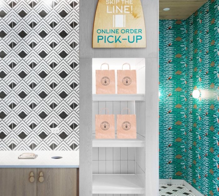
Because the pineapple is the logo for the HBros. brand, designers playfully infused the shape into the space. The pineapple beer taps were turned from solid teak wood, the cabinet pulls were CNC cut in the shape of a pineapple and the mirrors in the restrooms were custom designed in the shape of a pineapple.
To further infuse craft and authenticity into the space, a custom floor and wall tile was designed, which emulates the same Polynesian print seen in the interior and exterior screens. Custom wallcovering was also designed to reflect the tropical environment of Hawaii. The custom wallcoverings can be seen in the entry vestibule, restroom vestibule and both restrooms. Each space has its own unique print to provide a playful and custom design element at each entry point.
Finally, custom interior signage was created to maintain the feeling of craft and authenticity in a playful way. Guest who have ordered on-line or over the phone are directed to the ‘Pick-Up’ shelving near the side entry. The sign is a silhouette of a surf-board and uses the same font as the H.Bros branded typography.
The overall goal for the designers was to give guests a preview of what to expect when they dive into their plate lunch. The same amount of craft and detail H.Bros places into their meals is reflected in the space at every turn. The overall design is playful, yet timeless. Every detail was thoughtfully considered and executed and brought together in ways that create a unique and authentic experience from the exterior to the interior.
Design: Clockwork Architecture + Design
Design Team: Daniel Umscheid, Elle Abernathy, Isaac Thompson
Contractor: ARC Construction
Photography: Tony Thompson Photography





Now editing content for LinkedIn.