Shy Table Restaurant
STUDIO8 Architects‘ design of Shy Table restaurant in Hangzhou integrates continental cuisine with local ingredients, embodying introversion and rationality in the layout and lighting for a unique dining experience.
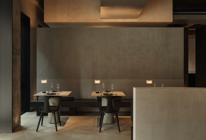
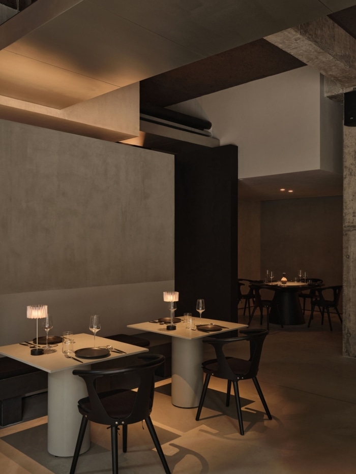
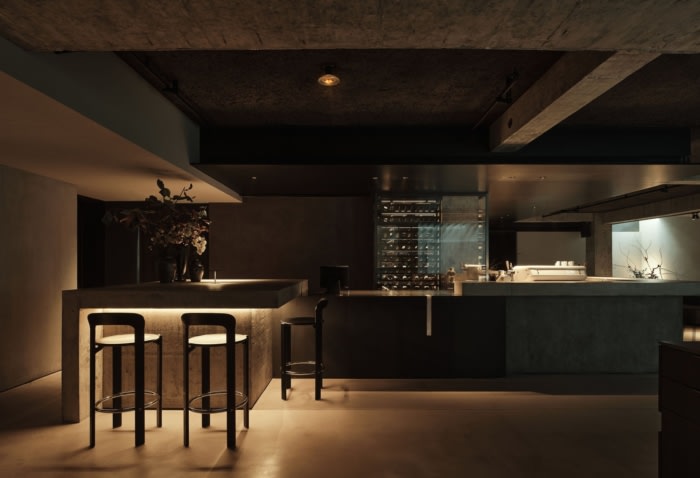
Located in the Rising Center near the Xixi National Wetland Park in Hangzhou, “馐(Gourmet)·shy table” is a innovation western restaurant based on continental cuisine and its cooking integrates with local ingredients. The selection of the brand name “shy” conveys characteristics of introversion, truth, low profile and quietude, just like the personality of the owner. The relationship between people and food in Western cuisine is the subject-object relationship. People taste the ingredients rationally after “dissecting” the food with cutlery. Space design introduces this dietary philosophy and analyzes the relationship between human and space with a rational attitude.
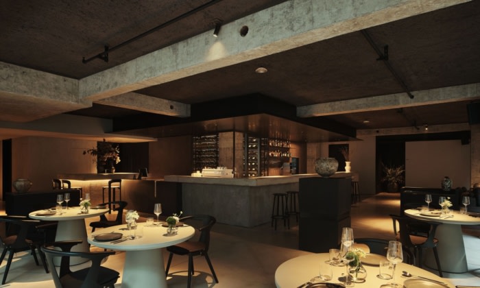
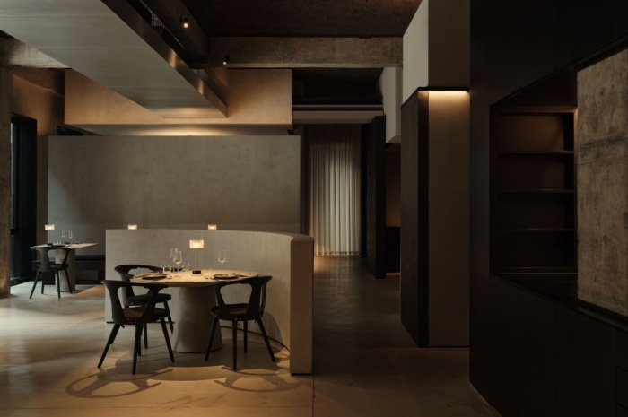
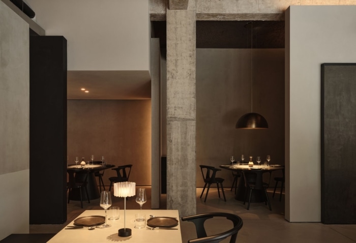
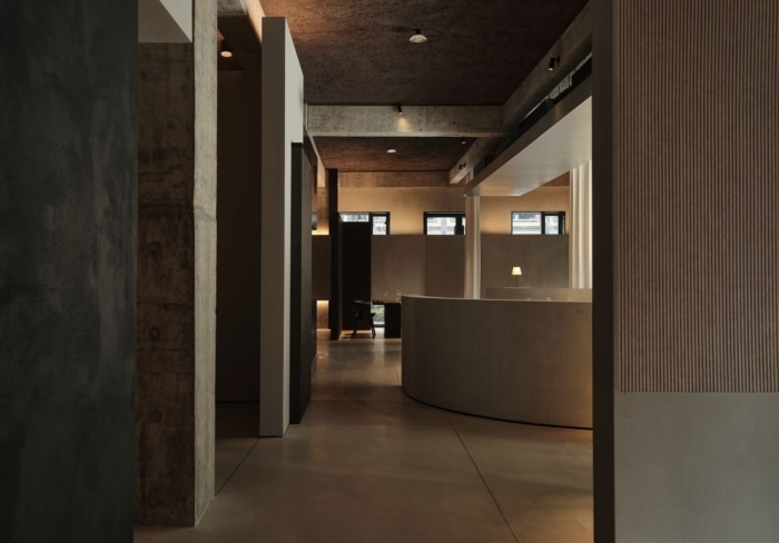
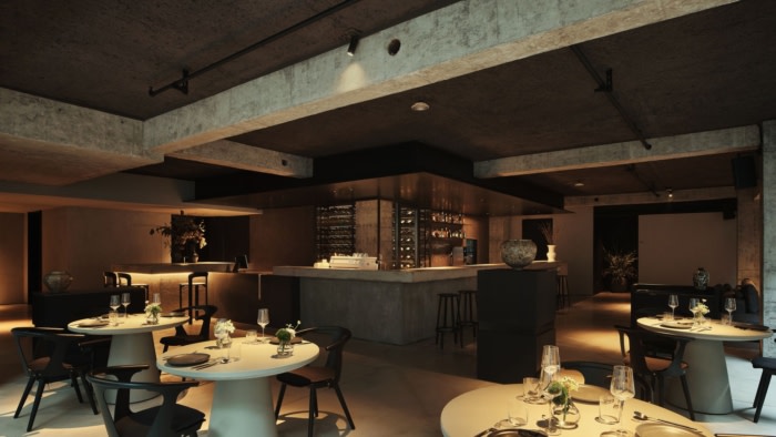
Following the functional layout and considering the interpretation and translation of the brand culture, we redesigned the column grid and circulation originally used as an office space and selectively enclosed a semi-private and semi-open dining area with skill and ease. We used floor-to-ceiling drapes as partitions in some areas, creating an echo with the undecorated columns. We designed an arc and a slanted low wall to break the usual layout of the hall space, re-establishing the spatial order. The symbol is derived from the western tableware. The slanted line is like the cutting of a knife, while the arc is like the curve a person makes when dipping into the sauce. These two walls add a set of diagonal axes to the originally horizontal and vertical column grid space, and the diagonal axes run from the interior to the exterior, with the paving following the axial layout.
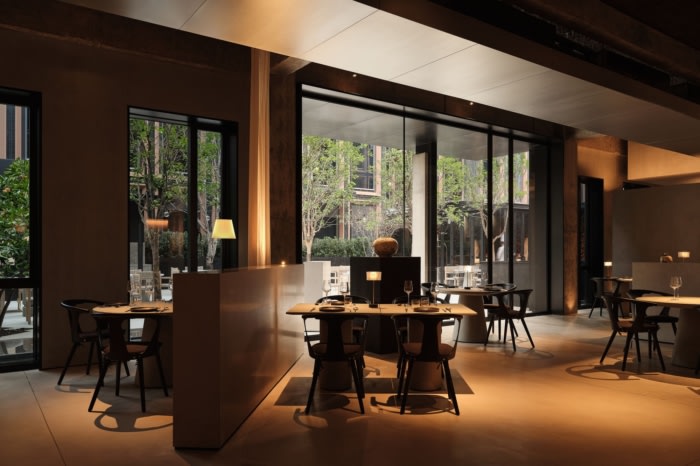
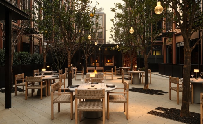
There are two floors in the restaurant: the main dining area with an outdoor garden and the underground bar dining area. In order to connect these two areas, we expanded the garden entrance first. Also, we dismantled the original metal column ornament and use the dismantled metal plates and concrete to create a new column with the same shape as the original column. Meanwhile, we pushed this new column outward without destroying the rhythm of the original facade, and thus widened the canopy, naturally realizing the space transition of the indoor and outdoor. The enclosed garden is a square space, which is reminiscent of the orderly agrumeto in the West. We chose local citrons and combined the tree array with the seat, the central fireplace and the light strings between the trees, creating a romantic and breezy atmosphere for dining in the orchard.
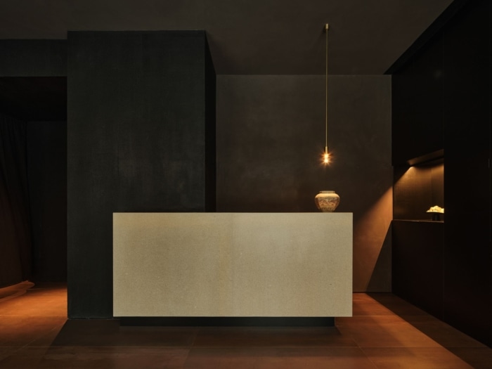
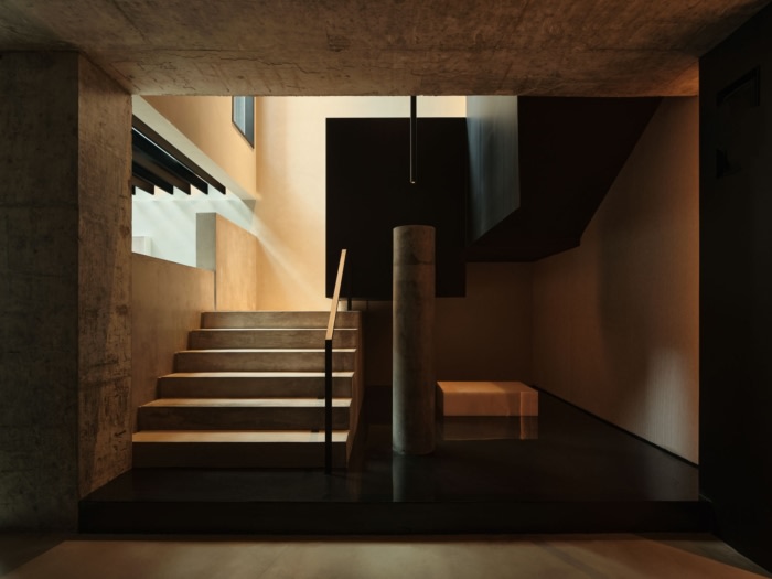
Secondly, we extended the staircase to connect the upper and lower floors. Combined with the light, the traffic space serves as a sensory transition. From the palpable light and shadow at the landing of the staircase, the steel railing panels are designed to be high enough to block views, allowing people to experience the space gradually opening up as they climb down the steps. When people step down, the light merges with a sculpture suspended on a black mirror-finishing wall, where the light source comes from overhead and guides those ascending the stairs.
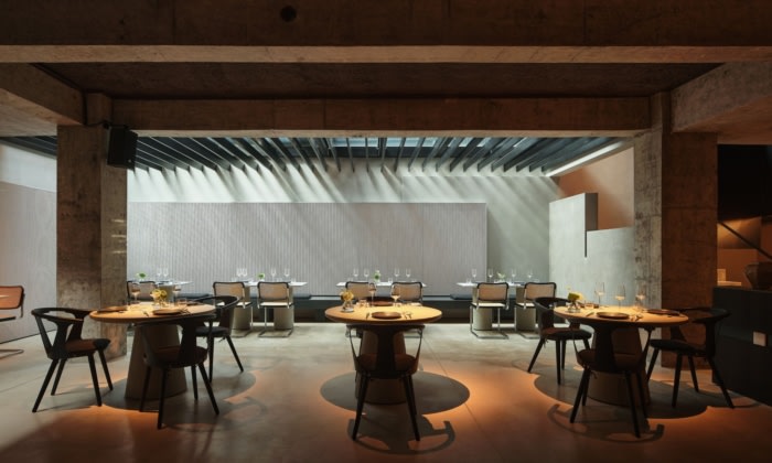
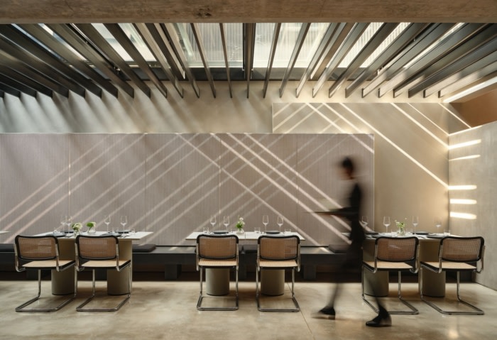
Light not only is the striking point of a space but also exaggerates the mood of the space. The whole restaurant adopts an open space, partial spotlights or ceiling lamps with table lamps, and some small point lights are appropriately set in some key places. The whole space is dominated by warm color light, gestating moderate and reserved spatial sentiments. The ventilation pipe and other equipment rowing on the ceiling have been delicately combed and designed, all of which are stored on one side, and the external package is made of sound-absorbing materials, which are inconspicuously hidden into the bottom of the beam. Natural light shines into the underground space through skylights, planting wells and skylight corridors, casting a rhythmic light and shadow on the walls.
The design of the building’s facade echoes the theme “shy”, hoping to leave a low-profile and mysterious impression from the exterior as well. The window frame serves as a link between the interior and exterior, and we chose to weaken the interaction between the interior and exterior in a subtle way, using partial blocking to reveal only part of the dining table and chair legs, so that viewers passing by outdoors can’t see what’s on the table and who’s dining there. Mini-paintings hanging on the wall make each pane of the window frame a scene and make the facade gallery-like, attracting people to get closer to appreciate it. While more imagination is introduced in between such obscurity. The design transformation of the “馐(Gourmet)·shy table” responds to the brand’s tone and concept–modesty, low profile, delicacy and introversion in every detail, and at the same time opens up more ideas for designing the space of this ordinary office building.
Design: STUDIO8 Architects
Design Team: Shirley Dong, Matteo Piotti, Andrea Maira
Photography: Sven Zhang





Now editing content for LinkedIn.