Etna Pastificio Pasta Shop
Studio MHA in Montreal transformed a former restaurant into Etna Pasticio, a pasta shop with a simple, light-filled design that showcases handmade pasta preparation and Sicilian-inspired elements.
Montreal based Studio MHA, has converted the former restaurant Etna, into the pasta shop Etna Pasticio. The pasta shop, formerly in a nearby location, was relocated to the 700 sq.ft. space of the owners’ former restaurant, on a main street of the Villeray neighborhood in Montreal. For the design, the clients turned to Michael Hall of Studio MHA, who had worked with them previously on the restaurant Etna.
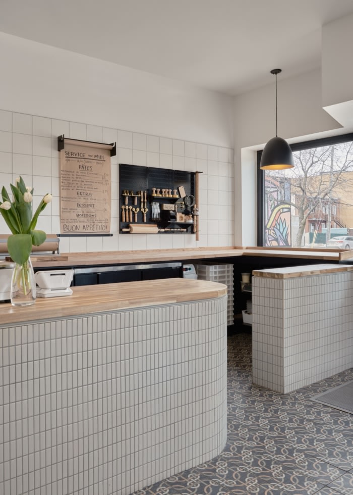
The young owners of the pasta shop, wanted a simple space, bathed in natural light, where clients would happily shop and dine; while in the open kitchen space, it would be a delight for the employees to make pasta. In response, rather than pushing the kitchen to the back of the space, the designer divided the space length wise. Along one wall, from the street front windows to the rear of the small shop is the kitchen. Along the other wall stretches the space for dinning and the sales displays for wine and pasta.
As a result, the staff skillfully preparing the pasta by hand, take center stage at the street front window. Their daily work a show to passersby on the sidewalk, and a reminder that the pasta at Etna is lovingly prepared on site.
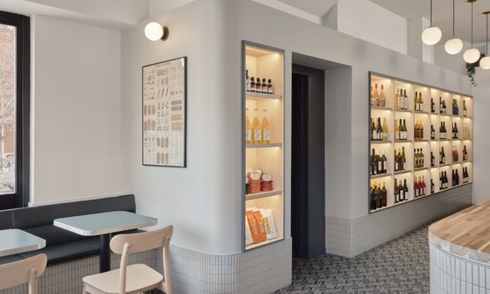
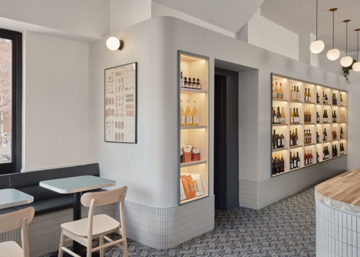
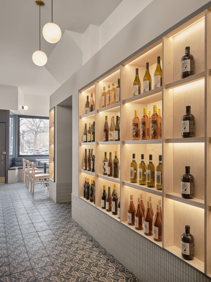
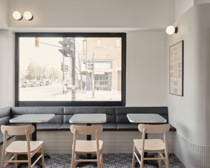
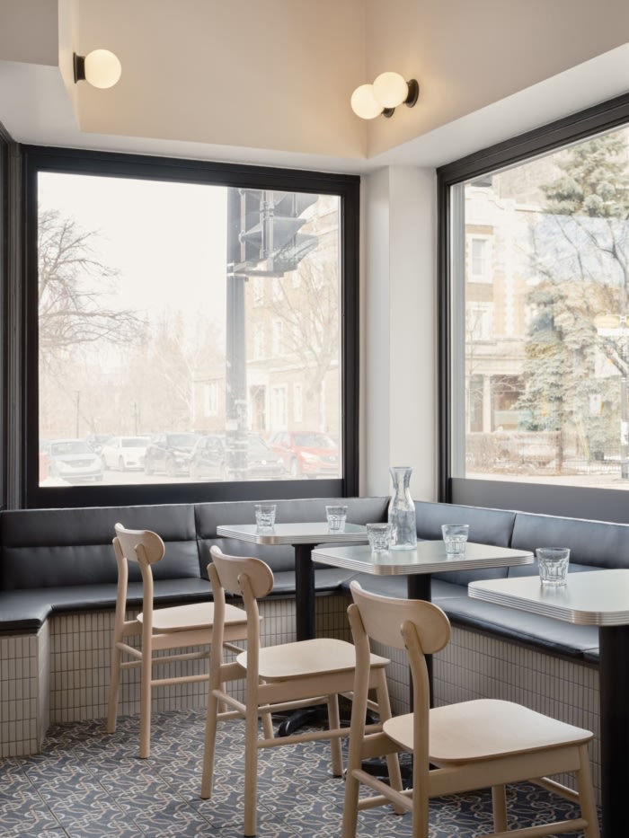
At the opposite street front window, clients dine nestled in a cozy banquette. In this delightful corner, a casual lunch can be enjoyed, while basking in the afternoon sun streaming through the glass. Between these two spaces is a central aisle where shoppers linger in front of the pasta cases and the wine display. Tying both sides together are the mirrored curves of the wine display and the sales counter. The repeated curves, not only add visual interest, they also facilitate easy movement around the small store.
Mindful to avoid design clichés and pastiche, Studio MHA nonetheless wanted the space to echo the architecture and design of Sicily and the surroundings of Mount Etna. The bold patterned tile floor of the store is a nod to the beautiful colorful tile floors of the older homes on the Mediterranean island. The rest of the material palette is deliberately restrained, consisting of neutral-colored ceramic tiles, white and beige tones on the walls, birch plywood and the oak counters of the pasta kitchen. This minimalist approach allows the displays of wine and pasta to take center stage, and makes them the visual focal points of the space.
Design: Studio MHA
Photography: Phil Bernard






Now editing content for LinkedIn.