La Prime Kitchen
La Prime Kitchen is a new restaurant and cocktail bar in Shenyang, China designed just like the cold-weathered yet fast-paced city in which it is located, combining a cool, wintry look with an extravagant quirk, done by Q&A Architecture Design Research.
The dining project was developed entirely by Q&A from the brand and visual identity to the design of the interiors, and was centered on the contrast between irregularity and rigidity, by devising a system of carefully layered materials, languages and atmospheres.
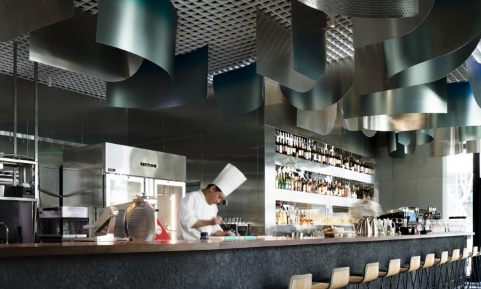
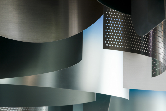
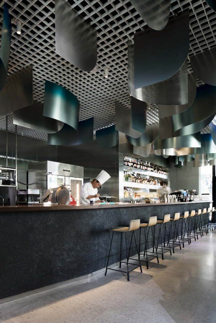
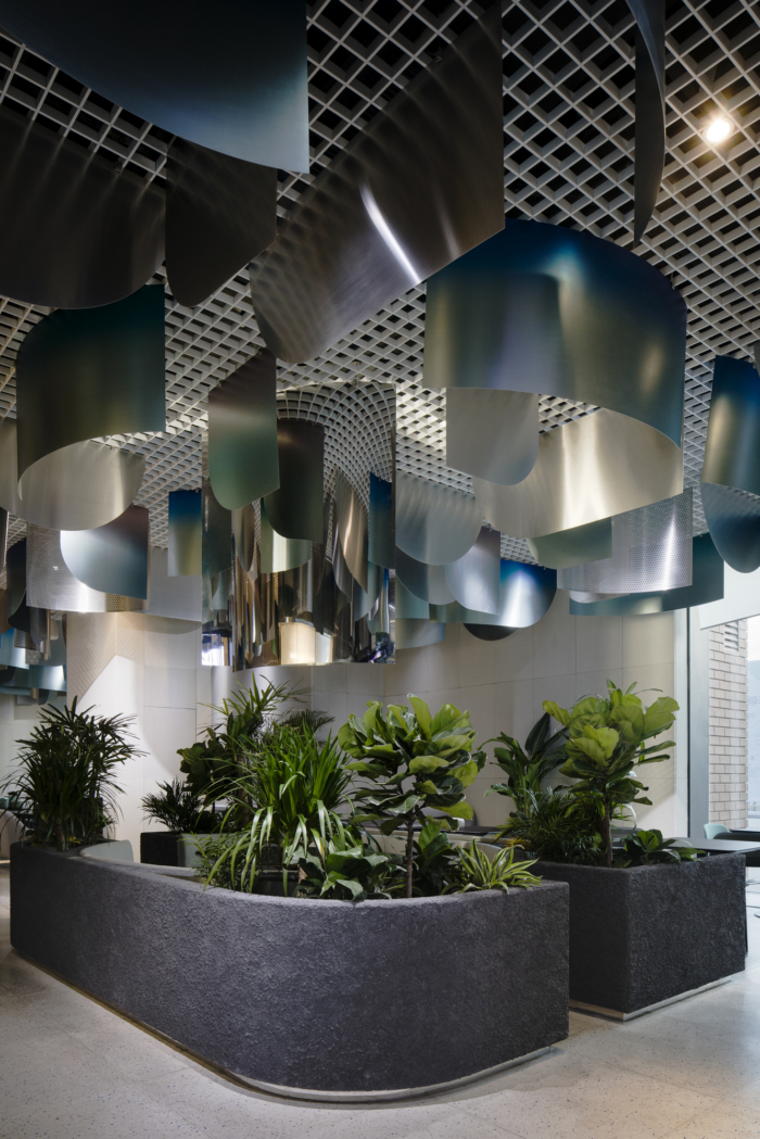
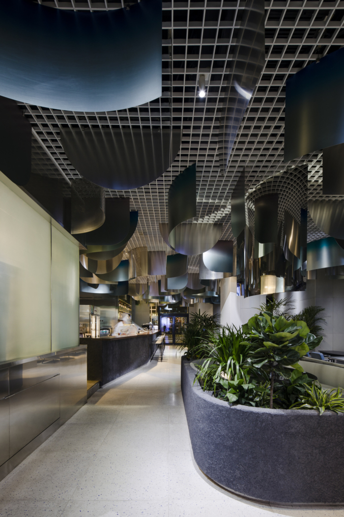
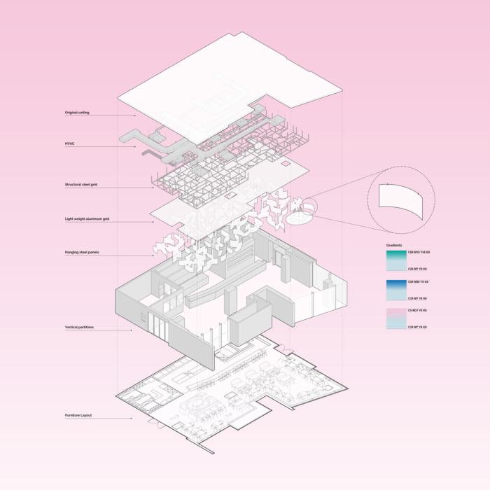
Coldness and boldness, lines and curves meet in the design’s main themes. The metallic façade, impersonal at first glance, reveals the heart-warming palette of a Northern aurora, from blue, to green, to pink. Steel screens bent in sinuous shapes hang from the ceiling, breaking its grid-like pattern and referencing the restaurant’s whimsical logo.
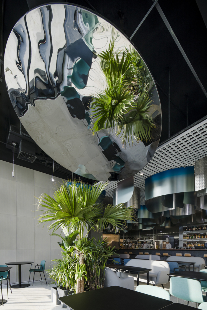
The screens do not only have a decorative function, but rather are meant to capture the unpredictable behavior of light in different seasons and times of the day, thus constantly altering the surrounding space. The copious use of greenery in the space creates a contrast between natural and artificial, with the two elements cohabiting harmoniously through the exchange of light.
The ephemeral and almost glacial elements above on the ceiling are combined with highly tactile materials at eye level. This balance reflects the true personality of the place: upscale but not pretentious, romantic but not mawkish, hip but not showy.
The kitchen is where the tension between the ceiling and the other surfaces reaches a pinnacle: here, a long wooden countertop, striped concrete wall tiles, coarse-grained stuccos and terrazzo flooring all contribute to a game of opposites which sets the scene for the interactions between the chefs and the customers, between creation and taste, between imagination and tact.
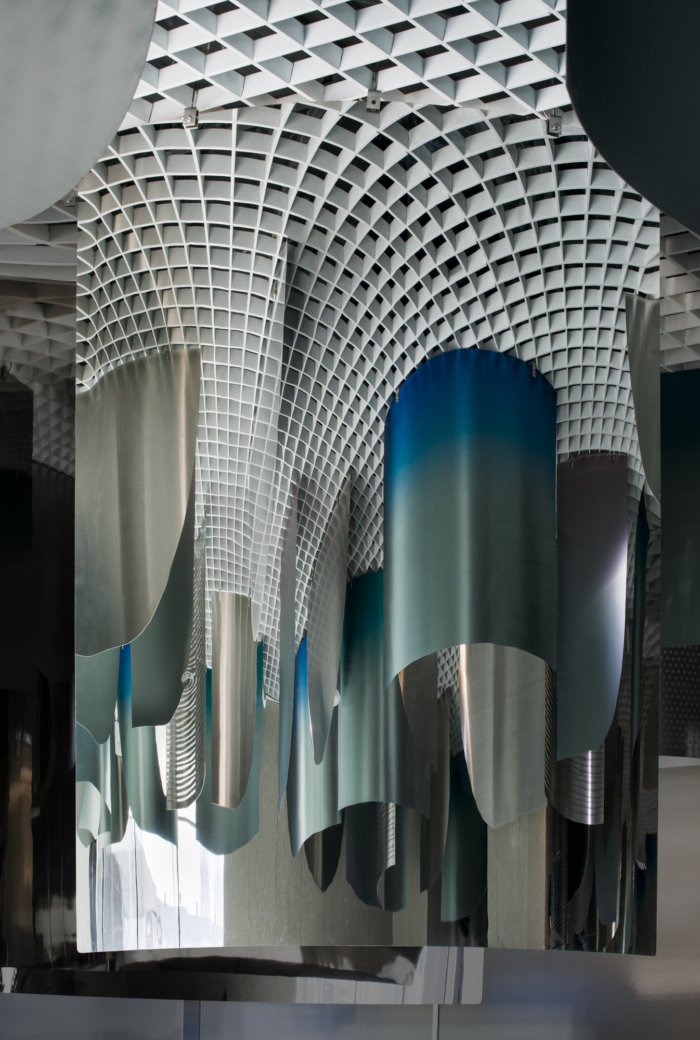
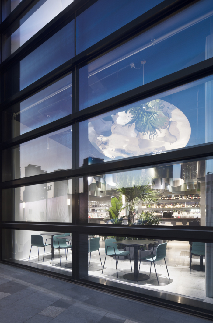
Interrupting the grid that occupies most of the ceiling is an oversized circular mirror, which leans towards the windows in search of natural light. Projected onto its irregular surface, the light of the space underneath distorts into colorful shapes before being cast outside.
The irregular and almost tortuous layout of the venue entangles the to and fro of staff and customers, who cross their paths around crossroads and bifurcations. Slight variations to an otherwise simple plan, like protruding plant containers, draw a multifaceted interior landscape reminiscent of dense urban environments.
As a final touch of quirkiness, magic mirrors hang from above distorting the view of the ceiling panels and increasing the sense of crowdedness of the overhead space.
From the outside, passers-by peeking through the full-height glass windows can instantly perceive a sophisticated yet casual atmosphere. The oversized mirror casts an enthralling glow on the sidewalk, like an artificial moon that blends into the blinking lights of the surrounding cosmopolitan skyline.
Design: Q&A Architecture Design Research
Design Team: Gianmaria Quarta, Michele Armando, Gu Tao, Eleonora Beltrame
Photography: Peter Dixie / LOTAN




Now editing content for LinkedIn.