The Post Office Cafe & Bar
The Post Office Cafe & Bar in New Delhi, was designed by Studiio Dangg with inspiration from vintage post offices, Harry Potter, and Cuban bars, creating a retro, nostalgic space.
Situated in New Delhi, The Post Office was a project where the name preceded the design. Prior to Covid, The Post Office was a staple in the neighbourhood of Rajouri Garden, loved by both its residents, and the barrage of young adults due to colleges, and offices around.
The name Post Office compelled us to reminisce about vintage English Post Offices. Perusing through multiple vintage post offices for inspiration, we came across a myriad of details that instantly made us nostalgic for a lot of movie references. From metallic curlicue detailing on concierge fascia to expansive flooring details to embellished mailboxes.
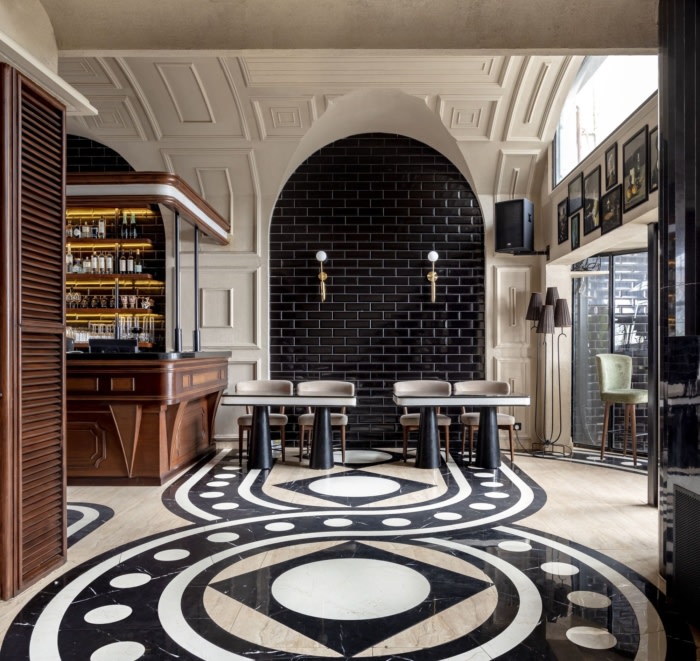
While the site inspired a Cuban aura, the name itself threw us back to the realm of Harry Potter. Pertaining to, the design process brought forth a palette that was an amalgamation of both very vintage, and very imaginary elements. Inspired from a more modern, and intriguing version of colonial design, we drew influences from Harry Potter – the glossy tiled black walls, in Department of Mysteries, the intricate flooring of Gringotts, the halls of Hogwarts with quirky lighting are spaces one would be nostalgic about being in this space.
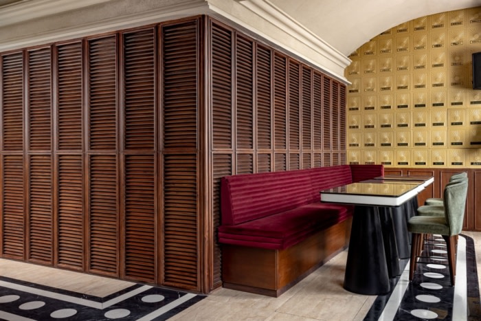
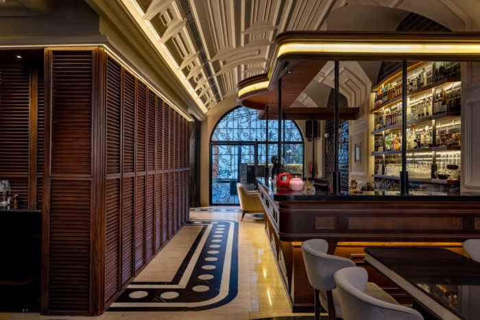
At the entrance, one is greeted with a pair of twelve feet tall arched double doors, adorned in curlicue metal detailing to set the tone, and mood. In the immediate vicinity of the entry is the high table seating set against a wall of wooden louvred shutters. The right side showcases a wall of brass mailboxes reminiscent of colonial post offices with a twist, complete with detailing similar to that of an antique vault lock.
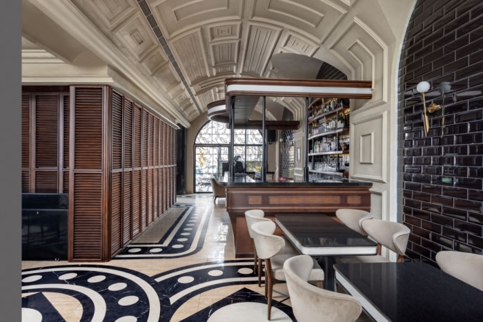
However, the doors essentially lead to the hero of the space – the vaulted ceiling embroidered with mouldings. The lit-up ceiling at night creates an awestruck experience inducing a sheer mesmerism, alike walking into a Roman museum.
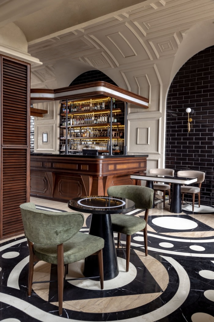
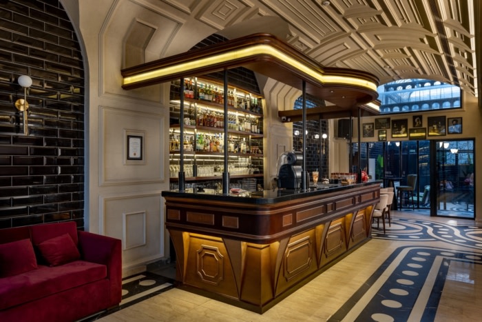
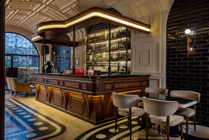
The second set of doors give a glimpse of the wooden bar, reminiscent of an old-school pub, with a twist of detailing that pertains to a concierge desk in English post office. The elongated side of the indoors housing the bar is fragmented with three arches cladded in glossy black tile, and framed with moulding details that ascend along the height of the wall, and curve up onto the vaulted ceiling.
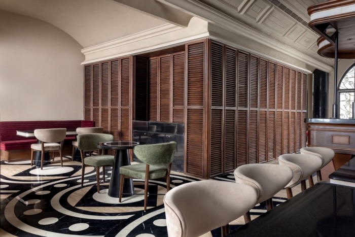
As the passage narrows in front of the bar, the wooden louvered detailing continues across the bar as well, perfectly hiding store rooms, and fire exit doorways within its seemingly dummy shutters. Upon crossing the bar, the space broadens again into the dining seating. The widened area peeks onto the outdoor seating through curved windows. A passage way to the right leads towards the washroom area, yet again themed in deep, but distinct palettes as an echo of the idea of various houses at Hogwarts; embellished with quirky hand shaped wall sconces, and tiled curved walls, adding to the intrigue of the whole experience.
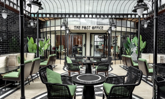
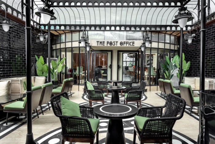
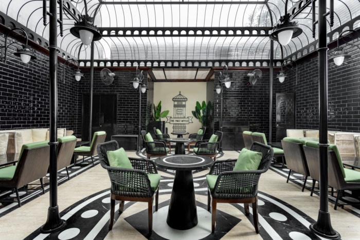
Since the outdoor portion of the site was abutted by buildings that towered over it at least by three floors, we wanted to resolve this issue without taking away much from the spaciousness. For the space to be usable all through the day, and during all seasons, a metal structure constructed that acts alike a gazebo, but one that you would find at Hogwarts. Varying forms used in the detailing for indoor area was brought to life on a micro scale here to enhance the volume, and dimensionality of the form.
As the clear roof ascends, it closes in on the space to create a more structured visual. The more geometrical approach to the detailing in the roof captures the attention of patrons creating an easy indoor-outdoor relationship. The metal roof largely is a framework for a glass enclosure. Cleverly concealed mist pipes provide respite during summers, and a massive skylight that is opened up during an enjoyable weather – allowing the space to be accessible during every season.
As the sun sets on the place every evening, the gaps in the neighbouring buildings filter the sunlight just so, that it strikes onto the glossy black tiles on the outdoor walls, creating a water-like reflection. In line with the theme, the space was materialized through a concise set of materials, which would otherwise seem run of the mill, but with the correct detailing, textures, placement, and combinations work splendidly. With the glossy subway tiles, patterned flooring, vintage lampposts, and louvered wood panelling, The Post Office is a respite that feels retro, yet evocative in an understated way.
Design: Studiio Dangg
Photography: Jeetin Das




Now editing content for LinkedIn.