Mercado San Valero
Located in the emblematic district of Ruzafa, in Valencia, Mercado San Valero was designed by nihil estudio with the aim of creating the first Street Food Market in the city.
The concept Mercado San Valero has been developed following two lines, one of spatial character and the other of chromatic character, forming a tandem that allows the visitors to enter a genuine atmosphere with a personality of its own.
From the viewpoint of space, the current norms and regulations make reference to the existence of two spaces: public space and private space. However, there are many texts that mention a third type: collective space. It is here that we work with a shared mentality, as it is a private space with a clearly public use.
This concept is added to the previous one in a space that is well known and used by everyone: a market. In a market, the central character is not the space, but the product
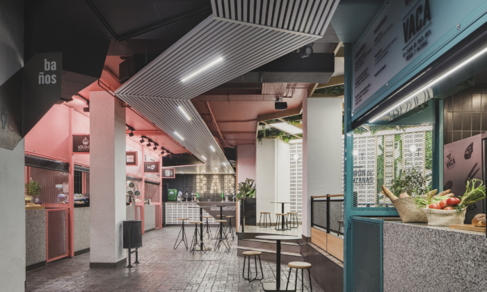
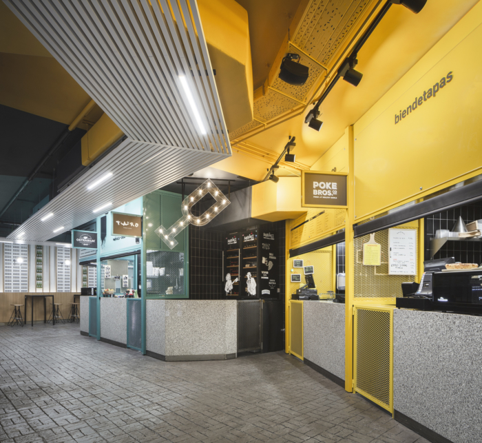
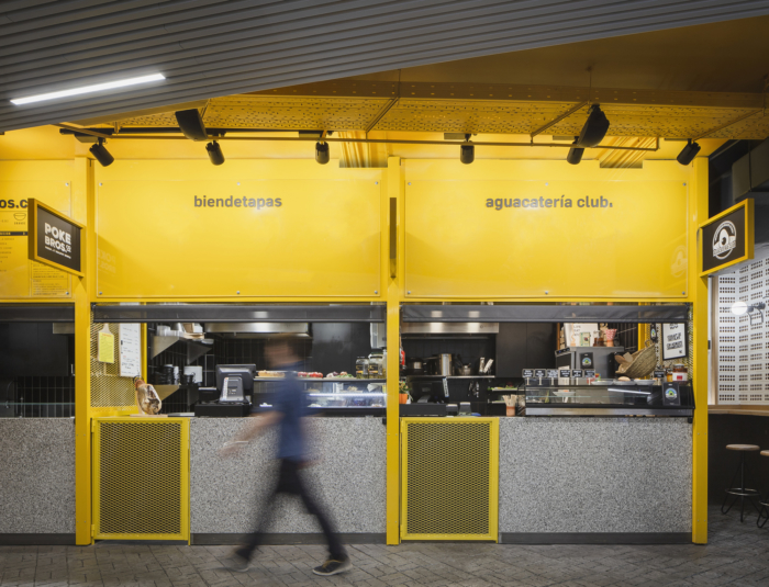
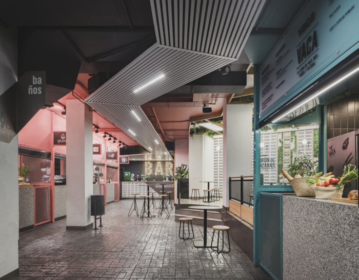
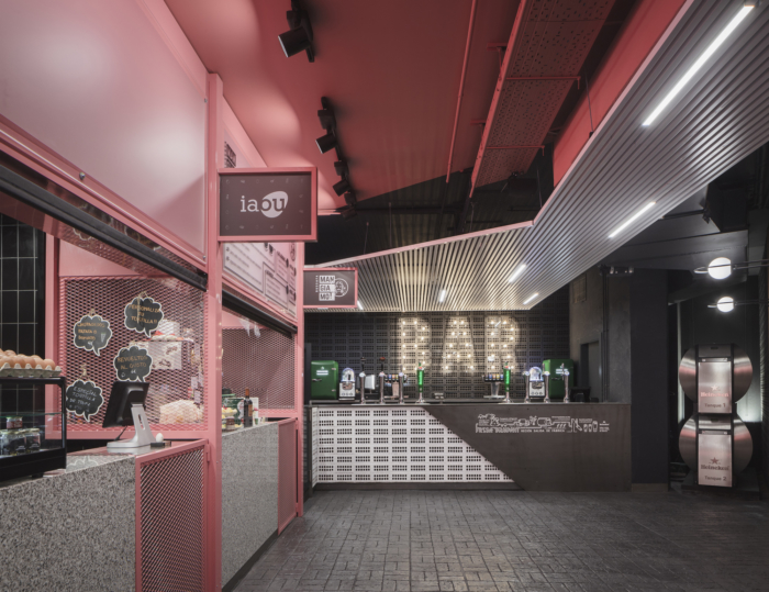
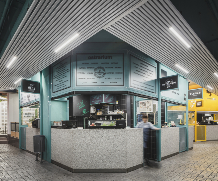
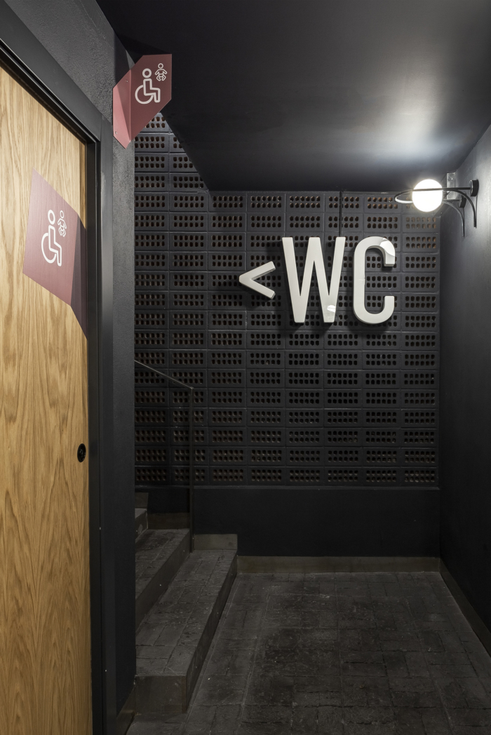
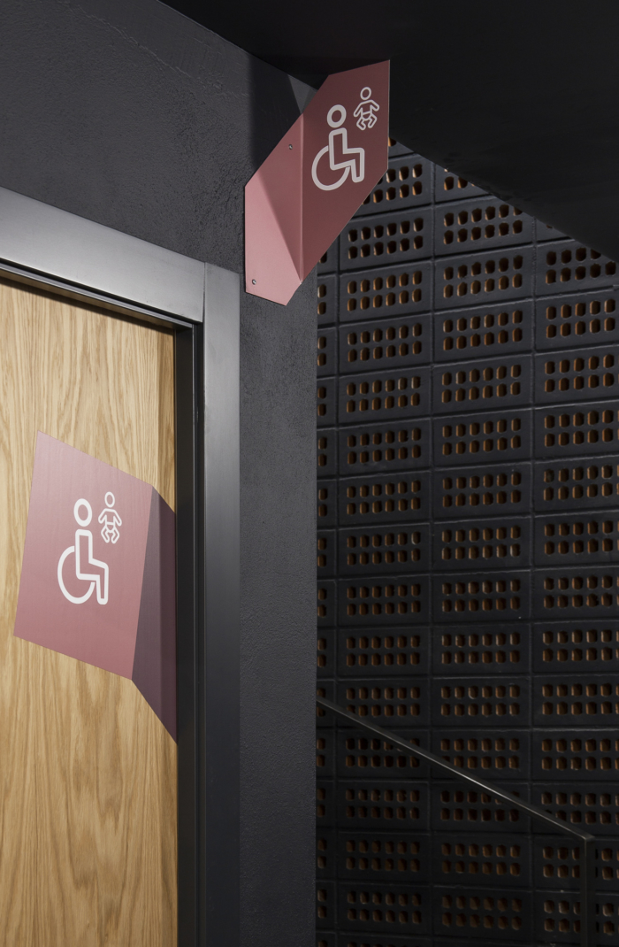
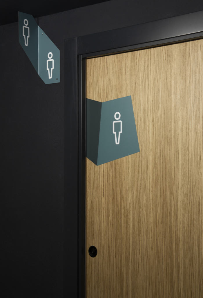
Our proposal for colours originally makes reference to the main sources of nutrition in the food pyramid, alluding to the fresh products to be found at the different stalls in traditional markets. So, by making a chromatic deconstruction they are minimised and grouped in three shades of colour (red/pink for raw meat and fish and red fruits, green for fruit and vegetables and yellow for cereals, grains, tubercles and dairy products) getting to classify the different stalls in the market and their signalling.
Materiality is of the outmost importance in this intervention of nihil estudio, in which the different uses and activities are clearly defined by chromatic and material changes, thus generating different scenes.
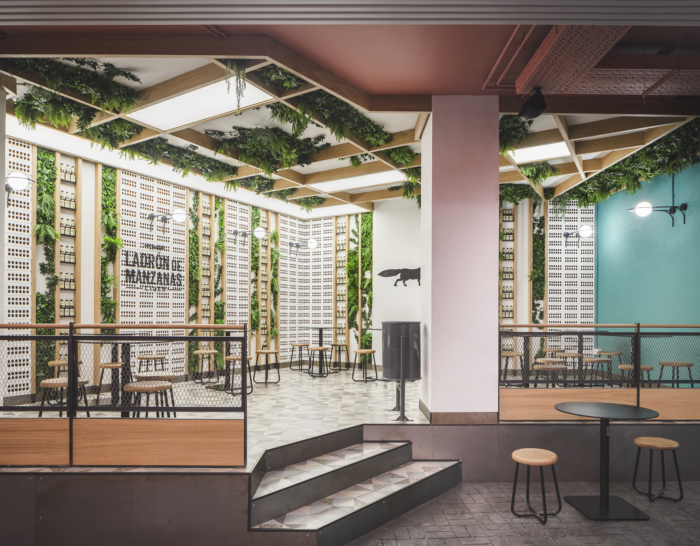
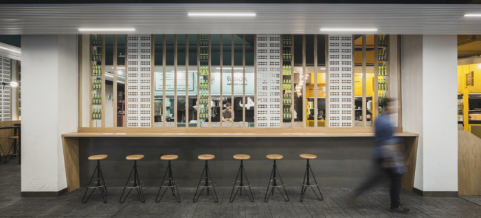
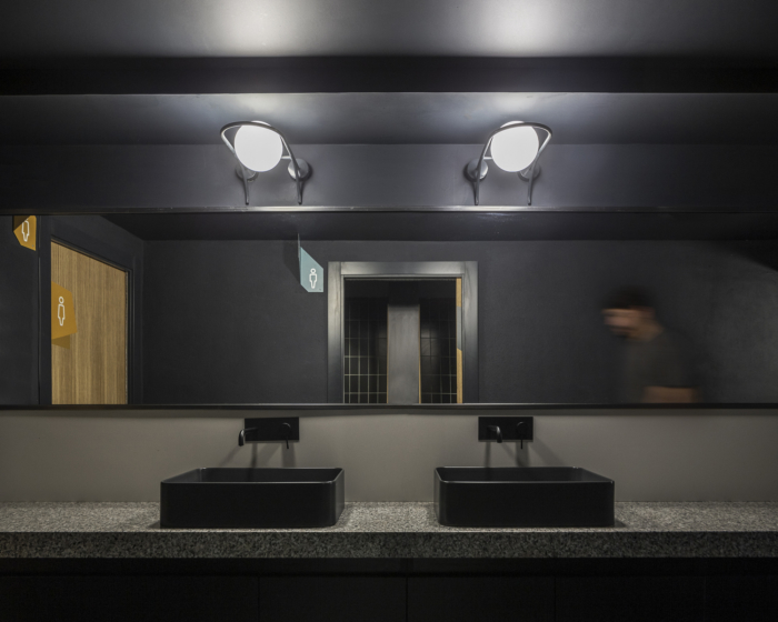
The floor spreads into the inside in a layer of printed concrete, imitating cobblestones, that guides the visitor throughout the different zones of Mercado San Valero. The changes in volume and the double skins shape the stalls in the market, with bars made of granite intentionally chosen to make reference to the typical bars in traditional markets. Thus creating a variety of atmospheres in a perfect balance between service and public use.
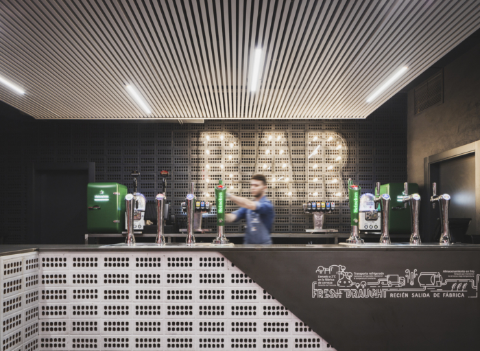
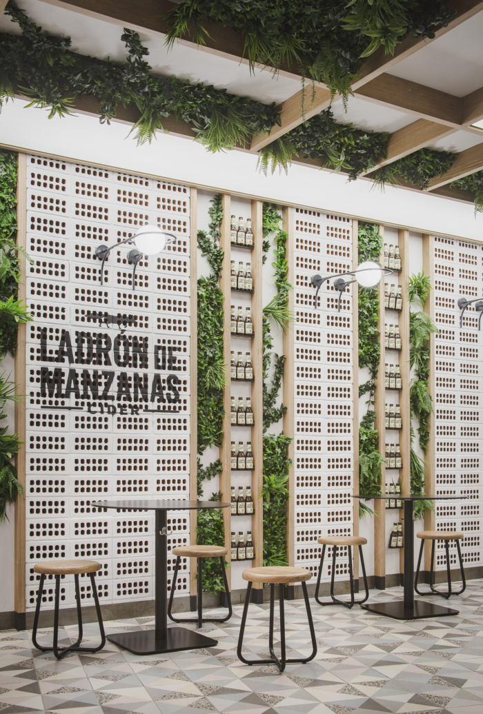
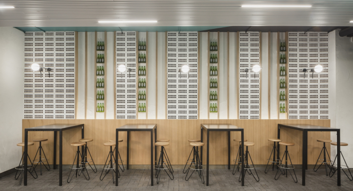
Wooden strips and coating made of coarse plaster and honeycomb bricks are the elements give continuity and unify the space as a whole. Besides by combining vegetation brushstrokes, they create double skins that help the acoustic conditioning of the premises.
Illumination becomes an essential element, paying special attention to its changes in space, both during the day and at night.
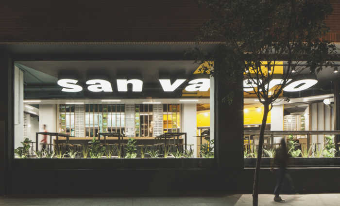
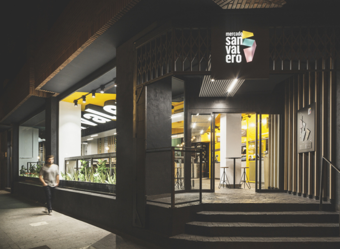
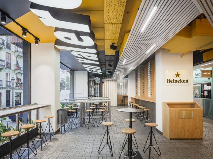
During the day big windows are open to the outside letting natural light come in and working as a tunnel, almost an alley.
At night, artificial illumination connects Mercado San Valero to the outside. Integrated in the false ceilings made of slats, it is used as a guide in the crossing zones and divides the different areas of work, accompanying visitors in their tour of the premises until they reach, intentionally, the main bar.
A project made out of a concept clearly defined from its very beginning, in which nihil estudio aims at creating an atmosphere that activates the feelings and emotions of visitors.
Design: nihil estudio
Photography: David Zarzoso





Now editing content for LinkedIn.