Eberly
Divided into three distinct dining experiences under one roof, Clayton Korte designed Eberly to capture the independent spirit of Austin, Texas.
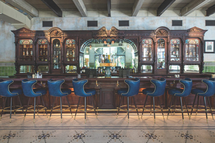
Eberly, inspired by sources both humble and lofty, marries a former 1970s print shop building with a salvaged bar from the storied Cedar Tavern in New York’s Greenwich Village to create a sophisticated bar, cafe and restaurant in central Austin. Following the owner’s purchase of the legendary bar, hand-carved mahogany sections were carefully transported and restored with the goal to again surround the bar top with a creative atmosphere worthy of the original. Working within the raw concrete and glass context of the print shop, the design team divided the building into three distinct environments: a “restored” Cedar Tavern, a mod Café, and a book-filled Study.
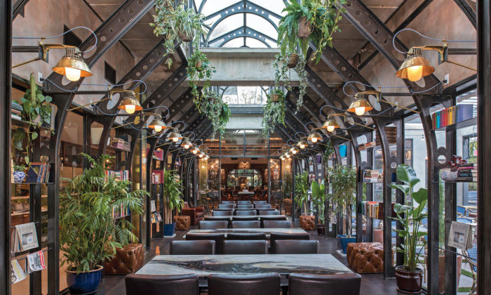
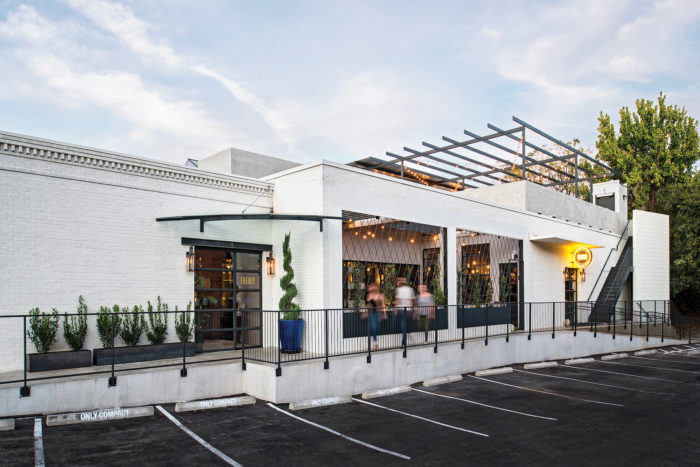
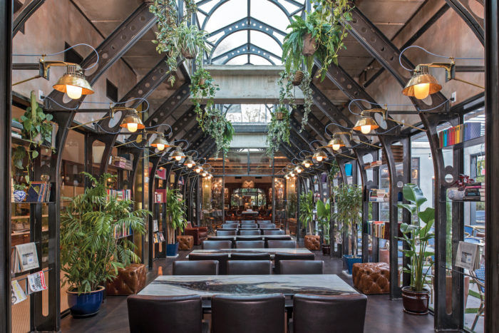
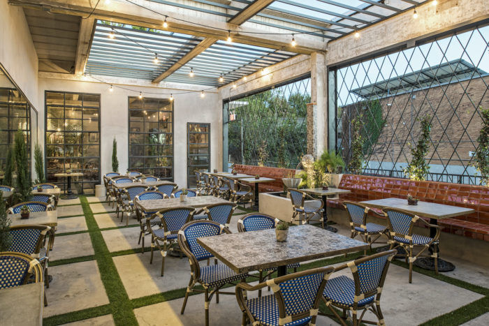
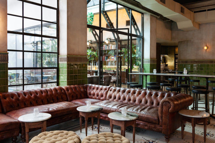
Located just south of the Colorado River, Eberly is within walking distance to numerous retail stores, offices, parks and event centers. The building sits on the edge of downtown Austin and the Zilker Neighborhood. The street-facing Café greets visitors with sleek forms and rich textures. Inspired by English greenhouses, the Study serves as coffee shop by day, filling the large, open plan building with natural light, and as extension of the Tavern at night, with glowing openings to the adjacent courtyard and a 4,000-square-foot roof-top bar.
Intended to reflect the Texas capital’s independent spirit, Eberly was conceived as a gathering place where risk takers, creative types, and liberated thinkers could connect and feed off of each other’s energy and creativity. The establishment’s visually layered spaces support this intent. As patrons enter the Café, a dark, almost brooding atmosphere defines the space. The moody darkness is contrasted by the light-filled Study immediately adjacent to the entry which draws the eye to, and through, the space back to the historic Cedar Tavern.
The existing building’s open layout features a regular column grid and CMU walls that largely drove the new spatial division. The dividing wall between the Café and Study share a line that separated the former print shop front offices from the rear floor production. The design works within the existing structural module to create a series of balanced, proportionate spaces.
Circulation and flow dictated the secondary organizing principle. The Study and kitchen hallway serve as the central spine connecting the Café back to the Cedar Tavern. Creating a spatial flow to result in a memorable experience necessitated reworking the organization of the 10,000-square-foot building. Visual layering and spatial connectivity along with stylistically distinct yet complementary interiors serve as an invitation for patrons to explore the restaurant.
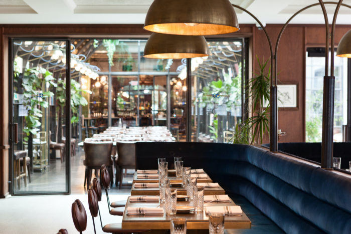
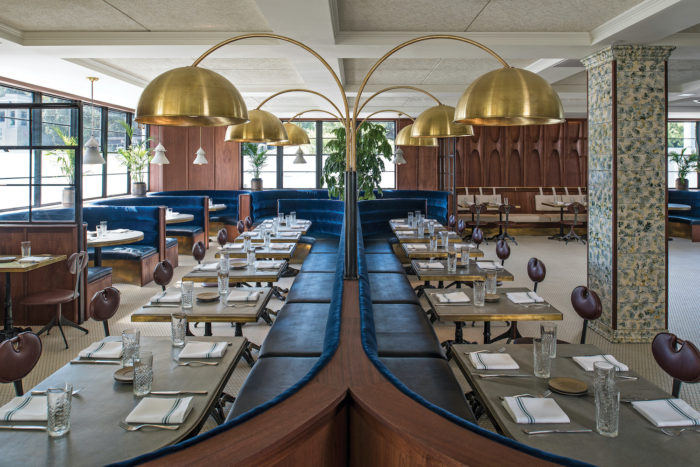
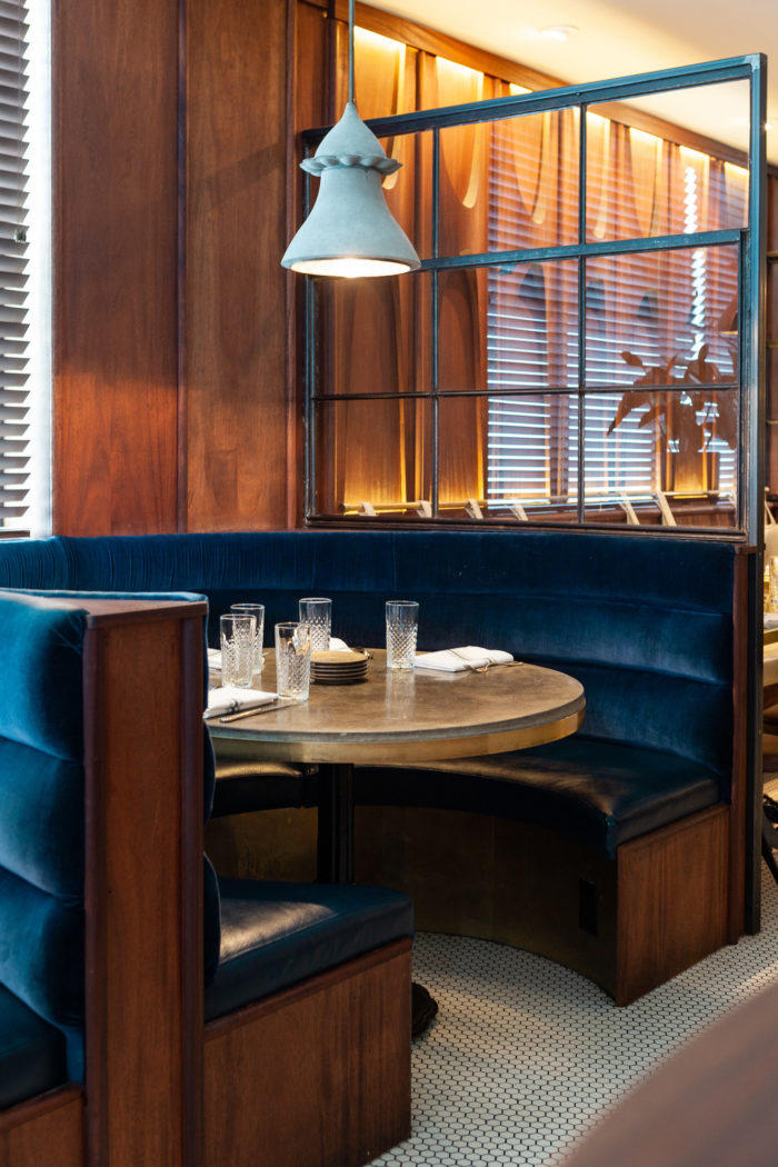
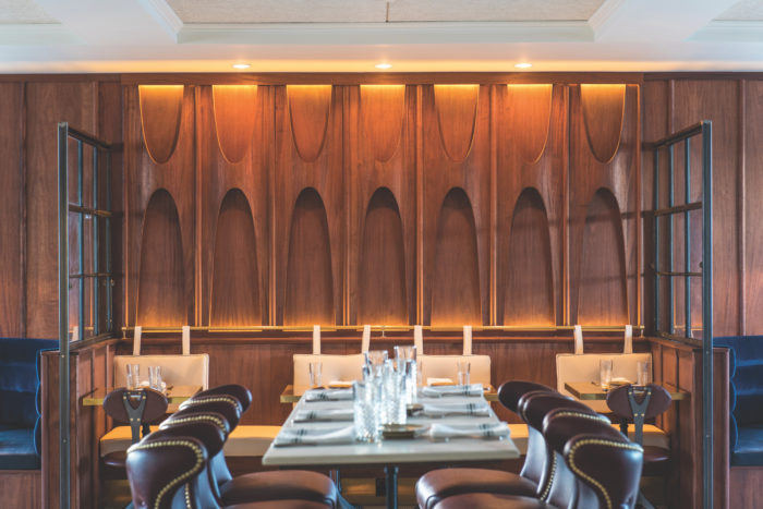
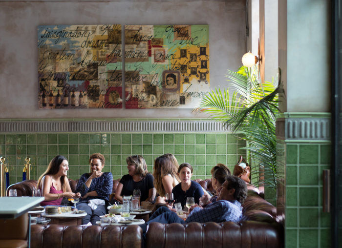
To deliver on the owner’s desire for a more intimate space, the Café features a lowered, coffered ceiling which sets the tone upon entry. The mahogany wood wall panels were inspired by midcentury modern design but with an Art Nouveau twist, bringing a modern take on old contemporary furniture and wall paneling. Velvet upholstery covers central and perimeter banquette seating. A large, central banquette accommodates large groups while remaining flexible enough to separate out for smaller parties. Ample banquette seating was chosen to foster the notion of the place as ideal for gathering, thinking, drinking, and dining.
To create an appropriately light-filled Study, the ceiling height was increased and the roof was opened to showcase the new addition of an extended steel skylight monitor above. The monitor adds visual lightness to the space while maintaining the structural integrity. The Study’s furnishings take cues from Cedar Tavern, albeit in simplified forms so as not to detract from the light-filled steel structure. Carefully curated books, curios, and plants adorn the walls creating a sense of a lived-in space. Custom designed and fabricated wall sconces continue the industrial character of the steel and utilize heat sink fins to create the unique style of the lights.
The interplay between the Café, Study, and Cedar Tavern is key to changing the mood between spaces, producing varied dining experiences, and options that work together to create a rich experience.
Architect: Clayton Korte
Design: WIT, Mickie Spencer
Photography: Merrick Ales, Chloe Gilstrap




Now editing content for LinkedIn.