The Terrace Restaurant
Saniya Kantawala Design have created a tasteful and bold design aesthetic from the moment patrons walk into the Terrace Restaurant in Mumbai, India.
The dining experience at a restaurant begins as soon as the customer walks into the restaurant. The choice of color, material, and signage all inevitably add to the visual appeal of a space and entice consumers to visit it. In this age of social media and Instagram, the fascination with posting about our ‘where’s’ and ‘when’s’ has completely re-defined the process of conceptualizing a restaurant and its design. Clients now trust designers for attractive colors and balanced tones and the need for a non-fading a practical approach in a space today. The design brief for The Terrace was inspired by this idea of creating a visually enticing space that could allure and mesmerize customers as soon as they step inside and compel them to post on social media and thereby attract more customers.
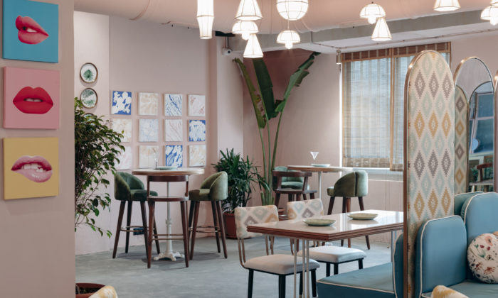
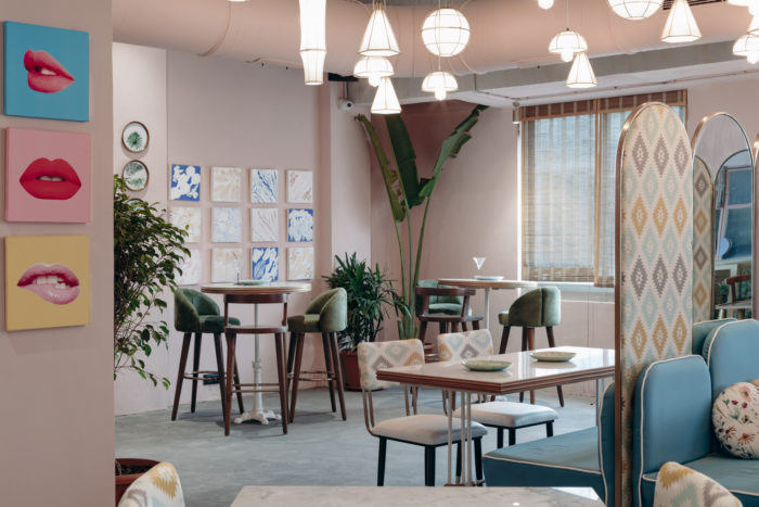
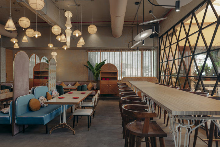
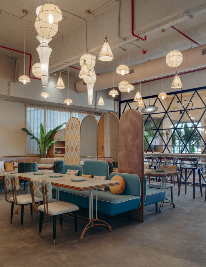
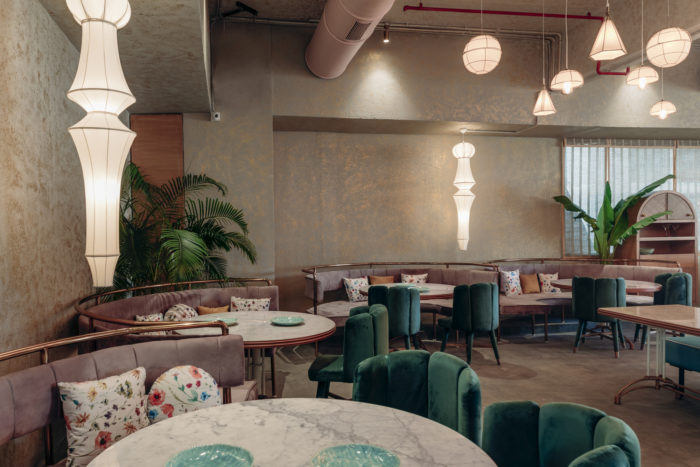
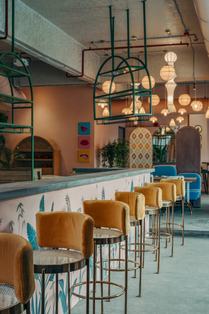
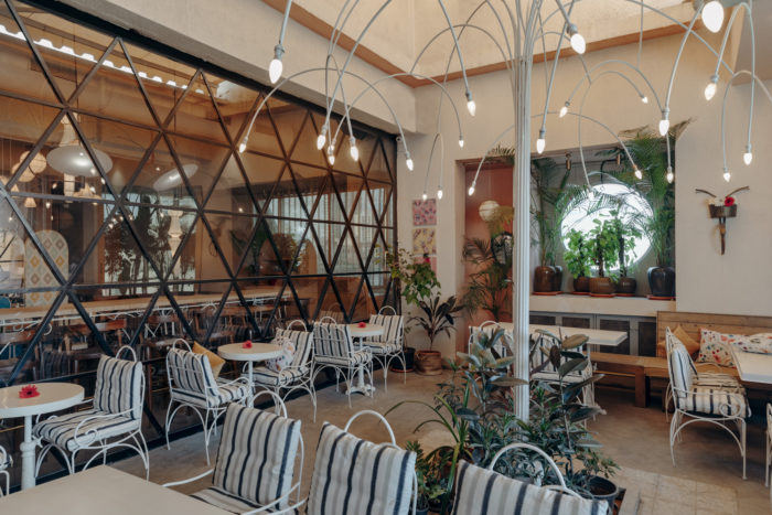
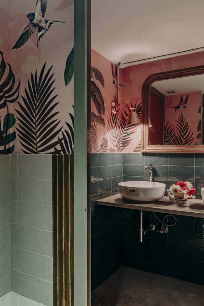
A restaurant primarily for the millennials and gen-x, the entire theme and decor for the space includes elements that are attractive to this genre. The Terrace comprises of a 2200 sq. ft indoor area that has been divided into several zones with a variety of seating that includes – high community seating to circular booth seating. For Saniya Kantawala, the principal designer of the restaurant, understanding the client brief and bringing it to life was instinctive, as she is a millennial herself; hence, millennial pink has been used in a variety of ways in the space. The combination of brass and pink, eclectic seating and dramatic jewel-shaped decorative lighting has been incorporated in diverse ways.
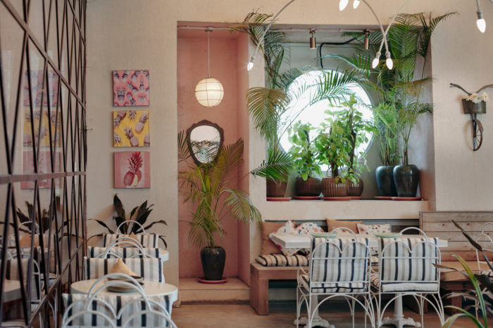
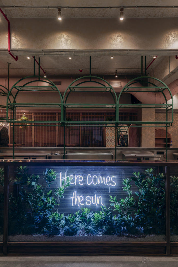
The bar has a glass façade on one side with plants and a neon light circle with the words ‘Here comes the sun’, which suggests that happiness really lies here. A key highlight, this is the most eye-catching feature of the restaurant. The space is extremely quirky with pop-up art that is displayed on the walls. The immediate area around the art reflects certain imperfections that reiterate the belief of the millennials who believe not everything in the world needs to be perfect.
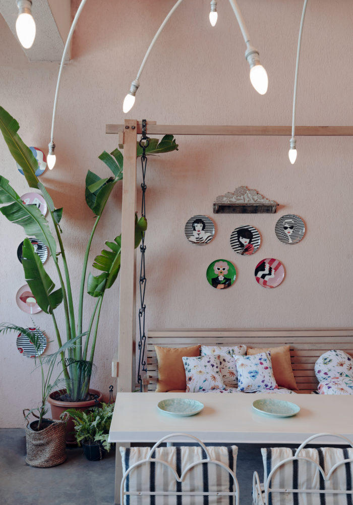
The outdoor area, a 600 sq. ft terrace garden, has a central light installation with lots of plants surrounding it. Quirky bent chair plates accessorize the walls of the garden and the seating has been arranged in such a way that it makes one feel like they are amidst an art garden. A swing installed in the garden also lifts the ambiance of the space and creates a visual that makes the restaurant ‘photo-worthy’.
Design: Saniya Kantawala Design
Design Team: Ritu Parekh and Simran Kanugo
Photography: Darshan Savla



Now editing content for LinkedIn.