MO Gallery & Lounge
Inspired by a couple’s love for art and refined whiskey, Quarta & Armando set out to design the luxurious MO Gallery & Lounge as a sophisticated and detailed space in Shanghai.
Two very different souls coexist in a single space in Shanghai: a flexible art gallery and a sophisticated lounge floor, with one secret.
A couple from Shanghai who has worked abroad for years in finance decided at some point to go back to their hometown and dedicate themselves to what they really love: art and refined whiskeys. In this context Quarta & Armando have been called to design two very different environments but connected by the type of experience that the owners want to offer to their guests.
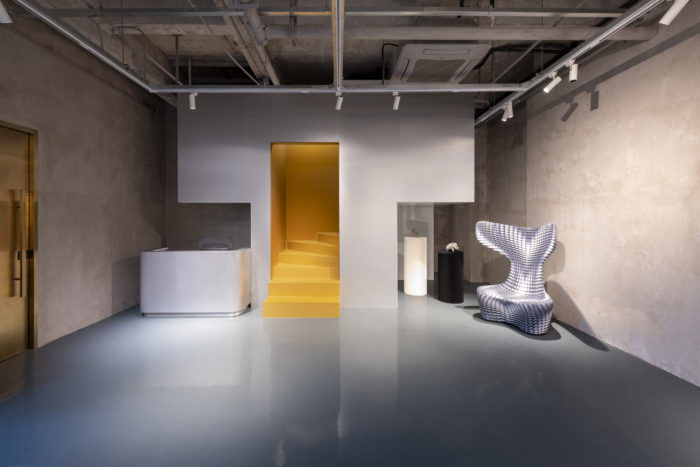
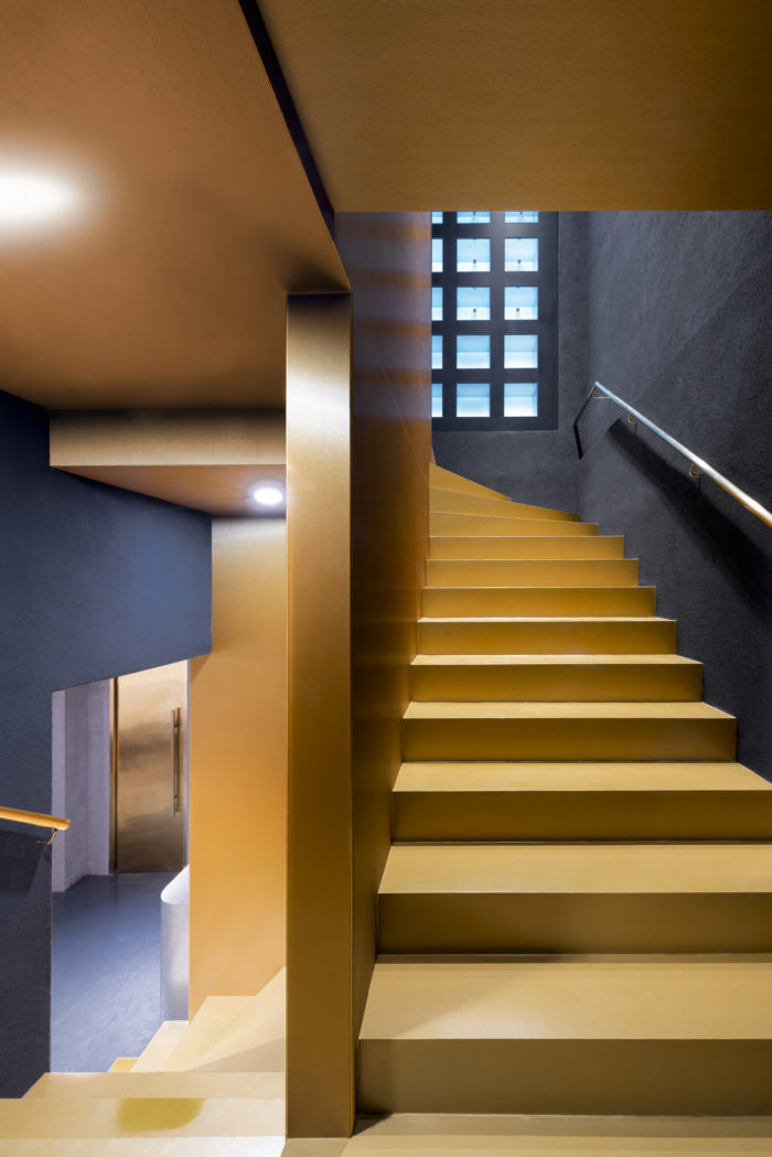
The ground floor has been designed as an extremely flexible single space in terms of partitions and use. The floor is made with a gray-blue color resin, reference to a calm sea which helps the concentration of the artworks observers. Different types of exhibitions will take place here during the year and the possibility of changing the gallery setting was a key point from the beginning of the project. The element that particularly catches the eye is undoubtedly the staircase, to which a particular visual importance has been dedicated. This, conceived as a functional cube cut out of its superfluous parts, suggests the entrance to a completely different space in terms of functions and materials. The box is made with a metal-clad structure hiding both storage units, a small working area for gallerists and the staircase.
Inside this sculptural element a golden space reveals itself and from here a tongue of steps lead us to the upper floor where we can see a feature wall with the real protagonist of the lounge: time, here identified with the aging of whiskey bottles.
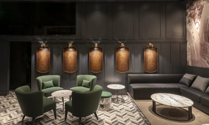
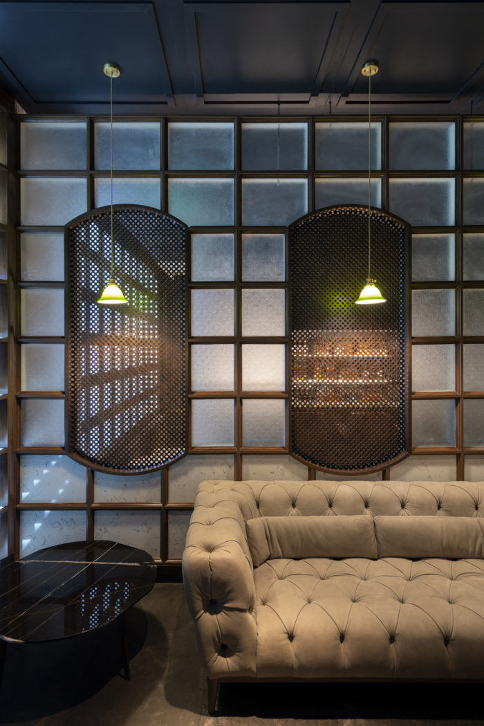
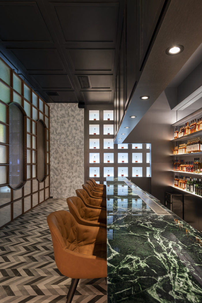
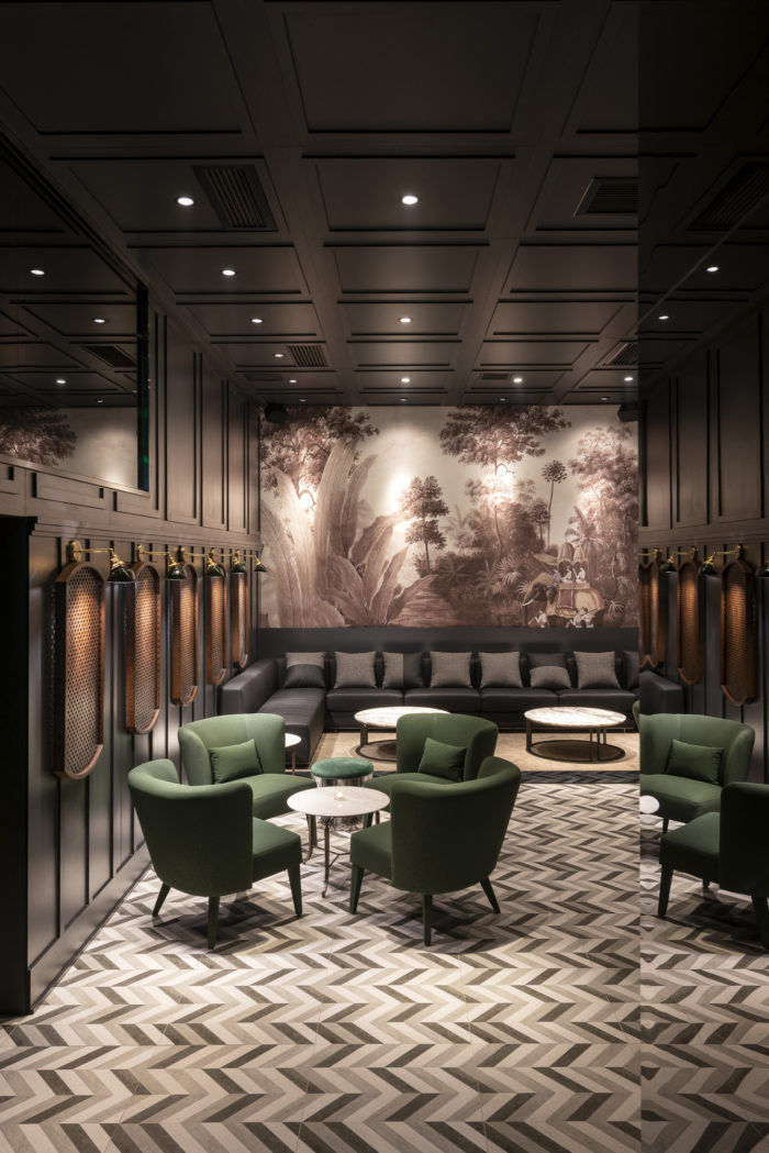
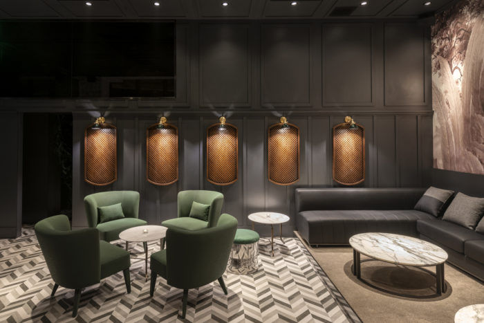
Here the environment clearly changes: from the minimalist art gallery we get into a more sophisticated and detailed space, almost nostalgic. A strong use of old construction techniques such as boiserie on the ceiling and woven rattan for partitions give this space the warmth of times long gones. The bar top is made with a Indian green marble while black and white colors have been selected for the tables. The furnishings are in leather and the colors vary from brown to beige to the green of the armchairs in the main space.
This latent nostalgic feeling is often broken by contemporary elements that seem to deny it: the mirrored coverings and metal finishes lighten and enlarge the space, breaking the classicism of the boiserie ceiling. A custom made wallpaper dominates the main space and a mirrored glass on the wall lets the customers perceive the presence of a further hidden space.
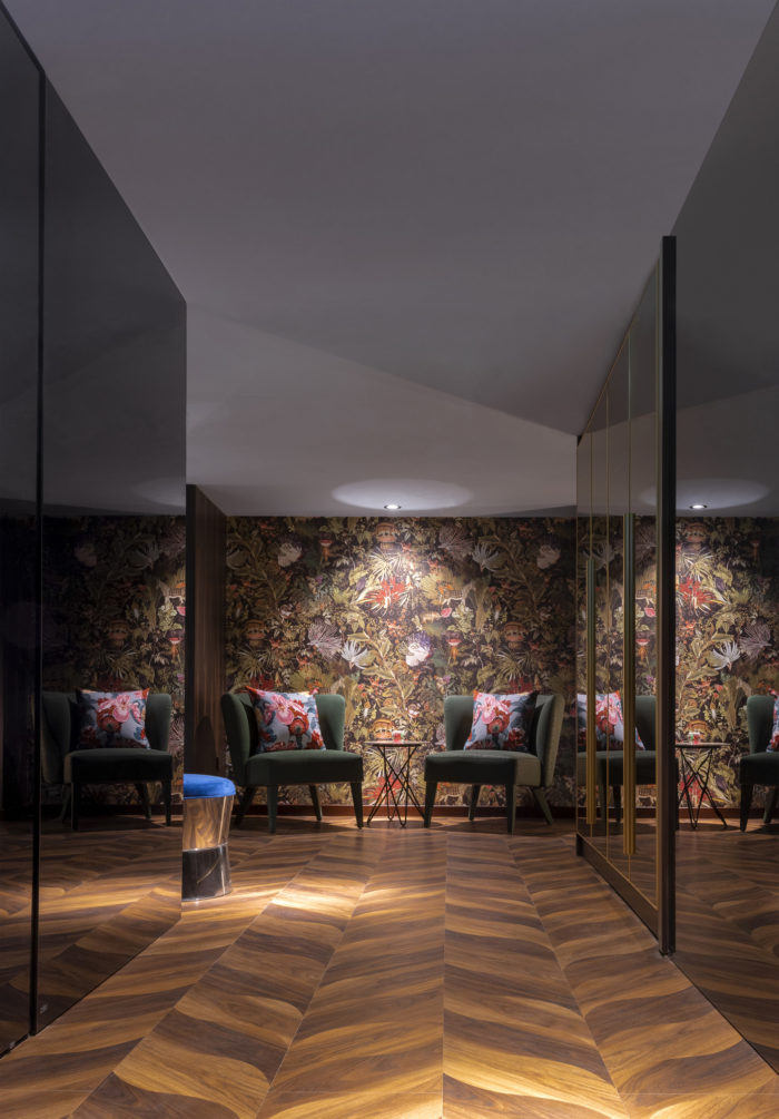
Taking advantage of the full height of the space, a third, secret floor can be accessed through a hidden entrance concealed in the boiserie wall. This floor can be reached by customers for private events from which they can have visual access to the space below without being seen. In this area, particular attention has been given to the use of refined wallpapers and each room has its own theme in terms of color and furniture. The walls with mirror surfaces create games of colors and geometries otherwise impossible in a closed space like this.
Design: Quarta & Armando
Design Team: Gianmaria Quarta, Michele Armando, Gu Tao, Tianyi Mao
Photography: Dirk Weiblen



Now editing content for LinkedIn.