Paragon Tea Room
Haeccity Studio Architecture completed Paragon Tea Room, an addition to complement an existing café along Vancouver’s Cambie Corridor.
The tearoom is the first of its kind, introducing the newest technology in tea brewing to the city.
Teaspresso mimics the same methodology of espresso making by extracting the essence of tea and delivering a delicately finessed cup with efficiency. Exploring this new product was imperative to the architectural design process, entailing a long first phase of research with many design rounds to understand exactly what the team was designing for. They worked in proximity with the graphic designer to achieve a space that would be coherent with the branding as well as the product.
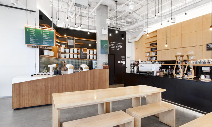
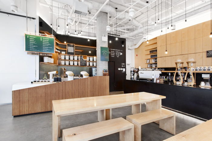
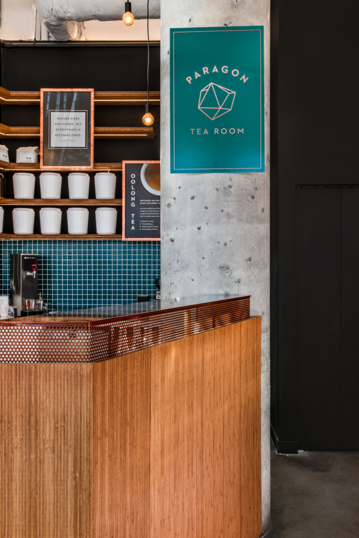
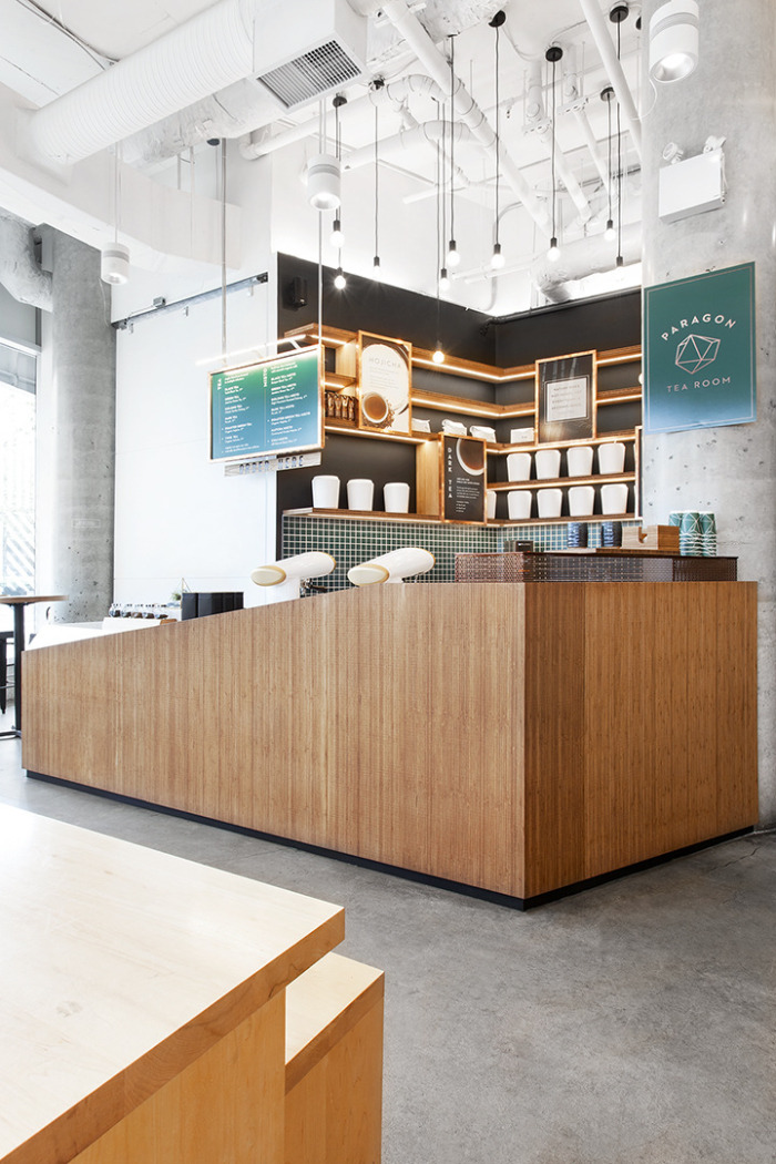
The design is inspired by the Zen qualities of tea culture – warmth and natural earth tones are conveyed with the use of bamboo plywood and dark green tile against a black backdrop. These notes are balanced with contemporary cues such as the white quartz countertop and copper screen that celebrate the tech-forward aesthetic of the Teaspresso machines.
Along with some of these guiding principles, Haeccity designer Jorge Roman also had to consider spatial limitation and the shared space that Paragon Tea Room occupies with its neighbour, Porto Café. He elaborates, “We played by the rules of the existing café by using the same proportions, counter heights, and backsplash– essentially all the same dimensional rules to keep the same datum lines along the interior space to create harmony.”
In contrast, Haeccity designers used very different materials and shapes but the vision was that the two spaces would mutually complement, rather than compete with one another. The prominent angular forms respond to some of the chamfered shapes at the existing neighbouring café. It was important to gesture at such visual connections in the design but also articulate the hinge points, exemplified by the bold transition in materials from bamboo to white quartz.
The resulting design offers an inviting space for guests to enjoy a perfectly brewed cup of tea where the ancient practice of tea continues to thrive and innovate.
The project is the addition of a tea shop to an existing café. We wanted to respect the original, finely designed space by playing by the existing rules. We referenced the existing proportions, counter heights, and backsplash – all the same dimensional rules to keep the datum lines throughout. At the same time time, we used very different materials. The aim was to be different, but complementary to the existing café.
Design: Haeccity Studio Architecture
Photography: Krista Jahnke, Upper Left Photography


Now editing content for LinkedIn.