Lee’s Donuts
Haeccity Studio Architecture updated both front of house and back of house function and design at the iconic Lee’s Donuts in Vancouver.
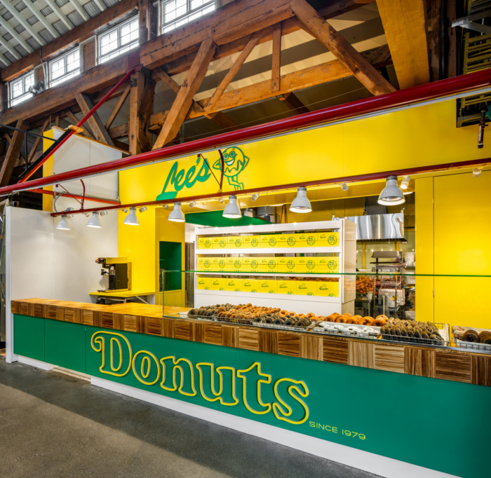
Haeccity Studio Architecture has just completed a renovation of Lee’s Donuts. An institution at Granville Island Public Market, the facility had not received a major upgrade since its establishment in 1979. A feature in Netflix’s “Breakfast, Lunch & Dinner” with David Chang and Seth Rogan only added to Lee’s Donuts’ popular legacy, increasing demand for an already strained production and service capacity.
The principal challenges of the project centred on a pair of juxtapositions. The first involved increasing capacity, both in back-of-house production and front-of-house customer interaction, within the existing business footprint. The second juxtaposition involves the challenge of maintaining the retro charm of a 40-year-old business when completely replacing its fixtures and finishes.
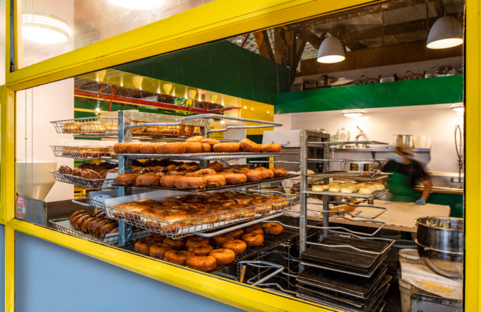
The solution here involved observing business operations over the course of a business day, identifying opportunities to increase the efficiency of movement, storage, and display. For the back-of-house kitchen facilities this involved rationalizing the donut-making process into a series of steps, establishing the associated space and equipment requirements for each step, and organizing them into a looped array that minimized the movement of people and product, eliminating unnecessary cross traffic in the restricted space.
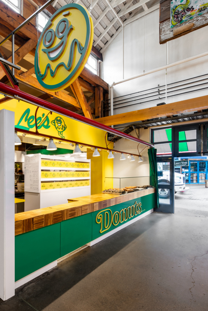
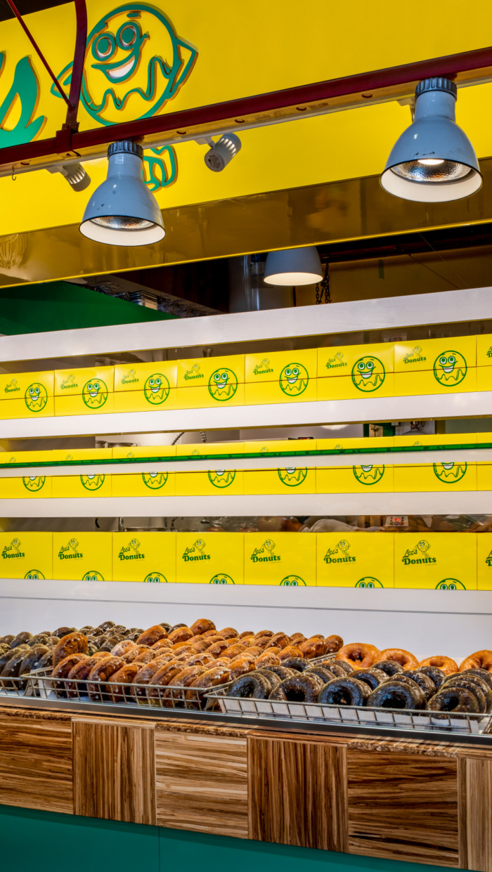
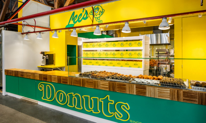
While the benchmark for production was a typical day, opportunities to easily reconfigure the work areas to accommodate peak holiday demand were identified. Efforts to improve front-of-house customer service focused on accommodating the flow of multiple employees handling customer interactions. Additionally, product display areas were closely coordinated with the module of the 12″ by 18″ donut basket, the arrangement of which can be configured to accommodate maximum donut density during peak business, and spread out to avoid having shelving appear empty as product supply diminishes.
The importance of the client’s brand is evident, with legacy colours, fonts, and logos providing the connection between the historical and the contemporary. Lee’s Donuts’ colour scheme of primary green, yellow, and white is used throughout the project on millwork and bulkhead finishes. The original logo and font are given a contemporary twist with laser-cut plywood signage elements at the storefront. The overall result of these efforts to balance old and new is a store that at once comforts and excites longtime customers.
Design: Haeccity Studio Architecture
Contractor: Pacific Solutions Contracting
Photography: Upper Left Photography