Jess Restaurant
BIANCOEBIANCA used simple patterns and materials combined to create a minimal but pop up interior for the Jess Restaurant creating a fun and stylish space.
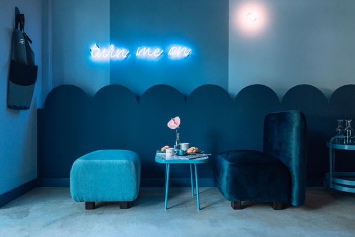
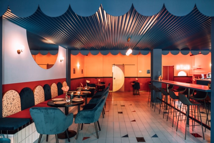
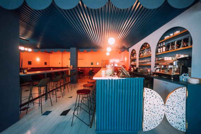
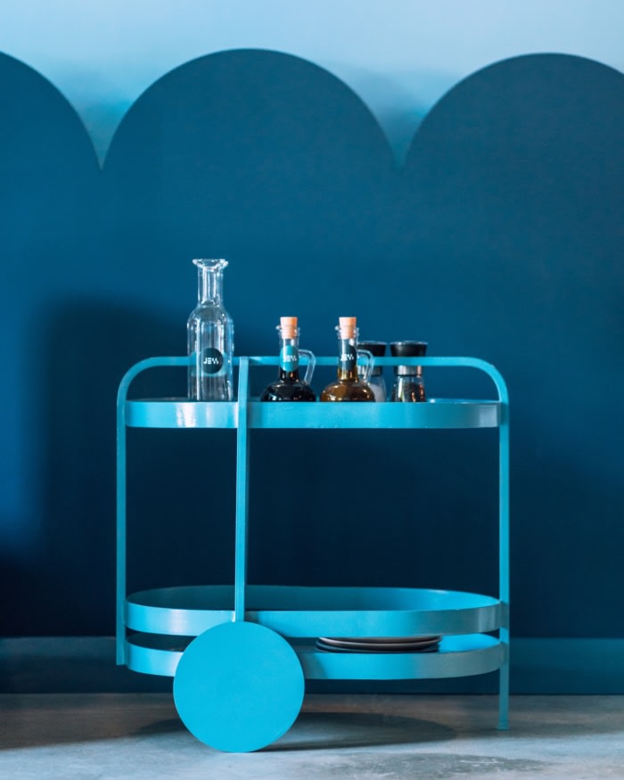
The concept of our project follows a constrast of bright and dramatic colors, and has a strong geometrical symbol that keeps on repeating in the space throw different materials, shapes, colors and objects . The half circle, present in the logo of the restaurant and the interior space, a symbol for Biancoebianca studio.
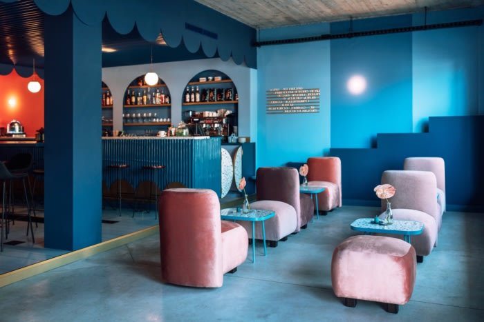
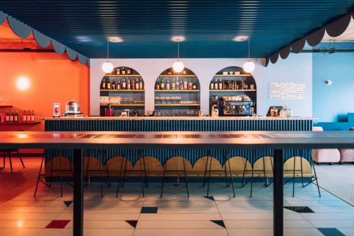
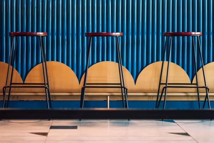
The box in box effect, the wow factor of the restaurant breaks the rules of the space. There are more patterns created by simple geometry , more colors usage . the design style is starting to look more dramatic rather than fresh and bubbly. The designers used a Wes Anderson color palette. Also there are some repetitions of magical numbers like 3 arches , 7 chairs , symbols that the design studio used as a concept to develop their imagination.
Biancoebianca studio is remarkable on the deisgn market for their childish approach, yet sophisticated . Bubbly shapes , curves , “yummy” materials are mix to create the mood of the space.
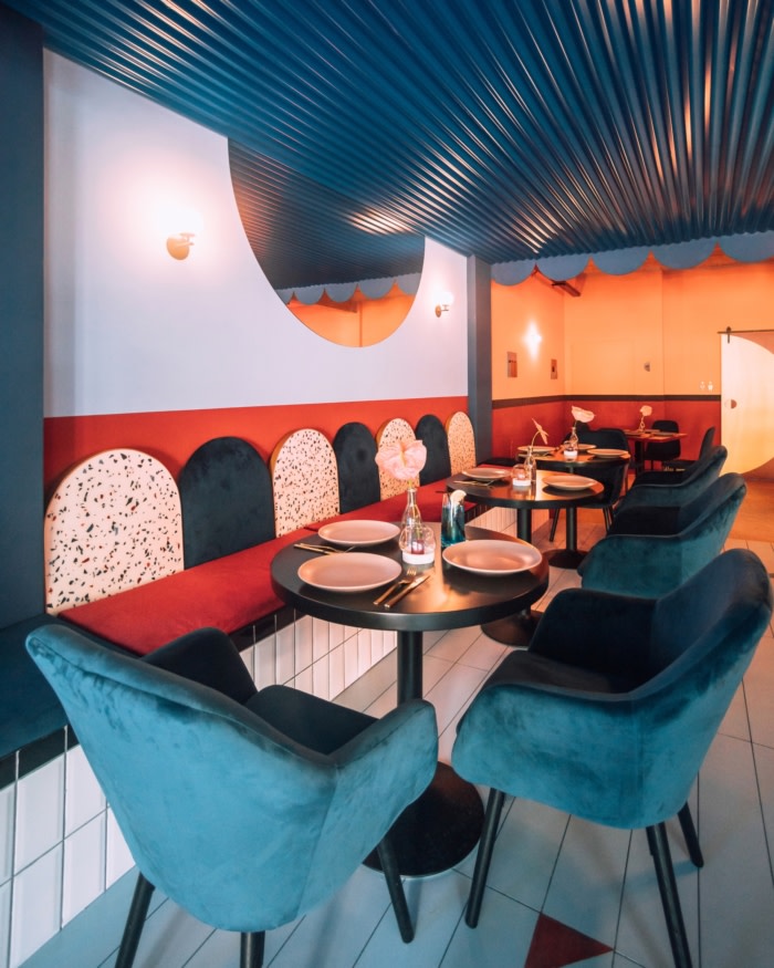
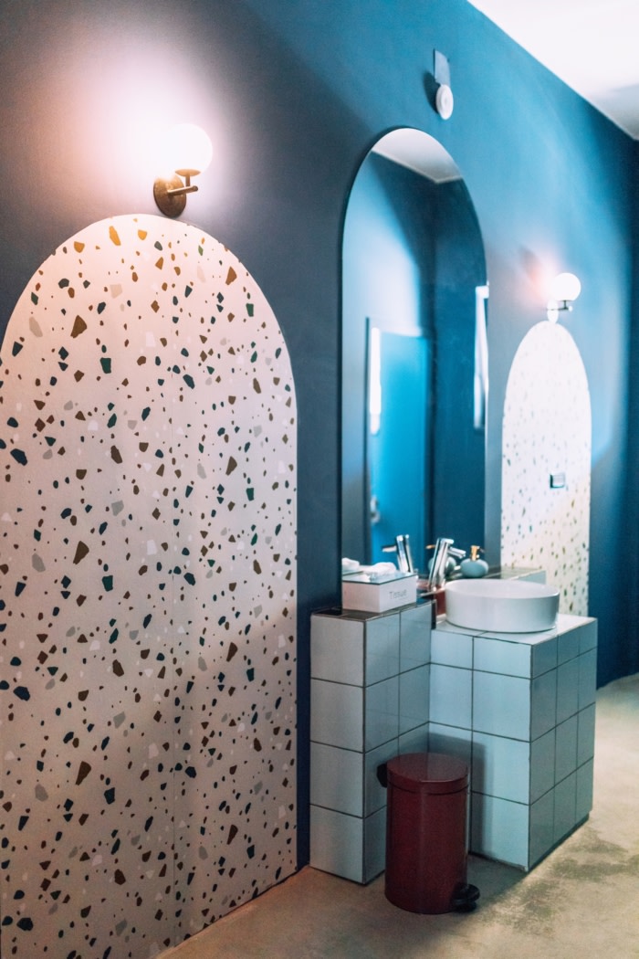
The customized resin – terrazzo pattern is the key in the design of Jess, which was designed and made piece by piece by the designers mixing some materials, like acrylic resin.
The same color shades are overused and used as table tops , backrests , bar door details, and bar counter.
Biancoebianca customized and designed the flooring in the center area of the restaurant , creating a 180 change between the rought concrete flooring that gives it a neutral feeling and the geometrical, colorful new pattern. Which is actually the terrazzo effect in a bigger, oversized scale. Every corner of the space has been taken care of: the design of the tables, the carts, bar, accessories, graphics, doors, symbols till the wall art of the space. A strong graphical eye is present in the space, throw simple patterns, colors and textures.
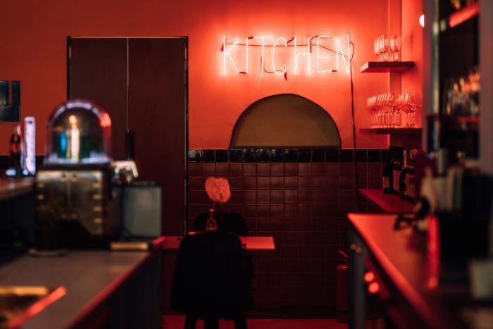
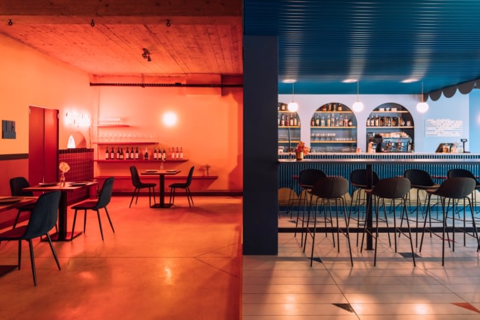
The back part of the restaurant represents the maturity, the design approach is more simple, with a twist of colors, bold lines.
The combination of royal colors in contrast with the baby bright colors was a challenge to highlight the 3 spaces and the mood for each one of them.
Design: BIANCOEBIANCA
Photography: Raul Jichici