Oborozuki Japanese Restaurant & Bar
The design from Giant Design for the Oborozuki Japanese Restaurant & Bar was to be a modern take on traditional Japanese interiors with a sense of luxury befitting the quality of the food offering and dining experience.
A year and half in the making and a with a budget of almost $5million, Oborozuki was been a labour of love for Giant Design. This was a complex site for services, with restricted head room to certain areas and difficulty in getting materials for the build. This all added to the challenge.
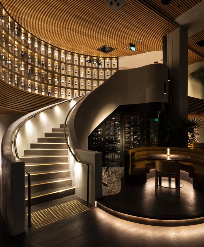
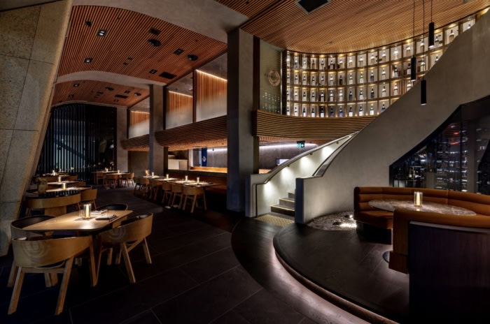
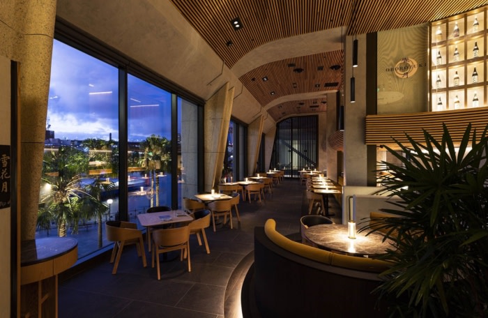
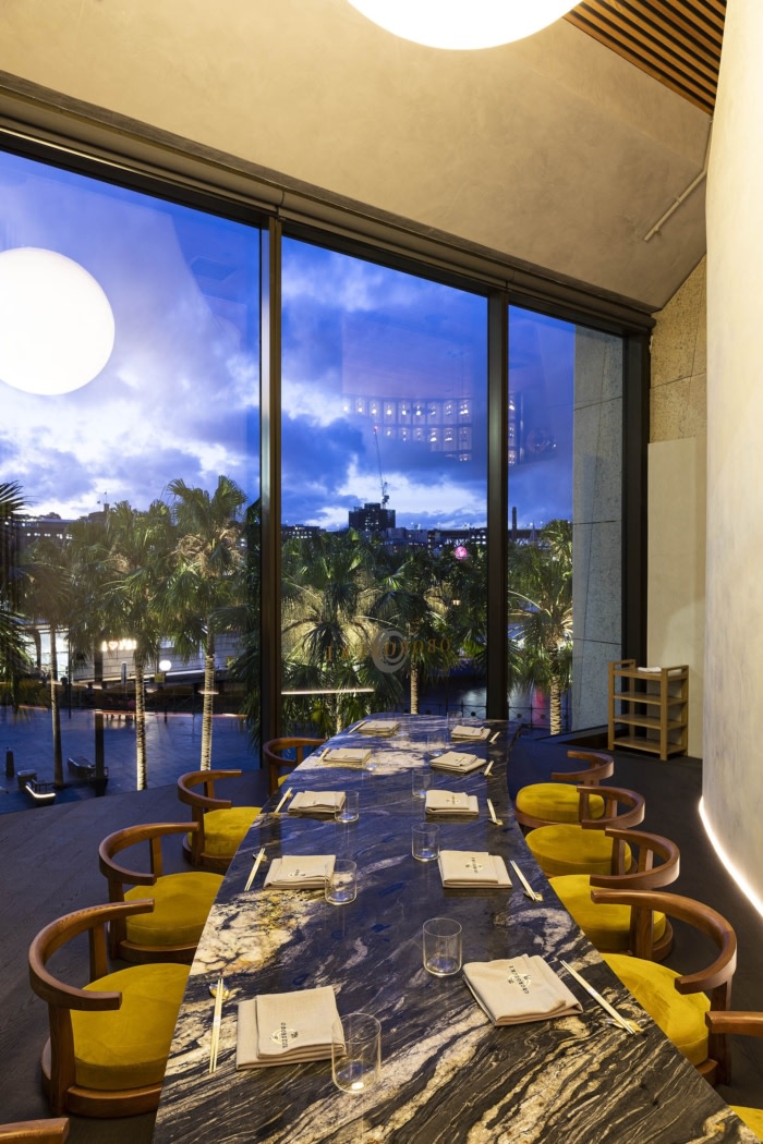
The client brief for Oborozuki, Circular Quay, was concise; create the best Japanese restaurant in Australia. Expansive harbour views through the double height windows of the new Opera Quays building was a good starting point for this mission, as were the architectural details of the site including exposed, curved, concrete beams reminiscent of the Opera House interiors and a set back mezzanine with grand spiral staircase, which have been treated lightly with a microcement coat and left exposed.
Oborozuki roughly translates to hazy moon, an allusion that provided ample inspiration for the interior direction. Alongside the traditional Japanese features of light slatted timber panels and ceilings, softly rendered walls and slate floors, there are layers of dark reflective surfaces and moody elements that cast a mysterious veil over the space.
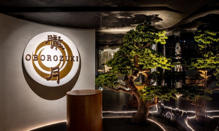
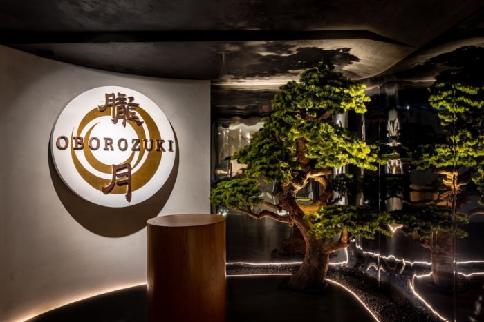
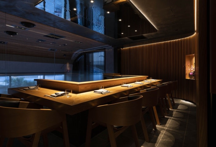
The patron enters into a round reception of smoked, mirrored walls and a black, polished plaster ceiling that reflects a simple podium reception desk and sculptural tree. This space opens out to the mezzanine, where curved up-lit walls lead to 3 timber clad teppanyaki rooms, deliberately located to ensure privacy and exclusivity, while allowing glimpses of the chef’s activity from the dining room below through smoked mirrored ceilings and graded frosting to the glass fronts. This gradient to this frosting is reminiscent of fog on moonlit water, a nod to our hazy moon.
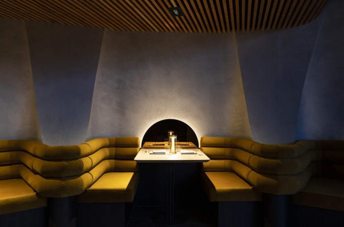
Flanked by a curved wall of uplit Sake bottles, a spiral staircase descends into the main dining space encircling a single circular booth sitting pretty on a raised plinth. The curved forms continue throughout, with 2 person booths nestled inside niches cut out of a monolithic double height micro-cement wall with a cut-out that reveals an epic glowing pendant in the private dining room beyond, a hazy moon on the horizon.
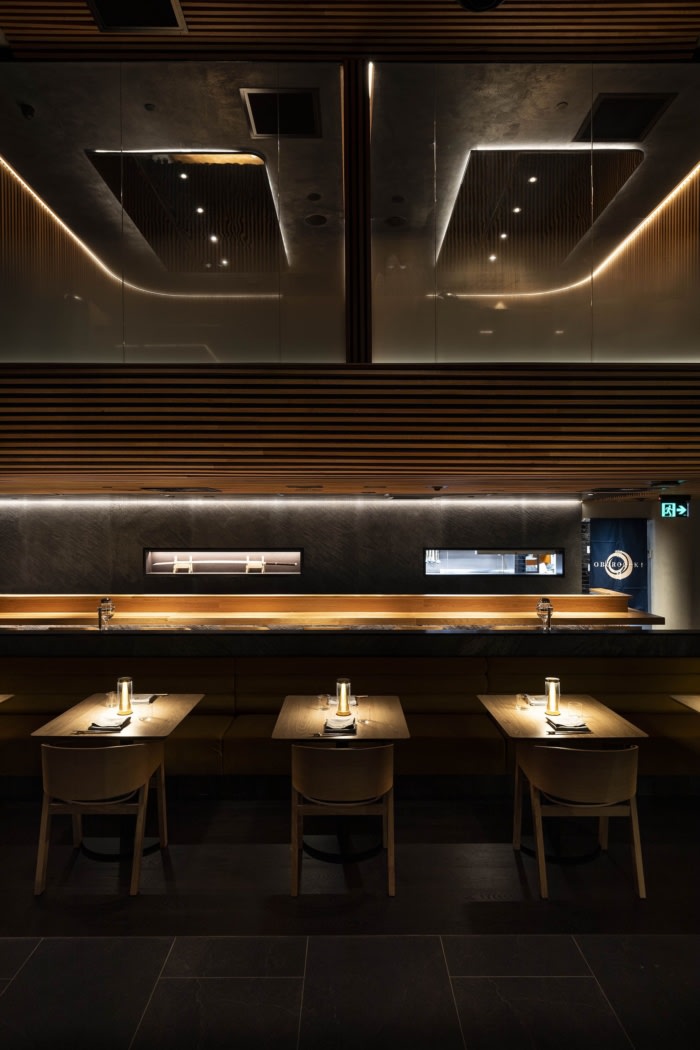
Elsewhere in the room an Omakase counter glows in front of slate walls, turning the back of the space into an exclusive experience, whilst a la carte diners take in the sumptuous views of the harbour.
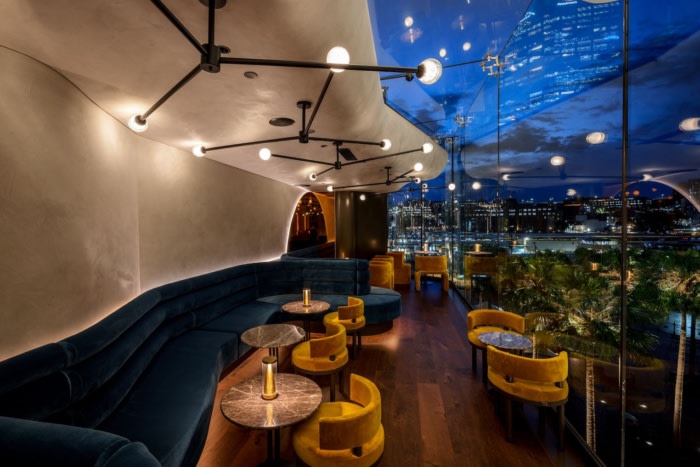
In the narrow glass walled tenancy next door, a slender cocktail bar extends the concept further. A galaxy of pendant lights sparkle in the sky from curved micro-cement forms above a snaking velvet banquette and dark timber floors giving the effect of floating in the night sky and maximising views across the quay.
Design: Giant Design
Design Team: Ed Kenny, Chris Wilks, Alysha Mornane
Photography: Andrew Worrsam



Now editing content for LinkedIn.