Luneurs Bon Enfant Bakery
hcreates interiors and design explores the theme of “retro futurism”, ignited by a series of retro-futuristic illustrations by a French Chocolate Factory in the 50’s and 60’s for the Luneurs Bon Enfant Bakery.
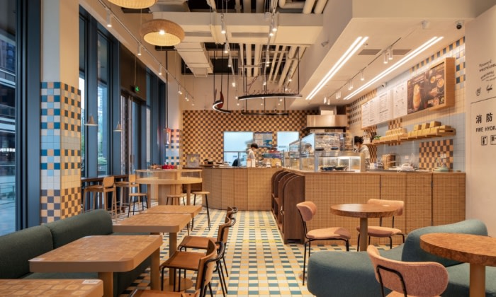
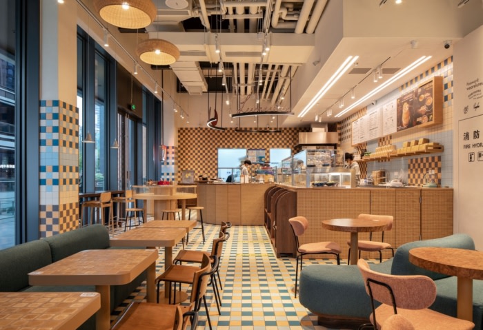
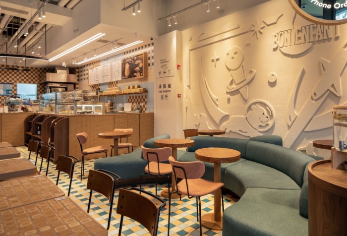
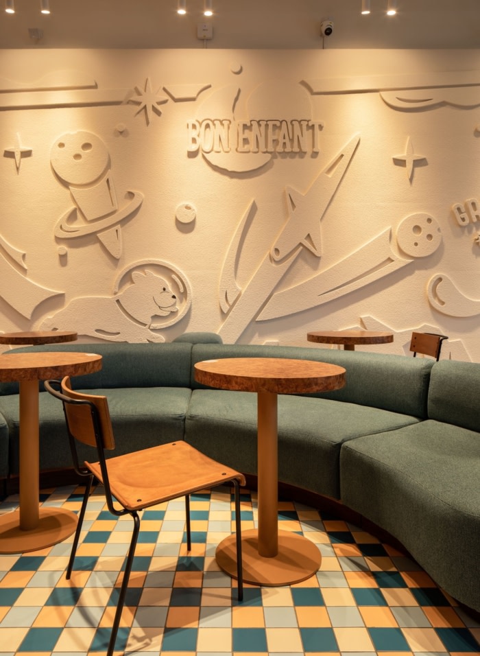
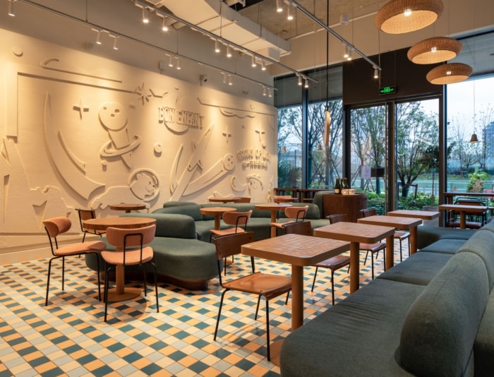
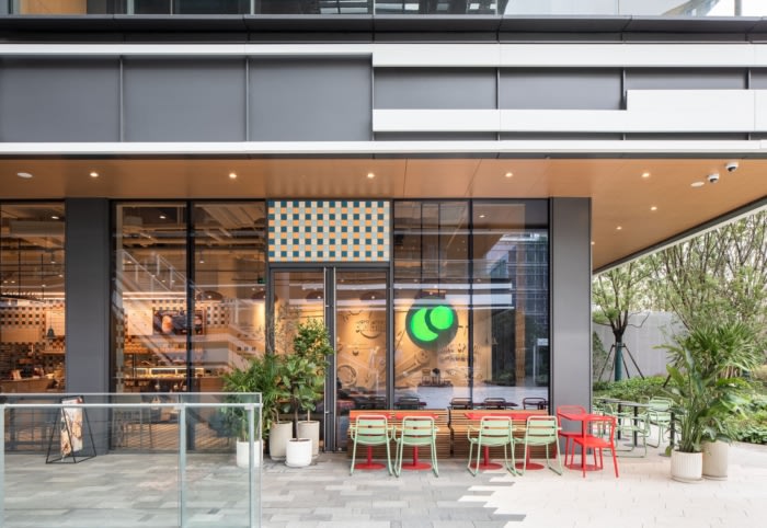
Retro futurism itself is a sort of contradiction; visions of the future from a time gone by, allowing us to play with the past era in a contemporary way. Evident in the French illustrations was the use of color, curves, movement, and form, and the general graphic, energetic style. When approaching both the layout and spatial design we tried to integrate these aspects as much as possible, from the sculptural curving bench seats that define the seating area to the iconography within the feature wall itself. The checkered tiles throughout were inspired both by the bold colours of the retro futuristic style but also by a vintage French tile catalogue we stumbled upon.
It was critical for us to ensure we were reinterpreting the concept in a thoughtful way that didn’t feel kitsch or too themed, but rather inspired by the playfulness of the Luneurs brand. To do so, we chose key elements to focus on subtlety, all the while curating a space that still felt modern and relatable.
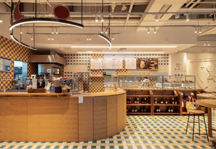
As the space is rectangle in plan, with defined entry points, our layout was originally controlled by the placement of the kitchen and the main circulation. From there we were able to take a playful approach to the seating. The two large sculptural bench seats reject the conventional form and create unorthodox corners and pockets for customers to sit and engage. The burl tables, an ode to the retro era and rounded imagery of the futurist aesthetic are ever so slightly oval rather than circular, while the collection of light and dark timber cabinetry offers a warmth and casualness to the space.
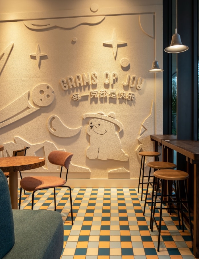
Acoustics is important to Luneurs who collaborate with Zenfeel to support the environment in their stores. At Mixc we integrated both concept and acoustics in the form of a 3-dimensional, iconography wall. On one hand this helps operationally with the acoustics in the space, but it also allowed one of the most obvious illustrations of the retro futuristic style. We specifically wanted this to feel like a wall finish rather than acoustics, so we spent some time developing an affect with the contractor that was integrated into the structure of the wall. It was also important for this to support the space rather than dominate attention, so the colour and texture was kept consistent and monochromatic to camouflage itself as part of the standard wall finish. We collaborated with Luneurs’ graphics team who provided the custom artwork (which even includes one of the owners dogs).
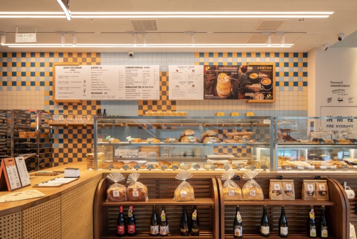
Often one of the biggest challenges for mall fitouts are the fire requirements. Understandably strict, they limit the range of materials we are able to use in the space, especially with regard to the softer materials that we associate with comfort and intimacy (such as fabrics and woods). This also has a flow on effect with regard to acoustics. For this project we used the coloured tiles on the main surfaces of the space, solving three aspects in one, concept, fire requirements, but also cleaning and maintenance. Due to the large amount of tiles, we had to adjust the size to be most visually effective and yet still economic. This involved using a larger tile than originally intended but also affected the colour options we had available. From there we created a custom tile pattern and layout throughout to tie the space together.
Luneurs are always excited and open to new ideas, and while they come to the table with thoughts and directions, they are also open to exploring varied concept directions. For the French/ Chinese owners it was important to bring both a new concept for this project under the retro umbrella, but also one which retained their French connection. This involved specific research into French inspiration, of which Retro-Futurisme was one possible direction.
Luneurs are incredible at what they do and we have been so fortunate to work alongside them on so many projects. For the MIXC location the client was enthusiastic about the concept and actively developed the brand and signage to align with this new aesthetic.
Take some time to explore the new mall at Mixc and check out the retro futuristic inspired Luneurs while your there.
Design: hcreates interiors and design
Photography: Brian Chua

