Hachiban Ramen
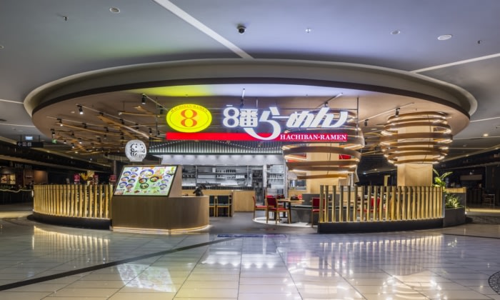
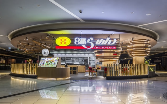
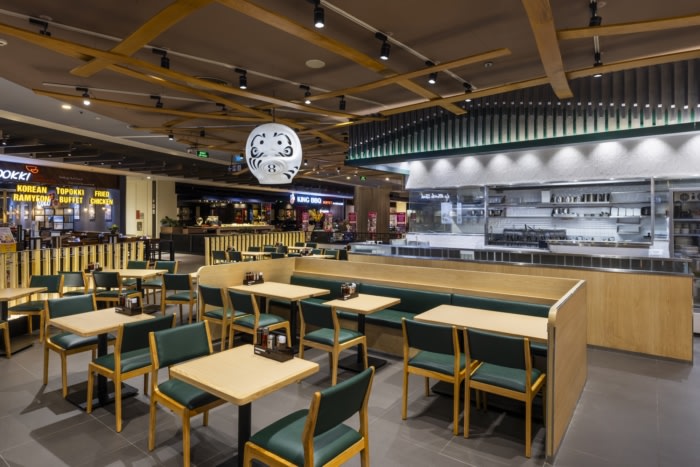
SEMBA focused on incorporating soft, free-form curves and playful elements to design a space for Hachiban Ramen in Ho Chi Minh City, including a unique spherical pillar and a suspended Daruma charm.
I wanted to organise the ingredients of ramen into a space. The main target customers were narrowed down to Vietnamese families and young people.
For this target group, I asked myself: “In what way can I express [Japanese ramen] image in a space to everyone?” After repeated trial and error, I have decided to stick with this approach.
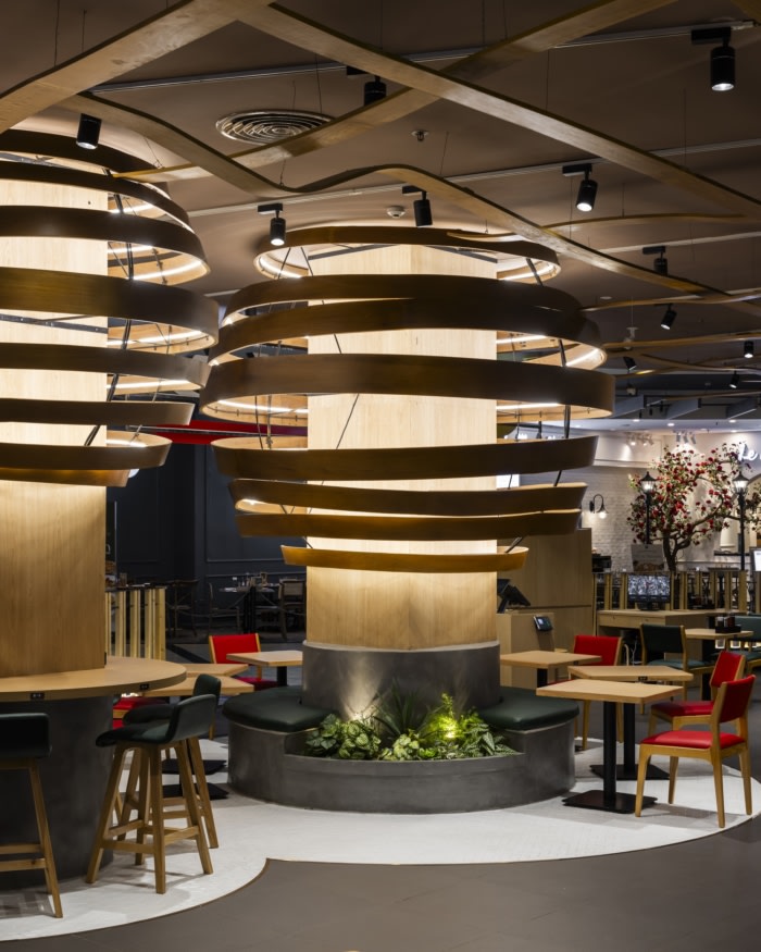
First of all, we wanted to incorporate soft, free-form curves into the design, given the food ingredient “ramen” and the compartment shape being a semi-circle. Then, with a particular playful intent, I tried to create a design that would make people unintentionally want to “Snap!” and take a photo of it.
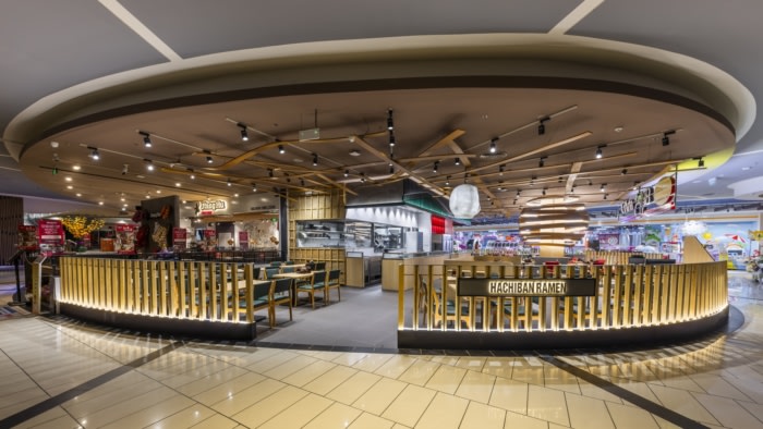
The spherical shape of the pillar rolls is reminiscent of a noodle ball, and the letter “8” is painted on the floor of the two pillars. This represents the “8” of the corporate name.
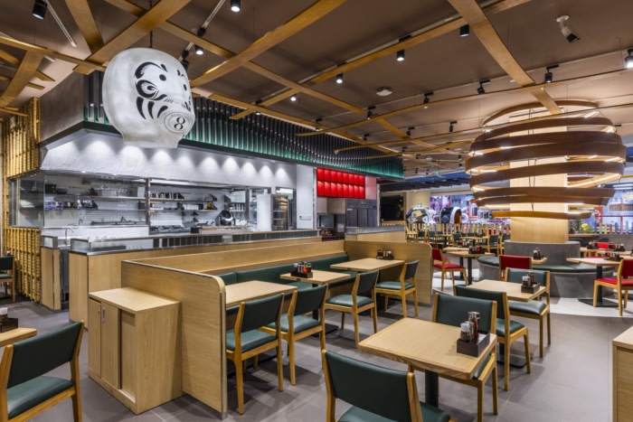
In addition, a large “daruma”, a well-known good-luck charm in Japan, is suspended from the ceiling. It is common to draw a lucky character on the belly of Daruma so I designed to paint the logo “8-ban Ramen” on its belly. Furthermore, we made Daruma itself luminous and extremely outstanding. The symbolised “Daruma” will develop an overwhelming presence.
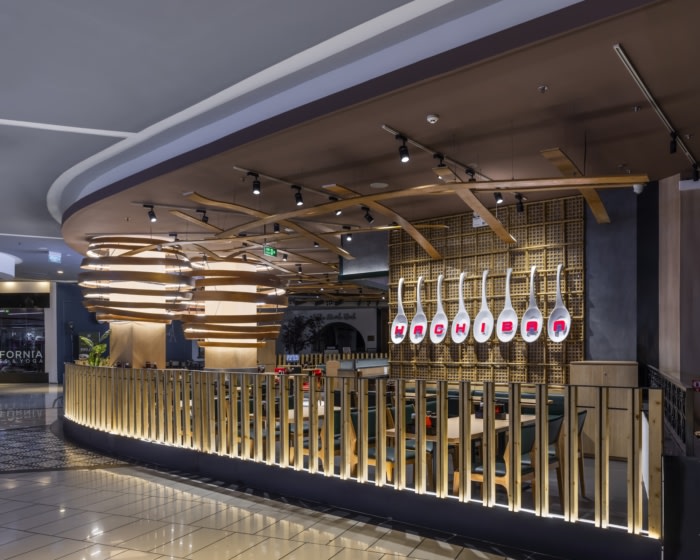
Curved wood panels were randomly hung from the brown-painted ceiling. The “menma”, a typical ingredient for ramen noodles, was also represented. The curved random wood panels suspended from the brown ceiling reminded me of “menma floating in ramen soup”, which is why I came up with this design.
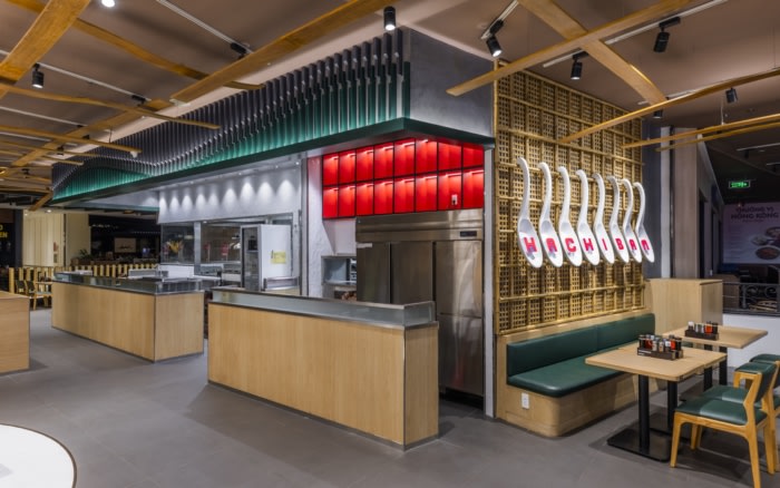
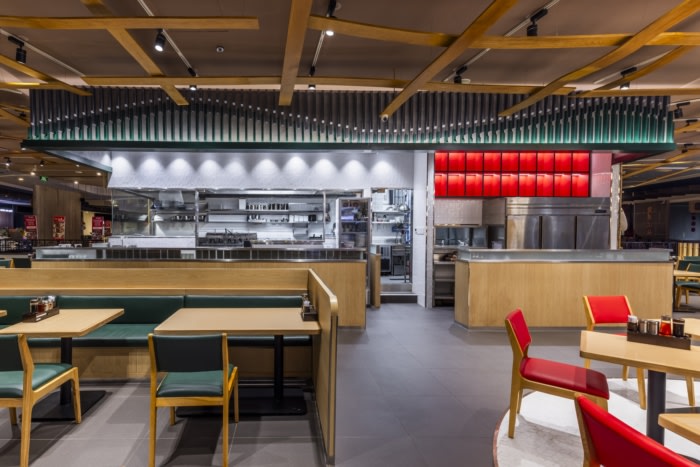
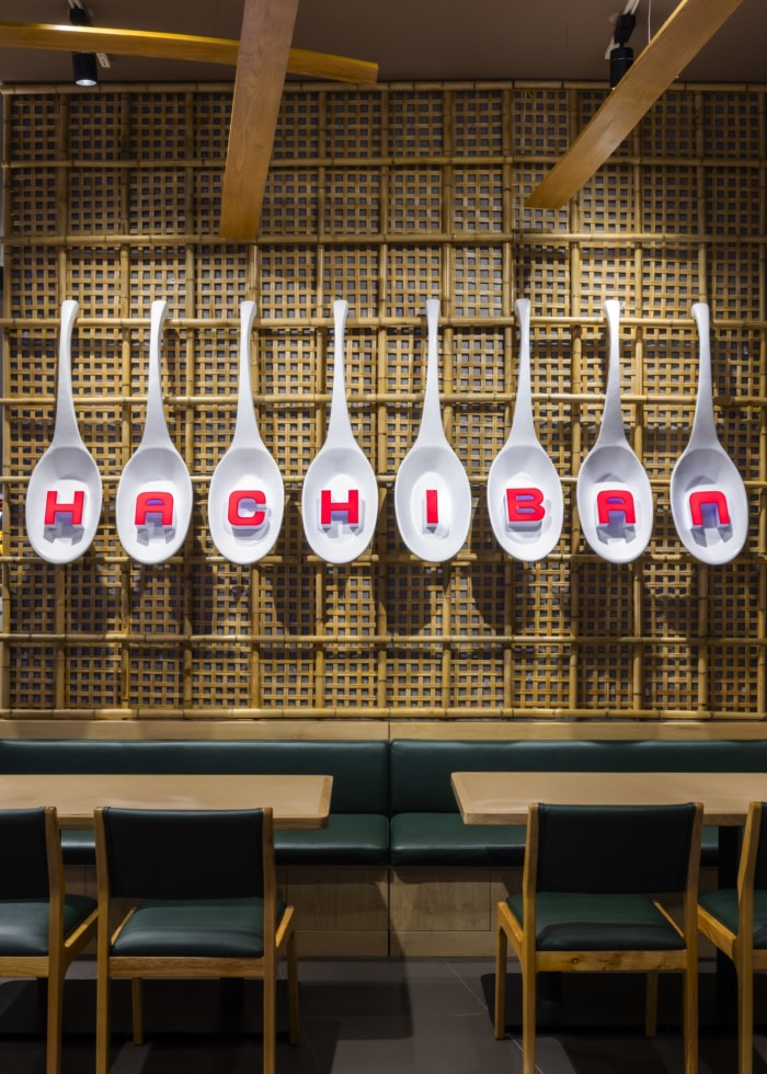
The LED letters on the object made in the shape of a Chinese spoon gave an image of “eating a boiled egg in a spoon”.
The curved line on the upper part of the kitchen lowering wall also expresses the softness of the noodles. We used the colour green as the CORPORATE COLOUR and installed a red display shelf below it, which is related to the complementary colour. The contrast helps attracting people’s gaze to the kitchen side and also contributes to the effect of showing a lively and clean kitchen.
Design: SEMBA
Design Team: Mamoru Maeda, Nguyen Ngo Thuy Dien
Construction: HTB
Collaborators: MIRAI IDCD
Photography: Hiroyuki Oki


Now editing content for LinkedIn.