The Roxy London
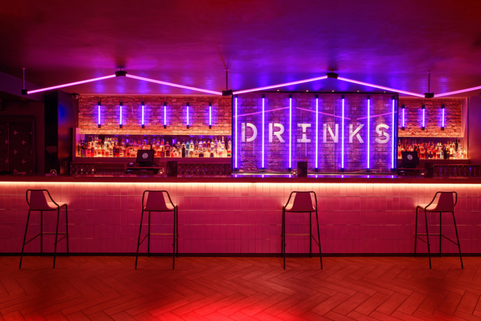
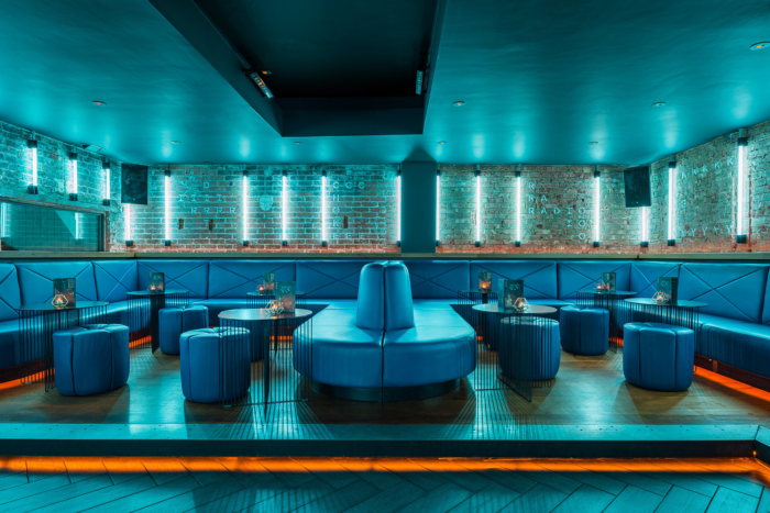
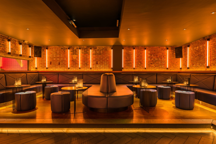
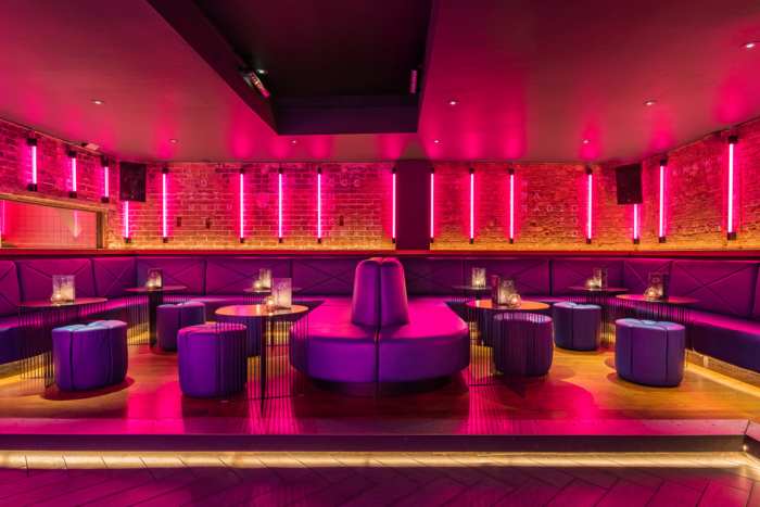
D.T. Practice has given basement bar and night club, Roxy, a fresh and dramatized look to appeal to a wider demographic of drinkers in London, England.
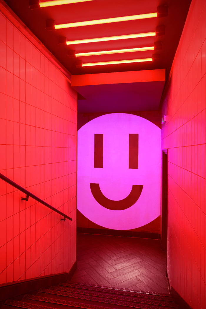
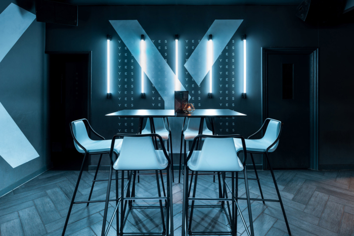
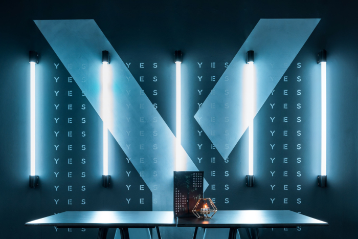
To evolve the Roxy’s visual identity we designed in 2012 and achieve a fresh look and feel while retaining recognition of the previous identity. To create a visual language that dramatised the space, including, unique and memorable features that people felt compelled to photograph and share. To appeal to a wide demographic, including older early evening drinkers and younger night-clubbers.
To build on the success of the club nights, while encouraging more early evening drinkers to drop in, we had to find a voice that made people look and think again, without alienating the more loyal, clubber crowd. To build greater recognition and stand out for the bar, without making it unrecognisable from the identity created 5 years previous.
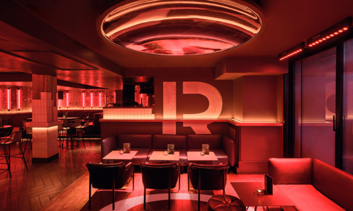
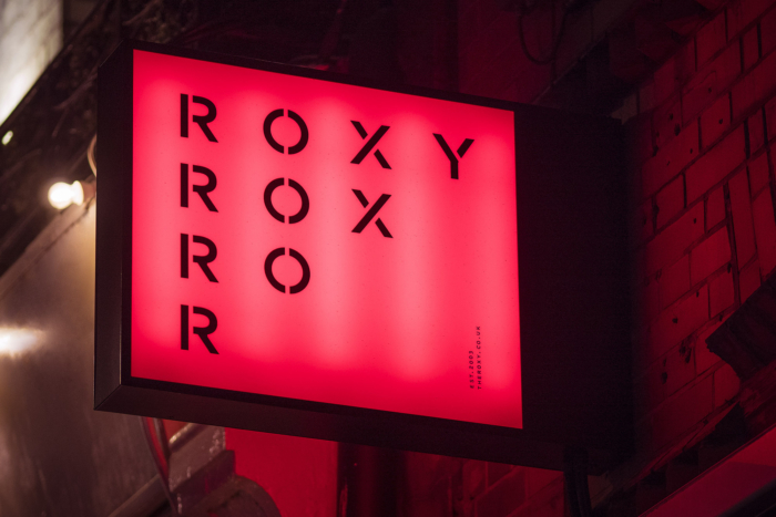
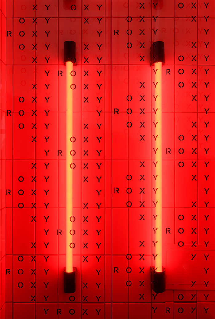
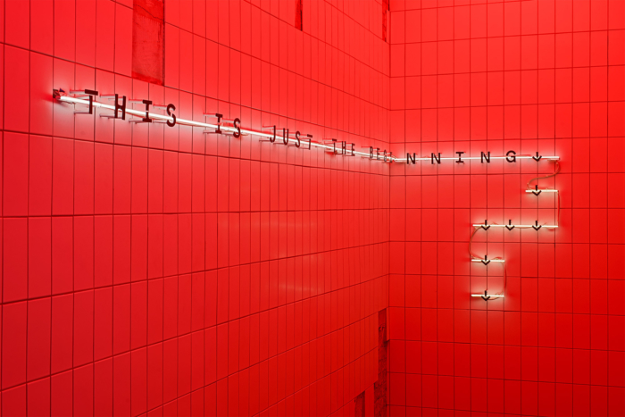
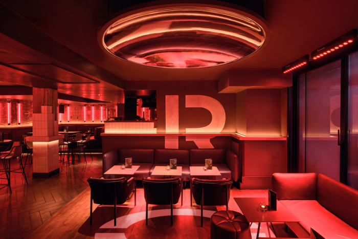
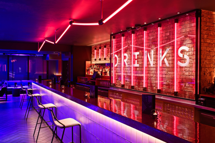
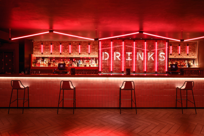
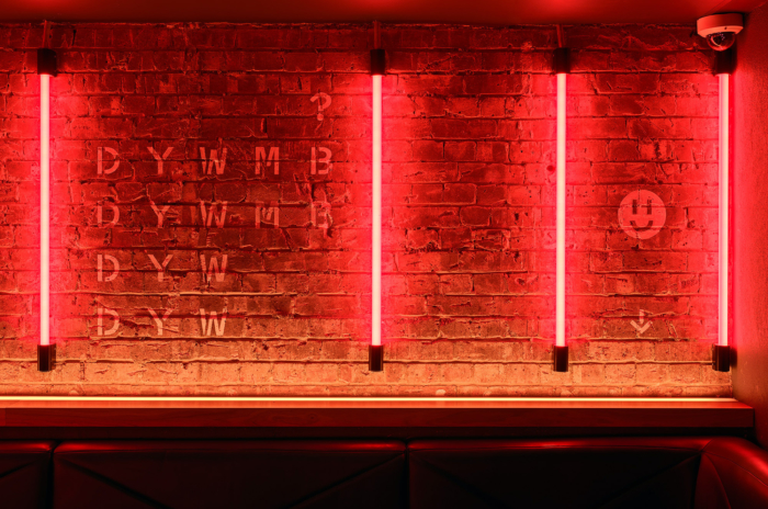
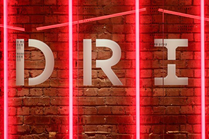
The identity is a transparent, typographic layer, that unifies a space featuring a multitude of patterns, finishes and colours. It’s built around our bespoke typeface, Roxy Sans (based on Klim’s Pitch) which is used at scale, as pattern, and through provocative text. The space has an infinite, adaptable colour palette that floods the bar via programmable neon lights. The result is Tokyo meets Flavin, a smart, innovative, universal aesthetic.
Design: D.T. Practice
Photography: Francis Ware, Franklin & Franklin


Now editing content for LinkedIn.