RA Café
RA Café was transformed by LOT Studio & Transit Studio to create a lighter and brighter all day café experience for guests within the Royal Academy of Arts in London.
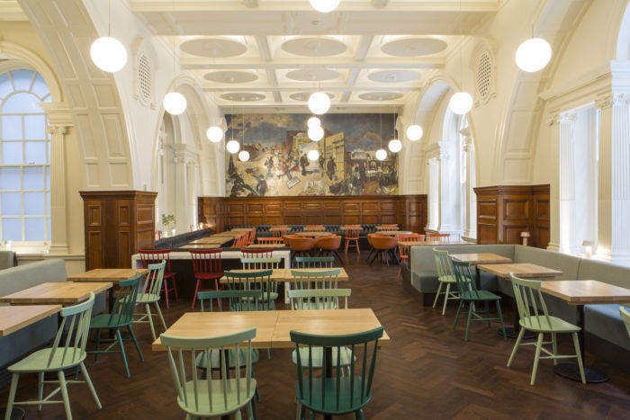
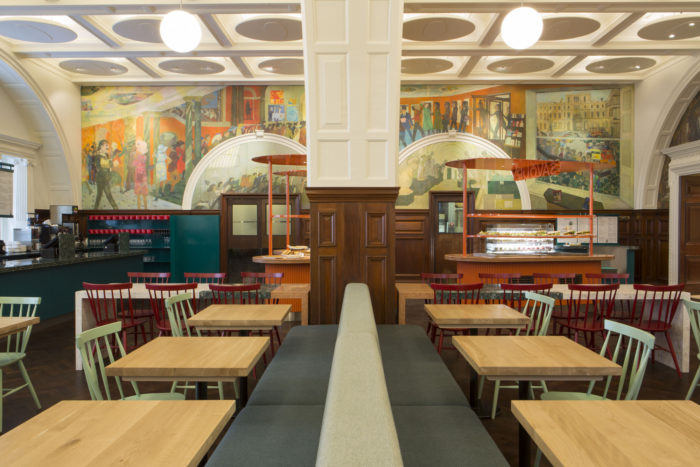
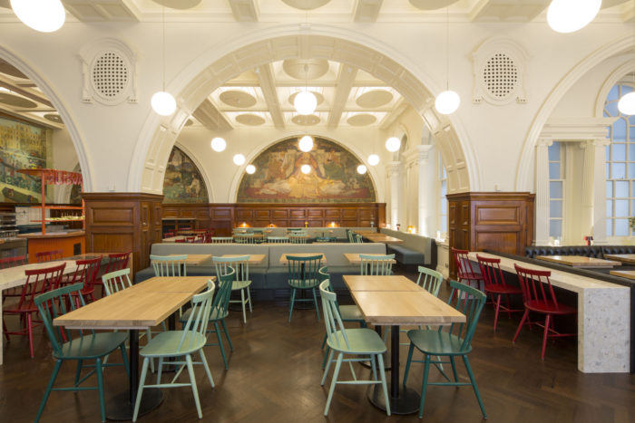
To coincide with their 250th anniversary, we transformed the RA Café, lobby space and courtyard bar at the Royal Academy of Arts in London together with Lot Studio. Using a palette of materials that referenced the murals that dominate the space, particularly the colours from Leonard Rosoman’s Upstairs and Downstairs, we created a lighter and brighter all day café experience.
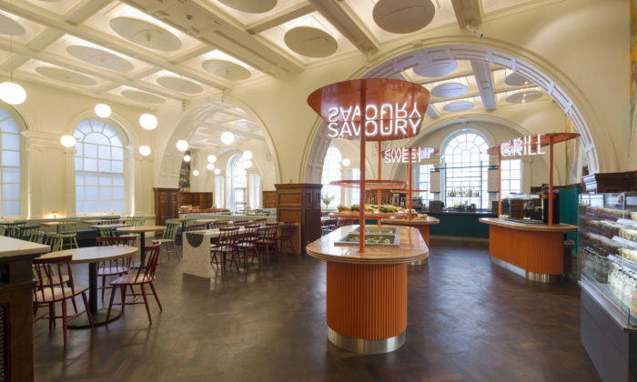
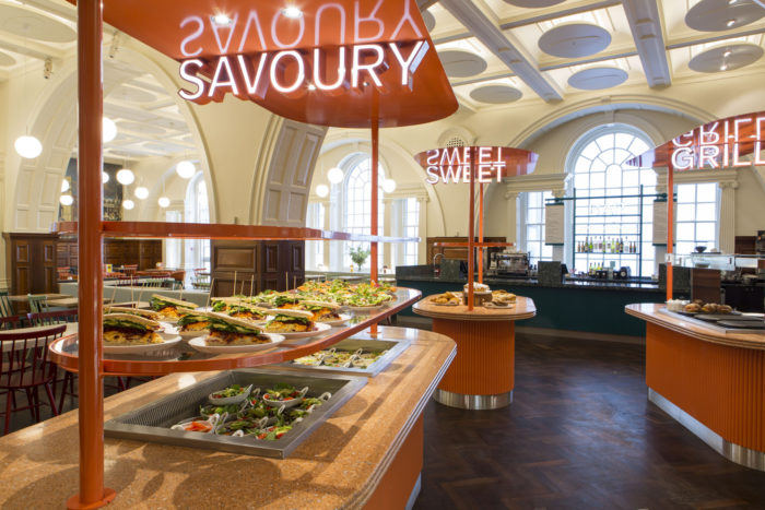
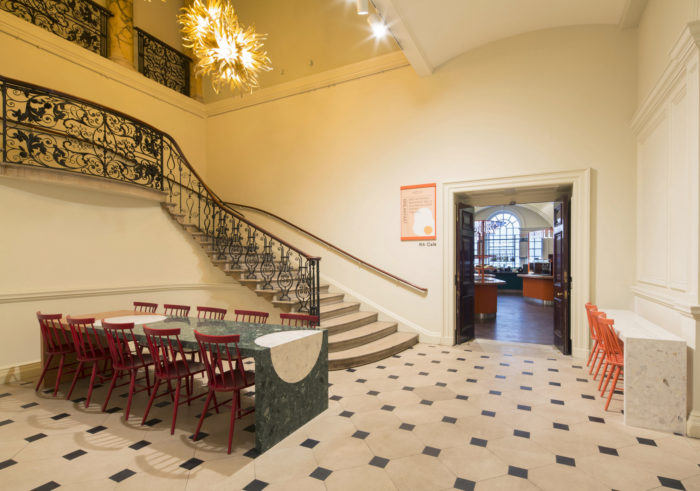
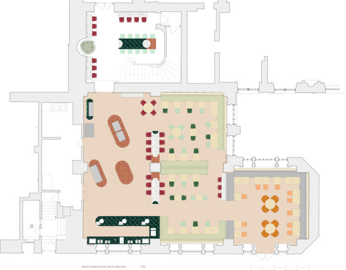
Bespoke communal dining tables and ledges create a unified design language across the café and inspire interactions between guests, while a ten-seat table in the lobby – comprised of terrazzo and marble with a circular pattern – can be used for large groups or solo diners. Individual island counters have been used to suggest an indoor market, with canopies overhead and illuminated signage, helping with wayfinding. The lighting has been greatly improved, including LEDs in ceiling coffers, minimal globe lights, up lights highlighting window details and small colourful table lamps dotted around the café.
We feel the project represents a very strong creative and contemporary design response within a historic environment balancing the constraints of a tight timeline and limited budget. We wanted to bring new life to the Royal Academy Café, Courtyard and Lobby space, through the use of lively and vibrant materials to catch the eye and imagination of a growing audience of visitors.
We were approached late into the redevelopment and refurbishment of Burlington Gardens by David Chipperfield, as part of the Royal Academy of Arts expansion. As part of the 250th Birthday of the RA, they wanted to refresh the RA Grand Café. The brief and budget were challenging, within a very short timeframe, from the first meeting to opening in just 5 months. Additionally, this timeframe precluded us from making changes that would require planning permission to alter the listed spaces. However we were determined to not let this limit our ambition in answering the brief.
We took this as our starting point for a lighter and brighter palette filled with fun and vitality to brighten up what had been a rather dark corner of the RA. We also needed to solve some operational issues with the circulation of peak time visitors and the queuing problems this brought. By splitting up the food and drink offer into a series of market stall like islands, we enabled a flow across the floorspace, with a focal bar at the end, where the tills are now located. We divided the dining room from the food market with custom high terrazzo tables suited to a grab and go coffee, with more relaxed dining option further into the dining room for longer more casual lunches.
Internally the lobby space to the café previously felt like a leftover room before the café entrance. We wanted to take ownership of the café visually by extending the visual language of the café out into the space, within the parameters of the historic intervention allowed. We added a tree as a wayfinding moment to catch the eye from the new north south axis of the gallery link, to help pull visitor flow. We created a terrazzo table as a focal centrepiece to the lobby, with a range of higher seating around the perimeter to give a range of eating and drinking options in what had previously been an inbetween space.
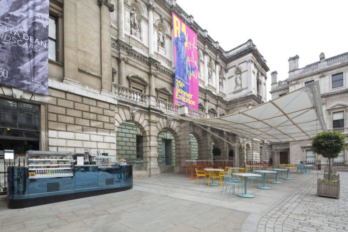
The custom splatter enamel tables were a way of creating interest and intrigue around the opening up of the RA schools for the first time. We wanted a design that was simple and fun and talked about the RA being both a place of exhibition of art, but also a place of production. The colourful furniture that compliments it was about creating a feeling of summer in a sunny but predominantly stone courtyard.
The reflective bar was a way of creating a very minimal intervention with a powerful moment where the entire courtyard and changing central structure shifts over time.
Design: LOT Studio & Transit Studio
Photography: Agnese Sanvito



Now editing content for LinkedIn.