Serafina
Best Practice Architecture wanted to honor the history of Serafina rather than entirely wipe the slate clean for this beloved neighborhood restaurant in Seattle.
As it entered a new decade under new ownership, the beloved neighborhood Italian fixture Serafina was in need of a refresh. Founded nearly 30 years ago, the restaurant has always aimed to echo the welcoming embrace of an Italian home, and has done so incredibly successfully, building a family of devoted regulars and eager first-timers.
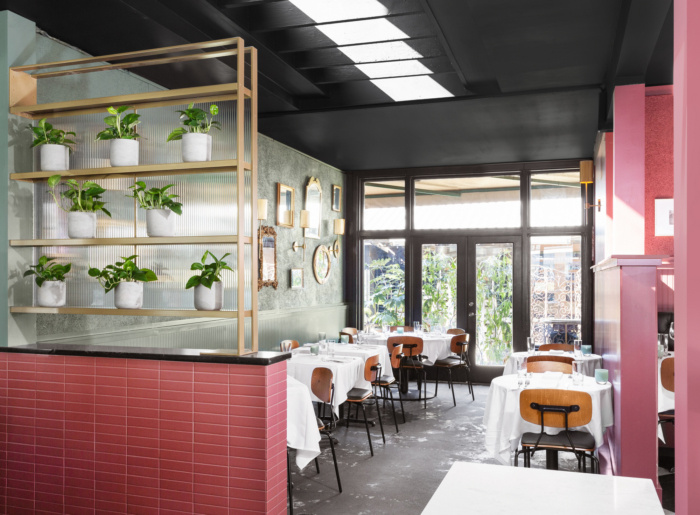
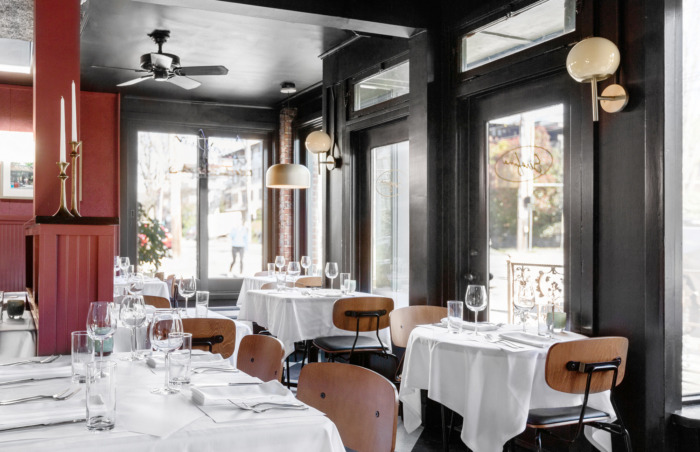
What was once two separate shops that had since merged into one, the existing space was funky and eclectic– a collection of unique artwork, found objects, and improvised table arrangements. The goal was to strike a delicate balance between past and present, to evoke the charm of a rustic Italian trattoria without being too referential or on the nose.
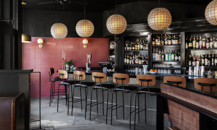
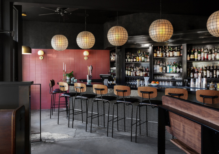
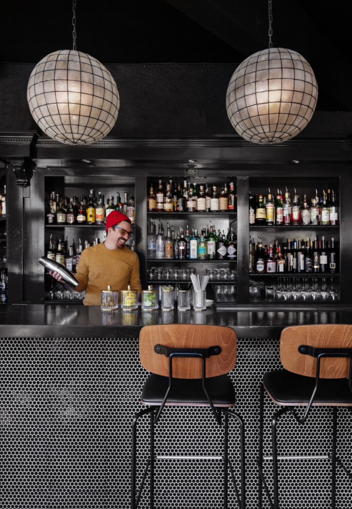
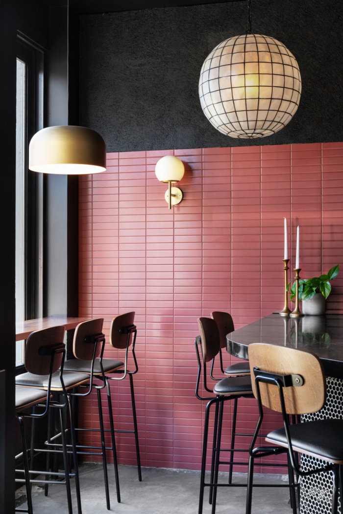
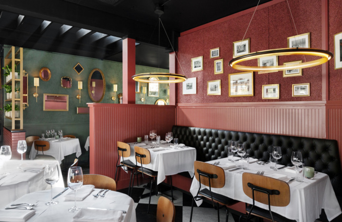
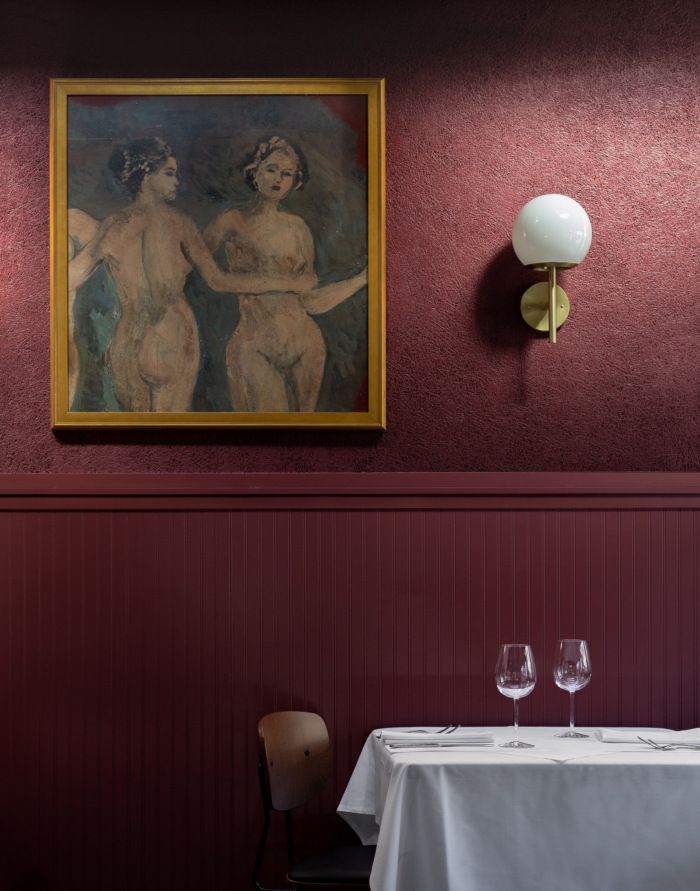
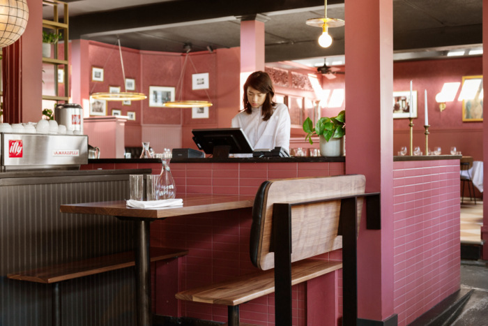
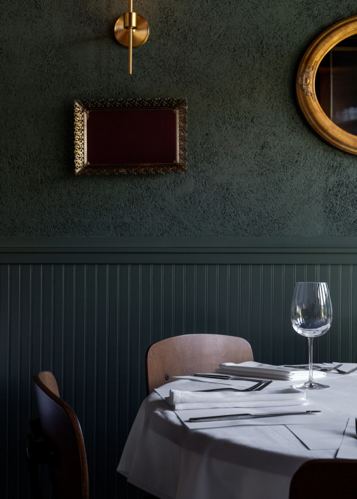
The design team began with the color palette –a refreshed version of the “Serafina red and green”– and updated the restaurant with new paint on virtually every surface. Along with color, Best Practice designed custom brass features that assisted in dividing up the large and disjointed space: a dark and moody bar in mostly black, a romantic dining room painted a mellow red, and a connecting solarium dining space painted a muted green. The brass screen and shelving pieces created new storage and space delineation, while avoiding boxing in any one area from another. Through a carefully curated set of new lighting fixtures, the team stayed true to the restaurant’s eclectic origins. The collection featured all brass fixtures, each slightly different in form and function, so that they helped separate bar from solarium and dining room, while maintaining a cohesive connection across the entire space. In the dining area, the floor was updated to a classic black-and-white checkered floor pattern, but it subtly subverted the traditional by creating a super-graphic checker pattern on the diagonal, instead of the typical 12-inch by 12-inch alternating pattern. The bar area was designed to veer on the dark and serious side with black paint and tile, black quartz countertop, and dark walnut furniture. The large Capiz pendants chosen to hang over the bar offer just enough of an old-world feel to an otherwise modern space. The team added brass shaded pendants hung at eye height over each table lining the full window wall along a busy street, adding curb appeal from the street and a consistent line of warm light onto a previously unlit section.
From a functional and operational perspective, one of the primary elements that needed updating involved acoustics–the many hard surfaces and the sheer volume of space created an echo chamber of noise rather than a cozy restaurant dim. Best Practice saw this challenge as an opportunity for design they used sustainable wood wool panels, a material typically employed strictly for its acoustical properties, as a sort of textured wallpaper across the entire space. These panels were painted either black, red, or green depending on their location, and were attached to the walls throughout the restaurant, providing a consistent backdrop on which to mount new sconce fixtures and hang the client’s existing art collection. Additionally, these wood wool panels were deployed on the ceiling for the dual purpose of acoustical control and visual cohesion. Previously a chaotic assemblage of wires and outdated track lighting, the ceilings throughout the space received a much-needed makeover. With strategically placed panels that both concealed electrical conduit and provided a grid for new track lighting, as well as a fresh coat of flat black paint over the entire ceiling, the focus could be redirected downward, on what matters: the plates!
The team affected change largely through color, finishes, and lighting, as well as a few select places that allowed for heavier-handed design. Best Practice’s aim was to use their delicate hand in enhancing what was already there, while deftly adding sprinkles of designed elements, in order to breathe new life into the space and ring in the next 30 years of amazing food.
Design: Best Practice Architecture
Design Team: Sara Smith, Ian Butcher, Kailin Gregga, Kyle Keirsey
Contractor: Choice Construction
Photography: Rafael Soldi


Now editing content for LinkedIn.